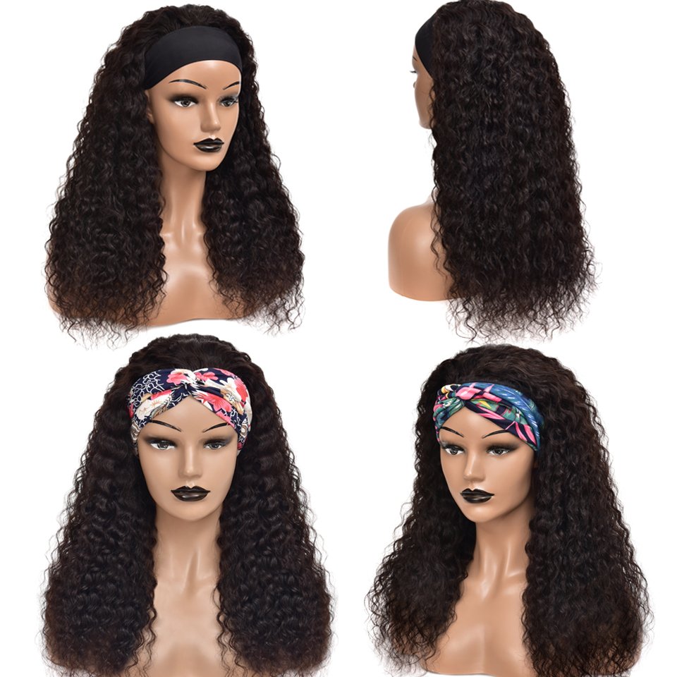
Human hair headband wigs are beloved by so much beauty. It is easy-to-install and beginner-friendly, and it looks natural on African American women. It is not only available to create a natural hairline and the scarf of the headband wig can also help to add a stylish touch to your look. Besides, it is also versatile in styling, the human hair headband wig can be bleach, dyed, and can be styled to any hairstyle you like. Thanks to these features, headband wigs are popular among African American women.
How to make a headband wig at home?
Today, we are going to talk about how to make a headband wig at home by yourself. If you are interested in it, go ahead and keep reading! It’s really very easy and affordable to make a headband wig at home by yourself.
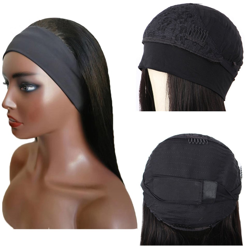
Before we start this small project, you need to prepare the following item: needle and thread, scissors, some t-pins and clips, a wig cap, a headband a velcro strip, a white marking pen, a mannequin head, 2-3 pcs human hair bundles.
Step 1: Measure your head size
Use a soft tape to measure your head size along the front hairline from one ear top to another ear top.
Step 2: Pin the headband to your wig cap
Use some pins to secure the wig cap to the mannequin head. Mark the ear positions on the wig cap (we have just got the distance number in the first step). Get your headband and then cut it down in the middle (where the seam is). Fold the band in half to find the middle position of the band, use t pins to secure the middle position of the band to the wig cap. And then stretch the band slightly so that the headband has enough elasticity to wrap your head, and pin the headband ends up at the ear positions. Finally, use the needle and thread to sew the headband onto the wig cap.
Step 3: Sew or glue the velcro onto the wig cap
Stretch the end of the band and mark their overlap on the back. Use the needle and thread to sew down the velcro to the overlap or you can glue it down, either.
Step 4: Sew in human hair weaves to the wig cap
Use the needle and thread to sew in the human hair bundles onto the wig cap, circle by circle, from the bottom to the top. Continue to sew in until the wig cap is filled with hair bundles sewed on.
And then a human hair headband wig is finished. It’s quite easy. It may just take you 1-2 hours to finish the whole object. And you just need serval seconds to put on or remove a headband wig. Worth it.
The key to make a perfect human hair headband wig at home is to choose high-quality human hair weaves so that the headband wig can be long-lasting, durable and versatile in styling. Or you can buy cheap human hair headband wigs from China Hair Vendor directly. All our headband wigs are made with 100% human hair, natural, breathable, comfortable, long-lasting, and easy-to-manage.
How to wear a headband wig?
Step 1: You can put your hair in like a few braids.
Step 2: You need to put your wig up on your hair. You don’t need to worry about braid patterns or anything, you just need to make sure that your leave out, your edges are kind of straight.
After this step, you are actually good to go out the door because it has a super cute wave pattern. Of course, you can follow the final step to make a new hairstyle.
Step 3: You can curl your hair with any curls you want, or you can also straighten this hair. It’s also a great choice to buy some hair accessories to make you more attractive. Do any styles you want to do!
If you have a plan to make a headband wig by yourself, or you’re searching for a reliable hair vendor, you are in the right place. China Hair Vendor wholesale affordable headband wigs and cheap human hair bundles. Multiple origins, textures, colors, hairstyles for your choice. You can choose from Brazilian hair bundles, Peruvian hair, 613 bundles, natural black human hair weaves, straight virgin hair, curly human hair weaves, short headband wigs, bob headband wigs and so on. All our hair weaves are made with 100% human hair, soft, smooth, shiny, with full and healthy ends, no split ends, no shedding, no tangling. As an almighty online hair store, you can almost find everything you need about human hair wigs and human hair weaves. Order cheap human hair bundles and human hair headband wigs from China Hair Vendor!
Related Read:
How to choose the fittest wig density?

1,095 Responses
Very interesting topic, regards for posting.Expand blog
Your article helped me a lot, is there any more related content? Thanks!
I don’t think the title of your article matches the content lol. Just kidding, mainly because I had some doubts after reading the article.
Thanks for sharing. I read many of your blog posts, cool, your blog is very good.
Can you be more specific about the content of your article? After reading it, I still have some doubts. Hope you can help me.
Thank you for your sharing. I am worried that I lack creative ideas. It is your article that makes me full of hope. Thank you. But, I have a question, can you help me? https://www.binance.info/join?ref=P9L9FQKY
Thank you for your sharing. I am worried that I lack creative ideas. It is your article that makes me full of hope. Thank you. But, I have a question, can you help me?
Thank you for your sharing. I am worried that I lack creative ideas. It is your article that makes me full of hope. Thank you. But, I have a question, can you help me?
Can you be more specific about the content of your article? After reading it, I still have some doubts. Hope you can help me.
I’m extremely inspired with your writing talents and also with the layout on your weblog.
Is that this a paid topic or did you modify it your self?
Either way keep up the excellent high quality writing, it is uncommon to see a nice weblog like this one today.
HeyGen!
Can you be more specific about the content of your article? After reading it, I still have some doubts. Hope you can help me.
Your article helped me a lot, is there any more related content? Thanks!
Whereas any SARM may cause some individuals to expertise dehydration, RAD-140 is
especially noted as a extra widespread culprit. Heart palpitations (increased or irregular heartbeat) are a rare SARM impact that
you just might see talked about by users. There’s no method of understanding whether
or not these individuals have an underlying situation, such
as anxiety or hypertension, which could cause modifications to their
heartbeat. Zits is rarely simple to eliminate and usually disappears after the first few weeks.
Traditional pimples mitigation, like loads of water consumption, clean meals, and a great pores
and skin cleansing regime, will considerably reduce outbreaks.
Adding a testosterone base to your cycle can worsen acne, so should you
plan to do this, increase it steadily through the first 2-3 weeks.
Sustaining your gains after a SARM cycle may be another problem
in case your aim has been to realize muscle.
Weight Problems places a substantial quantity of strain on the
center, and this is true even if lab tests show no abnormalities.
Including stimulants to that stress is dangerous, and it’s one
thing everyone ought to think about. Individuals who are overweight
ought to see their physicians for advice about dietary supplements or even pharmaceuticals they’ll take.
On the other hand, if you have a significant quantity of weight to lose, steroids are doubtless not the greatest choice – no much less
than at first. Losing weight with steroids is certainly attainable, but it’s important to remember that these
pills and injections usually are not miracle workers. In order
for any anabolic to stay up to its status, the individual
utilizing them must be dedicated to a nutritious diet and way of life.
One method Testosterone Enanthate does that is to reduce and even block the stress hormone cortisol, a catabolic hormone.
The result’s increased muscle protection and reduced accumulation of body fat.
Slicing steroids is still one of many drastically helpful items with potential power in the health objective.
Eat enough energy (both high quality and quantity), and you’ll see those shirts filling out within a couple
of weeks, and people will start to notice. Greatest of all, there’s no testosterone suppression, no PCT required, no high
cholesterol or blood strain, water retention, pimples, or hair loss.
Though most people in all probability think of buff celebs like Sylvester or Arnold when they consider anabolic steroids, these compounds are capable
of rather more.
Utilizing exogenous testosterone, you’re going to
get sooner, extra robust, and extra environment friendly in performing heavy duties.
Whether it’s any sports activities, working, or training in the health club, you’ll discover a major amount of enhancement of the energy in your physique.
Perfectmuscle-building stack, the DiDianabol’sddition serves as a Kickstarter, offering wonderful outcomes
till Deca and Take A Look At begin to reply.
Although injectable Dianabol is out there, Dianabol
primarily comes in capsule form. This format is perfect for bodybuilders who
don’t want to mess with needles due to pain or the results of a misplaced injection. We find bulking steroids are
greatest taken along side a high-calorie diet to maximize anabolism.
In this text, we are going to element the most effective steroids when it comes to results when bulking and chopping.
This is because they won’t cause any water retention and have the flexibility to scale back
a customers body fat share. In terms of muscle positive aspects (in relation to facet effects), oral dianabol is up there as probably the greatest
AAS on the black market. It’s not overly harsh and has proven to be probably the greatest steroids you can make
the most of for building muscle (which has remained the same for the final 50 years).
Fat loss differs ever so slightly from “cutting” as a result of, for my part, fat loss can apply to anybody and everybody.
Navigating the realm of Most Secure SARMS, Ligandrol LGD-4033
stands as a compelling selection, offering a spectrum of advantages from muscle preservation to enhanced fat
loss and metabolic help. In terms of weight loss, Ligandrol is ready to attach to fat receptors and stimulate fats loss.
Ligandrol is likely one of the finest SARMs for increasing lean mass
and it prompts the muscle regeneration process after a workout.
As with all outcomes from this slower-acting steroid,
it’s going to take time for endurance benefits to be felt.
Nonetheless, once they are, you’ll quickly find that your
previous limits could be pushed by way of easily, growing your workout depth.
Testosterone Enanthate comes with a host of potential unwanted side effects and dangers to your well being.
The antagonistic results and long-term health consequences,
together with the unpredictability of steroids, make it not value
risking. With an androgenic rating of 100, you can anticipate to be
dealing with a number of the well-known androgenic unwanted effects that we face when using many
steroids. The severity of androgenic unwanted effects you’ll see with Testosterone Enanthate will rely lots in your dose and how genetically predisposed
you could be to specific unwanted aspect effects.
Consuming a diet with cholesterol-friendly foods will assist present
some protection. These embody high-fiber foods and foods wealthy in omega-3 fatty
acids. Avoiding saturated fat is essential, as is
including plenty of cardio in your workouts. The examine also showed that
these unfavorable adjustments reversed themselves after five weeks of ending use of the steroid – again, this was at a low medical dose.
Needless to say, you need to pay shut attention to your cholesterol when using Winstrol.
If you have present excessive cholesterol, you’ll be taking a significant threat in utilizing Winstrol at
all.
Preserving fluid retention underneath control is among the
most critical actions when using Testosterone Enanthate (and any other steroid).
Not just for aesthetic functions however, more critically,
to stop stress on the cardiovascular system.
When it comes to pimples development, those that skilled severe zits throughout their teenage years are sometimes extra susceptible to developing it while using Testosterone Enanthate.
This consists of not solely on the face however zits popping up on the shoulders,
back, and elsewhere.
References:
jbhnews
But the good JBH News is that the liver is a outstanding organ that’s in a place to heal
and rejuvenate itself. Ingestible steroids (a.k.a.
“orals”) normally come in capsule or capsule type.
In some cases, orals additionally come in a liquid form you could drink.
Injectable steroids are available in a sterile, oil-based preparation and should be injected “intramuscularly” using a
syringe and needle.
As you will notice, one methodology in particular ought to by
no means be used and comes with a seriously excessive threat of death.
Far too many individuals make mistakes that may put them off injecting forever.
Injecting might sound simple at first, however there’s a lot you must know and think about before giving it
a go.
In the modeling space, customers are seeking muscular
tone, a decreased body fat % and of a moderate
muscular mass, with additionally some nice definition of their overall muscle appearance.
For this purpose, an applicable program of implementation of Tbol can be a dosage of anywhere between 15 mg and 30 mg per day.
This should be subdivided in two day by day administrations, one in the
morning and one within the evening, for a period of time of wherever between 8 weeks and 12 weeks.
Tbol provides you with the most effective results in gaining lean muscle
mass, decreasing physique fat, and enhancing your body power.
High doses of this amount will improve mass and energy positive aspects, as will the risk of androgenic unwanted aspect effects.
Advanced customers on a cutting cycle will likely wish to stick to a 40mg daily dose, which makes use of Turinabol mainly
as a muscle preservation compound quite than a mass-gaining one.
Oral Turinabol is suppressive to pure testosterone and
must be used along side exogenous testosterone.
Men who use Oral Turinabol without exogenous testosterone will danger
a low testosterone condition. Such a situation can include a number
of possible symptoms ranging from bodily, psychological and sexually related.
Private chats and boards will help you learn one of the best and most secure way of
shopping for steroids to minimize legal problems. Your dosage and the way long
you employ a steroid will decide your risk of voice changes and, specifically,
just how deep your voice might get. It begins slowly, with a noticeable however usually intermittent crackling or
hoarseness of the voice, which you might mistake for an sickness.
However different individuals will soon start to discover your vocal change if it progresses with continued steroid use.
It is a strong anabolic androgenic steroid available orally, often in pill kind.
It was formulated to help East Germany’s athletic team achieve benefits in the Olympic Games between 1968 and 1989.
As mentioned earlier than, Turinabol is considered as being in nature
a really ‘mild’ anabolic steroid concerning its unwanted facet effects.
It shares this function with other anabolic steroids as Anavar and
Primobolan, and particularly boasts an androgenic
rating of 6. This is probably the bottom of its category, while Anavar has a rating of 24 and Primo
sits at forty four.
Being acquainted with the mandatory provides and numerous terminology relating to utilizing
them will present you with the boldness you want to proceed with injecting.
Under are just some samples to provide you an idea of what you can do.
It’s finest to use Winstrol for shorter durations or switch
it out for Masteron if you need to run it for an entire
commonplace cycle. Your decisions will be made primarily based on whether or not bulking or cutting is your major
goal. The half-life of a steroid gives you a way of understanding how long
that steroid will stay active in your system at a level the
place efficiency and physical benefits shall be noticeable and achievable.
Knowing concerning the half-lives of steroids24 will contribute considerably towards your success while
using each compound! Half-life is a scientific idea that’s applied to all
kinds of medicine and substances, whether or not it’s steroids, pharmaceuticals, or vitamins (and more).
Temporary endogenous testosterone suppression is certain when taking any
anabolic steroid. Thus, bodybuilders under our care report higher overall fats loss
on Anavar (vs. Turinabol), especially within the midsection, due to a lower in visceral fat.
Neither compound will trigger any weight reduction due to simultaneous muscle progress.
Some users will endure from extreme cramping, however others may have zero points with cramps.
This can be dosage-related and can compel you to lower
the dose. Growing your intake (or supplementing) of meals rich in potassium and magnesium can go a long way to reducing muscle cramps.
It will virtually all the time solely be discovered through large web
primarily based suppliers. Whereas it’s not an especially frequent anabolic steroid, with a little digging you should have the flexibility
to buy Oral Turinabol online with relative ease. There’s also the risk of buying an under-dosed product or a complete fake steroid.
If you don’t analysis your provider in query, there is also a risk of being
directly scammed out of your cash. We can say with confidence that the side effects
of Oral Turinabol are some of the mildest of any anabolic steroid on earth.
Nonetheless, we will also discover that it might possibly have
a strong, negative impact on cardiovascular well being.
Turinabol is tolerable in girls particularly when compared to different related steroids.
If taken in accordance to the proper dosage, customers are much less
likely to experience extreme side effects. In many cases, the utilization of
the substance can still be detected in trace quantities of the remaining metabolites long after the compound has exceeded its active life in the
body. So, whereas a steroid will no longer be offering you with any efficiency benefits,
it might nonetheless be detected in a drug check many weeks
and even months later. Typically, any oral steroid will have a shorter
detection time than injectables, though it may possibly still be surprisingly long (potentially a
quantity of weeks) when considering the quick half-life.
There’s a giant distinction between oral and injectable steroids as far as their affect on detection occasions goes.
Oral steroids are energetic nearly instantly and depart the physique
rapidly as they pass through the liver and are exposed to metabolic processes.
Tbol’s role in this cycle is to promote strength features and a
few muscle features early on, whereas testosterone kicks in a number of weeks into the
cycle. Regulate your testosterone dose based on your preferences and objectives.
Most novices want to maintain the first cycle so simple as potential, which implies stacking Turinabol with a testosterone ester such as the long-acting Testosterone Enanthate.
The testosterone itself will work extra efficiently with Turinabol binding to SHBG.
In this cycle, Tbol will still contribute to mass features whereas improving recovery and endurance.
Turinabol will often be the first or solely anabolic compound for girls,
so it’s typically simpler to judge the precise effects of this steroid.
This just isn’t a steroid that anyone is in all probability going to make use
of by itself in a cycle.
You can at all times run one thing else alongside the Take A Look At, like Deca-Durabolin. Alternatively,
another choice is blast cycles or common short cycles followed by TRT for cruising.
Trenbolone acetate is probably considered one of the more challenging compounds you could use on this short cycle.
Tren Ace is powerful and works rapidly, however on the identical time,
it will be fairly suppressive even during this short-term use.
So, to make use of Tren Ace in this cycle, it’s really helpful to add HCG at a low
dose of around 500iu weekly (split into two administrations per
week).
Thank you for your sharing. I am worried that I lack creative ideas. It is your article that makes me full of hope. Thank you. But, I have a question, can you help me?
70918248
References:
Steroid Forums Sources (Itjobsbd.Com)
Thanks for sharing. I read many of your blog posts, cool, your blog is very good.
70918248
References:
ellagsäuren Testosteron (Tiroljobs24.at)
70918248
References:
KäLte GefüHl Iden Armen Und Testosteron
Your point of view caught my eye and was very interesting. Thanks. I have a question for you.
Can you be more specific about the content of your article? After reading it, I still have some doubts. Hope you can help me. https://accounts.binance.com/cs/register?ref=S5H7X3LP
I don’t think the title of your article matches the content lol. Just kidding, mainly because I had some doubts after reading the article.
Can you be more specific about the content of your article? After reading it, I still have some doubts. Hope you can help me.
70918248
References:
pill steroid [Reva]
70918248
References:
decca steroid side effects (acaprep.fabaf.in)
70918248
References:
anabolic vs androgenic steroids – Laurie,
70918248
References:
safest steroids for bodybuilding (http://www.onecallflorida.Com/)
70918248
References:
none (https://gettrialsnow.com/services/palia-story-completion)
70918248
References:
none
Thank you for your sharing. I am worried that I lack creative ideas. It is your article that makes me full of hope. Thank you. But, I have a question, can you help me?
Can you be more specific about the content of your article? After reading it, I still have some doubts. Hope you can help me.
Can you be more specific about the content of your article? After reading it, I still have some doubts. Hope you can help me.
Thank you, your article surprised me, there is such an excellent point of view. Thank you for sharing, I learned a lot.
Thanks for sharing. I read many of your blog posts, cool, your blog is very good.
Your point of view caught my eye and was very interesting. Thanks. I have a question for you.
Your article helped me a lot, is there any more related content? Thanks!
Thanks for sharing. I read many of your blog posts, cool, your blog is very good. https://www.binance.info/zh-TC/register?ref=VDVEQ78S
Thank you for your sharing. I am worried that I lack creative ideas. It is your article that makes me full of hope. Thank you. But, I have a question, can you help me? https://www.binance.info/lv/register?ref=B4EPR6J0
Your article helped me a lot, is there any more related content? Thanks!
With the best pod for vaping 24, experience smooth clouds, durable pods, and rich flavors. It guarantees consistent satisfaction, making vaping simple, stylish, and enjoyable every single day.
I don’t think the title of your article matches the content lol. Just kidding, mainly because I had some doubts after reading the article.
Can you be more specific about the content of your article? After reading it, I still have some doubts. Hope you can help me.
statistics on anabolic steroids
References:
https://www.google.com.sb
best supplement stack for mass
References:
platform.giftedsoulsent.com
Can you be more specific about the content of your article? After reading it, I still have some doubts. Hope you can help me.
Can you be more specific about the content of your article? After reading it, I still have some doubts. Hope you can help me. https://www.binance.com/vi/register?ref=WTOZ531Y
Thank you for your sharing. I am worried that I lack creative ideas. It is your article that makes me full of hope. Thank you. But, I have a question, can you help me?
Thanks for sharing. I read many of your blog posts, cool, your blog is very good.
Your point of view caught my eye and was very interesting. Thanks. I have a question for you.
cx777, aight, that’s a solid place to land. No complaints here. Pop over to cx777
Seriously, where can I get the real jq777gamedownload? Keep getting dodgy sites. This one looks promising though: jq777gamedownload
Okay, vwincasino, let’s talk. Site loaded fast, which is a HUGE plus in my book. Played a few rounds of Mention generic game, e.g., Blackjack, and no issues. Seems legit! What are you waiting for? vwincasino
MCW7733 is cool. Easy to navigate and loads of games. Could improve on the bonuses, but overall a solid site. mcw7733
I don’t think the title of your article matches the content lol. Just kidding, mainly because I had some doubts after reading the article.
What’s up! Just wanted to say hi888win is actually pretty good. I was looking for a reliable site and found it. Fast payouts too. Get your game on at hi888win.
Thank you for your sharing. I am worried that I lack creative ideas. It is your article that makes me full of hope. Thank you. But, I have a question, can you help me? https://www.binance.com/en-IN/register-person?ref=A80YTPZ1
Your article helped me a lot, is there any more related content? Thanks!
**mitolyn reviews**
Mitolyn is a carefully developed, plant-based formula created to help support metabolic efficiency and encourage healthy, lasting weight management.
Your point of view caught my eye and was very interesting. Thanks. I have a question for you. https://accounts.binance.com/lv/register?ref=SMUBFN5I
Can you be more specific about the content of your article? After reading it, I still have some doubts. Hope you can help me. https://accounts.binance.com/ES_la/register-person?ref=VDVEQ78S
Can you be more specific about the content of your article? After reading it, I still have some doubts. Hope you can help me. https://www.binance.info/ph/register?ref=IU36GZC4
Bạn có thể đặt giới hạn thua/ngày tại 888slot – hệ thống sẽ tự động khóa cược khi đạt ngưỡng, giúp bạn kiểm soát cảm xúc và tránh rủi ro tài chính. TONY02-25O
Đăng ký tài khoản tại xn88 hôm nay để nhận ngay 150.000 VNĐ tiền cược miễn phí. Cơ hội trải nghiệm các siêu phẩm mà không cần nạp vốn. TONY02-25O
Your article helped me a lot, is there any more related content? Thanks!
**backbiome**
Backbiome is a naturally crafted, research-backed daily supplement formulated to gently relieve back tension and soothe sciatic discomfort.
office rental space new york https://offices-rent-nyc.com
зеркало пин ап пинап казино официальный сайт
Volvo в Україні якісна техніка екскаватори, фронтальні навантажувачі та дорожні машини. Надійність, ефективність і сучасні рішення для будівництва. Продаж, підбір і обслуговування техніки для бізнесу.
пин ап бет https://school7-kirishi.ru
Thinking of trying PHL63 tonight. Heard good things from my friends. Time to see what all the hype is about! Go claim your bonus at phl63
Heard about 92supergame from a friend and decided to check it out. Pretty decent! Lots of games to choose from, and the site is easy to navigate. Check it out: 92supergame
Looking for a new gaming fix? Found 999rgameapk and it’s been pretty fun so far. Easy to download the APK and get started. Give it a whirl: 999rgameapk
Нужны заклепки? заклепка алюм вытяжная прочный крепеж для соединения деталей. Алюминиевые, стальные и нержавеющие варианты. Надежность, долговечность и удобство монтажа для различных задач и конструкций.
office space nyc small office for lease
возврат ответственного хранения ответственного хранения рыночная стоимость
цены ответственного хранения ответственного хранения рыночная стоимость
дизайн проект квартиры интерьера https://dizayn-kvartir-msk.ru
Thank you for your sharing. I am worried that I lack creative ideas. It is your article that makes me full of hope. Thank you. But, I have a question, can you help me?
Лучшее путешествие джип туры ялта горы, каньоны и побережье. Увлекательные маршруты, опытные гиды и яркие впечатления от путешествий по Крыму.
Do you trade cryptocurrencies? secure crypto trading bitkelttrade automate your transactions and earn passive income. Smart algorithms analyze the market and help you make decisions. Increase your income and reduce risks with modern technology.
напечатать флаг на заказ изготовление флага с логотипом
Хочешь оригинальную подушку? дакимакура купить комфорт и уют для сна. Длинная форма, мягкий наполнитель и стильные принты. Отлично подходит для отдыха и расслабления.
Нужен пластический хирург? клиника пластической хирургии современные операции и эстетические процедуры. Опытные хирурги, безопасные методики и индивидуальный подход. Консультации, диагностика и качественный результат.
Нужна мебель? https://mebel-dub-zakaz.ru эксклюзивные изделия из натурального дерева. Индивидуальный дизайн, качественные материалы и точное изготовление. Решения для дома и бизнеса.
Нужна премиум мебель? сайт премиум мебели изготовление на заказ. Натуральные материалы, эксклюзивный дизайн и долговечность. Решения для дома и бизнеса с высоким уровнем качества.
премиум мебель официальный сайт сайт премиум мебели
Наша лучшая подборка: https://listai.pro
Your article helped me a lot, is there any more related content? Thanks!
Learning how to choose proxy solution for ad account management requires understanding the trade-offs between residential proxies, datacenter proxies, and ISP proxies in the context of platform detection systems. Proxies sit between your device and ad platform servers, masking your real IP and location, but different proxy types carry different risk profiles and performance characteristics that directly affect campaign stability. The guide examines proxy rotation strategies, residential proxy reliability for high-traffic accounts, and why datacenter proxies can trigger faster detection on some platforms despite their speed advantages. For media buyers running multiple accounts or managing client campaigns across regions, proxy selection determines whether you maintain consistent access or face frequent blocks and authentication challenges.
Understanding how to find high-intent keywords in Google Ads separates profitable affiliates from those burning budget on low-converting searches. Many campaigns fail because marketers cast too wide a net, targeting keywords with surface-level relevance instead of proven purchase intent. This resource walks through keyword intent classification, deciphering search behavior patterns, and identifying micro-conversion signals that predict bottom-funnel action. You’ll discover techniques for mining search term reports, leveraging competitor analysis, and using negative keywords to eliminate wasted spend. The playbook includes tactical steps for keyword grouping, testing methodologies, and performance benchmarking against industry standards. Affiliates who master these skills achieve lower CPAs and scale faster than competitors relying on guesswork.
Thanks for sharing. I read many of your blog posts, cool, your blog is very good.
explore corner shop – I came across this today and the browsing feels simple and intuitive.
ForestCove Marketplace Hub – The site feels organized and is simple to move through without confusion.
In evaluations of e-commerce websites emphasizing simplicity and usability, one notable platform is Trail District Gilded Commerce Goods where the clean layout makes everything feel easy to browse through today, allowing users to access content quickly and without unnecessary complexity.
While comparing digital marketplace platforms built for usability, a standout example is Willow Dawn Experience Atelier which delivers pages are well organized and content is easy to understand quickly, ensuring a structured and user friendly browsing journey across all sections.
While reviewing online retail systems designed for clarity and usability, a standout example is Stone Harbor Commerce Hub which ensures nice layout with clear sections and straightforward navigation flow, offering a distraction-free and easy browsing experience throughout the platform.
Across multiple marketplace usability comparisons, a standout example is Lantern Orchard Vendor Lounge where smooth browsing with a calm design and easy page transitions, making it easier for users to locate products through a structured and intuitive layout.
Across multiple digital retail usability assessments, a notable example is Lakefront Unified Raven Guild which ensures the site looks structured and information is easy to locate, delivering a consistent and responsive browsing experience throughout the platform.
In comparisons of online shopping platforms focused on design and usability, a strong example is Stone Vendor Ember Vault which maintains clean and modern look makes the browsing experience quite pleasant, providing a smooth navigation flow without unnecessary visual clutter or complexity.
While comparing digital shopping platforms designed for clarity, a standout example is Brook Lemon Experience Corner which maintains easy to navigate and everything is clearly presented without clutter, ensuring a calm and intuitive user journey across all sections of the site.
During a long browsing session filled with mixed content, I encountered this curated boutique space and I just stumbled here, and honestly the vibe feels quite welcoming today, which made the overall visit feel warm and easygoing.
During a comparison of several ecommerce UI prototypes focused on responsiveness and layout consistency, I navigated a product showcase section featuring Canyon Retail Lemon Studio embedded in the homepage feed, and the experience felt smooth and intuitive while scrolling – content was well spaced and easy to scan without distraction or clutter.
In evaluations of modern commerce systems focused on clarity and design, a strong example is Gilded Brook Global District where nice visual balance and navigation works without any confusion, helping users access information quickly without clutter or unnecessary distractions.
While exploring various trading post inspired digital platforms for usability insights I discovered ember willow market hub overview during my comparison of navigation systems across similar websites – The structure felt balanced and easy to follow, giving a clear impression of organized content and efficient browsing flow throughout.
Online retail guild environments perform better when they maintain consistent visual alignment and predictable navigation paths across different pages and product groupings Raven Retail Navigation Guide improving browsing efficiency – The layout feels coherent and well spaced, helping users understand where everything is located without confusion
When analyzing online retail systems built for usability and consistency, one standout example is Night Trade Glade House where everything feels straightforward and browsing is comfortable and stable, helping users access information quickly through a clean structured layout.
During a structured review of ecommerce systems for UX flow and navigation clarity I examined a category interface featuring a href=”//opalgladeboutiquehall.shop/](https://opalgladeboutiquehall.shop/)” />Glade Boutique Opal Hall Exchange within a grid layout, – The clean layout ensures everything is easy to locate and view providing a straightforward and comfortable browsing experience
While browsing through various supplier directories for evaluation purposes, I noticed chestnut harbor listings and decided to examine it further while comparing similar services – After a quick look, the platform appeared reasonably organized and the experience felt acceptable for casual use.
During a casual exploration of individual profile websites and creative pages, I noticed something embedded mid-content check this personal site and it looks pretty interesting, making it worth exploring further due to its clean and engaging presentation style
Somewhere along my browsing journey, I encountered a well-presented retail space and it gave me a strong sense that I would return later to explore more helpful and engaging content.
While exploring different community engagement and support pages, I came across something embedded mid-way CT hope initiative and it is a great initiative focused on supporting community causes and creating meaningful local impact
In comparisons of digital storefront systems built for efficiency and usability, one standout platform is Amber Marketplace Summit where smooth experience overall, pages feel fast and easy to use, helping users move through categories smoothly without unnecessary visual clutter or delays.
While casually browsing through several online articles and notes, I encountered something that appeared unexpectedly discover this link and I’m not entirely sure what kind of information it holds, but it certainly looks uncommon enough to spark some curiosity
During my search through casual lifestyle and entertainment platforms, I found something within the text check this site and it looks interesting overall, presenting a fun casual destination vibe that feels relaxed and approachable
During an in-depth UX evaluation of ecommerce prototypes for navigation efficiency I examined a catalog page featuring a href=”//iciclegrovemerchantmart.shop/](https://iciclegrovemerchantmart.shop/)” />Icicle Merchant Grove Mart Exchange inside a product listing module, – The site feels simple and straightforward without any distractions ensuring users can browse content smoothly with clear structure and minimal cognitive load
uplandtrailcommercehub – Clean design and smooth navigation made my visit quite pleasant.
Across various marketplace usability analyses, a notable platform is Lakefront Icicle Market Mart which delivers simple layout and information is easy to find at a glance, ensuring a stable and visually consistent browsing experience throughout the site.
While exploring different restaurant listings and food experience pages, I came across something embedded mid-way view this menu site and it immediately caught my eye, looking flavorful and full of character with an appealing food presentation overall
While going through different awareness campaigns and resources, I noticed something that stood out see this link and it appears to reflect a meaningful initiative with positive intent
During a structured UX analysis of ecommerce systems for navigation efficiency and clarity I examined a category page featuring a href=”//jewelbrooktradecollective.shop/](https://jewelbrooktradecollective.shop/)” />Brook Trade Collective Jewel Exchange within a grid layout, – The layout is neatly arranged and feels comfortable to explore providing a clear and organized browsing experience that is easy to understand
While browsing through various property-style and informational websites today, I came across something placed within the content visit this property page and it has a nice presentation that clearly explains what is being offered, making everything easy to understand at a glance
Somewhere along my browsing session, I came across this curated shop hub and it appeared to be a well-maintained platform with content that was organized in a thoughtful and appealing way.
While reviewing different web-based marketplace layouts for usability insights, I spent some time navigating a demo platform where I encountered a section featuring Kettle Forest Market Studio interface elements that felt clean and minimal – the page structure felt logically organized, and every category was easy to reach without confusion during browsing sessions.
In the middle of exploring restaurant guides and culinary suggestions, I encountered something within the text take this link and it really looks like a great place that stood out and interested me right away
During my exploration of football teams and sports update platforms, I came across something within the text view club site and it is a football club page providing engaging match updates and sports information
Users exploring structured digital marketplaces often benefit from simplified navigation layers that reduce effort when switching between categories and product listings across vendor dashboards and curated collections Vendor Studio Navigation Panel allowing smoother transitions and improved readability for users who prefer organized browsing experiences during extended sessions – the interface feels practical and easy to follow for daily use
As I continued exploring different modern website layouts and online designs, I noticed something embedded in the content learn more here and it provides a smooth browsing experience with a clean and well structured layout that feels very intuitive
At first my browsing session felt ordinary and uninteresting, but halfway through I discovered an elegant shop link which stood out because of its fast loading speed and its layout that felt clean and very easy to navigate.
While reviewing several digital commerce mockups for navigation efficiency and visual hierarchy consistency, I examined a category panel containing Ridge Lemon Merchant Hub inside a grid layout, and the browsing experience felt reliable and clean without any issues while switching between sections – everything behaved predictably and loaded without delay.
While reviewing a mix of personal and creative online projects, I came across something embedded mid-way visit this concept and it had an interesting idea behind it that made going through the pages enjoyable
In structured vendor environments, clarity and spacing play a major role in how efficiently users process information and compare available listings Vendor Studio Trail Overview Panel allowing better decision making during browsing – The overall system feels balanced and user friendly, giving a sense of order that helps users stay oriented while exploring different sections
As I was going through various project and informational platforms online, I encountered something within the text explore this project and it is nicely put together and informative, making it definitely worth checking out for deeper understanding
While comparing different online storefront simulations for interface clarity and performance testing, I reviewed a category view containing Summit Ridge Lemon Shop integrated into a product grid, and – everything loaded quickly and felt structured in a way that made browsing feel effortless and easy to follow from start to finish.
As I browsed through different informational and educational resources, I noticed something placed within the content visit this resource and it seems to provide valuable insights that could help many users understand the topic better
During my exploration of election campaigns and political communication sites, I came across something within the text view campaign page and it is a political website presenting policy ideas and vision in a clear and simple manner
During a UX comparison of ecommerce systems for navigation clarity and layout behavior I examined a product listing page featuring a href=”//jewelridgevendorvault.shop/](https://jewelridgevendorvault.shop/)” />Vendor Vault Jewel Ridge Exchange within a structured grid system, – The interface is clean and offers a calm browsing experience overall ensuring a smooth and intuitive journey across all categories and sections
While reviewing various digital art gallery websites, I noticed something embedded mid-content check art exhibition and it offers a creative concept that makes exploring the different sections feel engaging and well structured
In the middle of exploring pet print shops and animal art websites, I encountered something mid-content explore this page and it shows adorable pet-related prints that are highly recommended for animal lovers everywhere
During a casual exploration of various online resources and web pages, I noticed something embedded mid-content check this page and after taking a quick look, it appears well organized with an easy navigation flow that makes browsing quite smooth
Expand details: https://sarapang.com
As I browsed through multiple wellness and charity foundation websites, I noticed something placed within the content discover this foundation and it is a nonprofit focused on hair restoration and global awareness work
As I spent time reviewing several online articles and discussions, I decided to highlight use this link in this part of the text – it introduced me to new viewpoints and helped expand my overall comprehension.
While going through several motivational and creative platforms, I noticed something within the content discover more here and the idea is inspiring, standing out strongly compared to similar resources
When I first visited this tracking platform – I only needed basic monitoring tools, but the clean and uncluttered dashboard design ended up being the reason I kept using it regularly.
While analyzing ecommerce demo systems for interface responsiveness and usability flow I came across a product feed containing a href=”//ambercoastmarketplace.shop/](https://ambercoastmarketplace.shop/)” />Marketplace Amber Coast Shop Hub within a grid system, – everything loads quickly and looks tidy which makes browsing smooth and enjoyable without any clutter or delays affecting usability
While going through several home improvement blogs and practical lifestyle guides earlier today, I decided to include check this helpful site right in the middle of my note – the ideas presented there were genuinely useful and gave me practical inspiration for improving everyday living spaces.
As I was reviewing designer fashion platforms and creative portfolios, I found something embedded in the text visit elegant site and the elegant design paired with smooth navigation creates a very smooth and enjoyable browsing experience overall
As I was going through various ecological and environmental protection websites, I encountered something within the text explore this nature project and it shows a nature focused organization promoting environmental awareness and long-term conservation efforts
During a structured review of ecommerce UI designs for usability optimization and visual hierarchy I explored a category page featuring a href=”//forestcovegoodsmarket.shop/](https://forestcovegoodsmarket.shop/)” />Forest Market Goods Cove Network embedded in a grid layout, – The layout is straightforward and helps users move around without confusion which creates a clean and easy browsing experience throughout the platform
sebastianbachlive.com – Live music updates and performances from Sebastian Bach online now
While exploring local media sources and community-focused editorial sites, I came across local insight hub – The content has a grounded feel, and a number of the perspectives shared are worth revisiting for additional clarity.
As I explored music artist websites and band fan communities, I stumbled upon music band hub – The overall feel is very polished and engaging, and the content is arranged in a way that feels both thoughtful and easy to navigate.
While analyzing ecommerce UI systems for usability testing and interface responsiveness I explored a category page featuring a href=”//amberwillowmarketplace.shop/](https://amberwillowmarketplace.shop/)” />Willow Amber Shop Marketplace Hub embedded in a structured layout, – everything feels smooth and pleasant with content organized neatly across pages which makes browsing easy and enjoyable
I’ve recommended this resource to a friend already</a – Because the content explains therapy in plain language while still feeling respectful and professional.
During a casual search for creative portfolios and design inspiration, I stumbled upon visual showcase page – The distinctive name drew me in, and exploring the site revealed a range of interesting design pieces.
While testing structured browsing systems across different online vendor environments, I noticed how well-designed navigation reduces cognitive load for users Ruby Orchard Marketplace Index – Users can easily scan through listings and understand the layout, which makes the entire browsing process feel efficient and straightforward.
While browsing discussion-oriented websites focused on community perspectives today, I came across something placed within the content Northern views forum and it seems like a place for meaningful discussions, offering thoughtful exchanges and engaging viewpoints overall
During a casual review of travel and urban transit websites, I noticed something embedded mid-content check this route planner and it serves as a transport information site providing useful updates for commuters and daily travelers
While reviewing multiple ecommerce UI mockups for usability testing and consistency I navigated a category interface containing a href=”//dawnlakefrontgoodsatelier.shop/](https://dawnlakefrontgoodsatelier.shop/)” />Atelier Goods Lakefront Dawn Hub inside a sidebar module, – the site looks neat and operates smoothly across sections which makes browsing feel consistent, easy, and well structured throughout the interface
The beauty of this guide – It shows that creativity doesn’t have to be abstract, offering unique solutions that are also easy to implement at home.
While exploring different illustration portfolios and digital art showcases, I came across something embedded mid-way view this art site and it is very artistic and expressive, making browsing the visuals here an enjoyable experience overall
While going through different political outreach and campaign information platforms, I encountered something mid-content visit this candidate page and it shows a political campaign site providing candidate information and public goals
thepaleomomconsulting.com – Nutrition consulting site focused on paleo lifestyle guidance for clients
While studying structured retail browsing platforms and their user experience design choices across multiple content areas, I noticed a clean navigation framework Velvet Trail Browsing Portal that helps maintain focus while exploring categories – The interface felt simple and visually balanced, making it easy to move through sections naturally
One great discovery recently was this page – The tone is consistently fun and uplifting, which feels like a breath of fresh air compared to typical websites.
In the middle of browsing through personal blogs and lifestyle content websites, I came across something that stood out see this blog page and it feels quite genuine overall, with content that comes across as personal and easy to relate to
During a UX evaluation of ecommerce environments for navigation structure and clarity I explored a catalog page featuring a href=”//harborlakefrontboutiquehub.shop/](https://harborlakefrontboutiquehub.shop/)” />Harbor Boutique Lakefront Network embedded in a grid system, – The clean presentation makes browsing feel simple and stress free overall allowing users to focus on content without visual noise or confusing layout elements
As I browsed through vacation rentals and charming getaway locations, I discovered island retreat link – The place has a welcoming and calm vibe that instantly made me think about planning a trip to Hawaii.
The best part about this amusing little corner – Is how naturally the humor flows, creating an environment that feels both welcoming and genuinely entertaining.
As I continued exploring various informational and simple resource websites, I noticed something embedded in the content learn more here and it is straightforward and useful, with information that is easy to understand quickly overall
Finding structured vendor data online can significantly improve productivity, especially when dealing with large sets of categorized information Pearl Cove Vendor Archive Portal allowing users to quickly scan and interpret listings – the interface supports efficient decision making and reduces confusion
As I was going through various cultural festival and event memory websites, I encountered something within the text explore this festival page and it is an event archive site preserving memories of past celebrations and long standing traditions
While looking into different online store concepts and experimental retail platforms, I came across strange concept link – The name is definitely unusual, but after exploring a bit, the overall idea starts to feel more coherent than expected.
One of the better finds recently is this family advice site – Where the presentation feels clean and thoughtful, allowing the interesting material to shine through effortlessly.
As I was going through various innovation and lab-based websites, I encountered something within the text explore this research site and it presents a clean design with an interesting focus, making it feel like a solid resource worth exploring
phiferforcongress – Political campaign website shares candidate vision and policies community focus
tribe-jewelry.com – Jewelry brand offering unique handmade designs and collections for customers
I appreciate how this organization’s website – Does not shy away from difficult conversations, instead providing clear insights and showing genuine commitment to progress.
As I was going through various informational and purpose driven online resources, I encountered something within the text explore this initiative and the content is nicely organized with a clear purpose, making it very easy to explore and understand overall
During a quick lunch break browsing session through various online pages, I discovered random web corner – It was a completely spontaneous find, but it wasn’t terrible at all and actually felt a bit more interesting than most random sites I usually click on.
I have to commend this network’s resource page – For tackling important themes with honesty and warmth, creating a space where difficult conversations feel productive rather than exhausting.
As I continued exploring different educational websites and academic platforms, I noticed something embedded in the content learn more here and it appears professional and welcoming, creating a strong first impression that is both inviting and trustworthy
While exploring creative portfolios and personal web pages for ideas, I came across clean mobile portfolio – The design is simple and elegant, and it’s clearly built to work well on mobile where browsing feels natural and effortless.
yogaonethatiwant.com – Yoga focused platform promoting wellness and mindful practice every day
While going through various creative web pages and location-based sites, I encountered something mid-content visit this clocktower page and it gives a unique impression that makes exploring its content quite enjoyable and engaging
During research into various coastal inspired ecommerce storefronts for interface evaluation and layout benchmarking, I encountered harbor coast digital boutique space while comparing multiple design systems – The browsing experience felt smooth, modern, and easy to follow with no unnecessary distractions or complicated navigation elements present.
While browsing culinary inspiration pages and restaurant concept sites, I discovered taste fusion hub – The mix of cultures feels creative and bold, and the menu photography is so appealing it immediately triggered my appetite.
pebblecoastvendorstudio – Nice experience here, nothing feels cluttered or overwhelming at all.
During a comparison study of multiple online retail environments for UX clarity and navigation behavior I explored a category listing that included Citrus Lemon Lark Store – the interface was arranged in a way that made everything easy to locate, which enhanced the overall ease of browsing significantly.
As I continued exploring different informational and public profile websites, I noticed something embedded in the content learn more here and it features clear messaging with structured layout, making the information very effectively presented and easy to understand
What I really like about this business resource hub – Is that it offers solid, actionable tips without fluff, so each visit leaves you with something practical you can actually use.
As I explored learning support tools and therapy education websites, I stumbled upon sensory resource link – The page offers clear and usable guidance that feels helpful for parents and teachers dealing with sensory-related challenges in children.
I didn’t expect much while browsing, but halfway through I discovered this organized merchant platform and I liked how the structure of the site made it easy to look around and explore freely.
Exploring modern wellness platforms, I found conscious movement yoga hub that focuses on intentional body awareness – it guides users through mindful yoga flows that strengthen the body, improve posture, and encourage relaxation through structured breathing and consistent daily practice routines.
During a comparative review of ecommerce UI systems focused on navigation flow and usability performance I explored a browsing dashboard featuring Stone Velvet Vault Exchange embedded in a structured catalog grid, – the platform felt trustworthy and well presented making it easy to browse through content without confusion or difficulty.
While exploring entertainment fan pages and sports-themed novelty websites, I stumbled upon quirky celeb link – The idea is funny in a strange way, combining a celebrity name with volleyball in a lighthearted and slightly absurd format.
What makes this catchy little website worth your time – Is the combination of a memorable name and genuinely fresh content that does not feel like everything else you see online these days.
While casually navigating different sites, I stumbled upon a modern retail hub in the middle, and I found scrolling through it enjoyable thanks to the appealing and thoughtfully displayed content.
From a planning perspective, this camping information hub – Does a fantastic job of answering common questions upfront, so you rarely need to go searching elsewhere for basic details.
In between random searches I happened upon this curated marketplace and I noticed right away how structured and appealing everything looked, giving me a very solid and positive initial impression.
The professional tone and layout of this medical practice hub – Make even detailed health information feel accessible, because everything is broken down into clearly labeled and easy‑to‑scan sections.
While conducting usability comparisons of various e-commerce inspired platforms focused on speed responsiveness and layout structure I recently opened Kettle Broke Digital Shop – and experienced a clean interface with fast loading pages and well structured sections that improved overall browsing efficiency significantly here.
My browsing experience became better when I found this refined merchant hub in the middle, and everything seemed neat and easy to access, which I really like due to its organized layout.
As I explored sweet treat blogs and pastry photography collections, I stumbled upon dessert bakery hub – The overall tone feels very Parisian, and the macarons look perfectly balanced in color, shape, and presentation throughout the photos.
I didn’t expect much while browsing, but halfway through I discovered a user-friendly outlet space and I found the experience smooth, with navigation remaining clear and straightforward throughout.
During a search for football injury support and athlete therapy resources, I found healing football hub – The mix of sport and recovery feels refreshing and unusual, creating a more holistic approach to athlete wellbeing than typical training pages.
For anyone who wants parenting advice that is not fake or overly polished, this mom‑focused site – Offers stories and tips that feel like they come from a trusted neighbor rather than a distant expert.
While going through several modern website recommendations, I found something that stood out in the middle of everything else, read more here, and it feels fresh with easy browsing that makes the experience smooth and pleasant
While testing various online retail interfaces for design clarity and usability behavior, I spent time navigating structured menus and discovered a consistent flow when I opened The Rade Collective Space – the layout was easy to understand, and everything responded quickly without making the browsing process feel complicated or slow.
While browsing rental advice blogs and urban lifestyle content, I discovered urban renter hub – The guidance feels grounded and useful, offering clear tips that are especially helpful for people new to city housing and rental processes.
What really stands out about this artist’s online hub – Is how the content manages to be both entertaining and easy to enjoy, creating a platform that feels lively without being overwhelming.
During my initial browsing session on this site while casually exploring online, I discovered this organized studio page and it felt reliable from the beginning, making the experience comfortable and easy to trust.
During my search through community service and nonprofit platforms, I found something within the text local support initiative and it is a great initiative that supports community causes and builds positive local impact overall
During a routine search across exhibition websites, I noticed something embedded in content, go to site, and it offers visually appealing artistic content with strong engagement overall
At one point during my browsing session, I encountered something naturally placed within the content, visit and explore, and it is an interesting website where I found useful details while going through several pages today
During my exploration of casual entertainment and lifestyle websites, I came across something within the text view fun site and it looks interesting overall, presenting a relaxed and fun casual destination that feels enjoyable to browse
velvetgrovemarketlounge – Design looks modern and everything works without any noticeable issues.
While comparing various digital food marketplaces I noticed clear layout grocery portal appearing mid-list in search suggestions and it seemed practical – the platform is designed with usability in mind, providing a smooth and uncomplicated browsing experience across different sections and pages
While reviewing several awareness platforms online, I noticed something embedded in the flow, learn more here, and the site presents structured and easy to understand educational information overall
While going through several recommendations, I encountered something that appeared naturally within the content, read more here, and it seems like a lively and interactive site worth exploring further
In reviews of online commerce platforms emphasizing clarity and user experience, a strong example is Willow Dawn Trade Atelier which ensures pages are well organized and content is easy to understand quickly, supporting a seamless and efficient navigation flow throughout the site.
In the middle of exploring dessert-themed visual branding websites, I encountered something mid-content explore this page and it shows unique branding, with everything appearing visually appealing and well designed
While reading through various online retail discovery platforms and boutique showcases, I found something notable at Boutique Hall Info Portal that offered a smooth browsing experience and I appreciated how the layout supported quick scanning as well as more detailed reading when needed.
In the middle of reviewing gardening tips and plant care websites, I found something that caught my attention explore garden discovery and it provides beautiful gardening content that feels calming and very informative for beginners today
In comparisons of online commerce systems focused on clarity and user experience, a standout example is Stone Harbor Unified Hub which delivers nice layout with clear sections and straightforward navigation flow, ensuring a smooth and structured experience across the entire platform.
During a long browsing session across various topics and ideas, I noticed something appearing right in the middle of everything else, visit this page, and it seems like the structure is thoughtfully arranged which makes it simple to navigate and understand
While going through different personal website and portfolio showcase pages, I encountered something mid-content visit this profile site and it feels clean and professionally designed, with a structured and visually appealing layout
As I continued exploring positivity themed platforms, I found something placed within the flow, discover smile hub, and it shows an enjoyable uplifting concept that feels refreshing overall
I was going through different ideas and references online when something appeared right in the middle, visit here now, and it actually seems like a concept that’s interesting enough to revisit when I have more time
While reviewing digital shopping platforms designed for simplicity and flow, a standout example is Orchard Lantern Commerce Lounge which ensures smooth browsing with a calm design and easy page transitions, offering users a distraction-free and stable browsing experience throughout.
During a casual exploration of food marketplace and shopping platforms, I noticed something embedded mid-content check this food shop site and it shows an interesting food and shopping concept that feels useful and creatively designed for users
People who enjoy digital nature collections frequently visit sites that combine scenic visuals with environmental appreciation, and they might encounter tranquil forest notes – The content often emphasizes peaceful outdoor experiences and encourages users to slow down and appreciate the subtle beauty of natural settings.
In studies of digital commerce platforms focused on UX design, a strong example is Lakefront Raven Vendor Guild which ensures the site looks structured and information is easy to locate, delivering a smooth and logically arranged browsing experience throughout the site.
As I continued exploring different informational and lifestyle websites, I found something naturally placed in context, discover this site, and it appears to be a helpful resource where I came across useful tips and ideas while browsing around
Individuals tracking civic engagement updates often visit campaign websites and informational pages that explain policy stances public policy brief site to stay informed about candidate viewpoints and legislative priorities – The content is usually presented in a straightforward way to support informed decision making process
Across various digital storefront assessments emphasizing usability and layout consistency, a notable example is Grove Opal Boutique Hall which ensures simple interface and content feels neatly arranged throughout the pages, delivering a calm and structured browsing experience across all sections.
As I moved through different music learning platforms, I found something in between the content, explore further, and the content quality is solid, well updated, and nicely presented for a clear learning experience
Residents interested in cultural enrichment often look for digital platforms that highlight neighborhood creativity and shared artistic experiences in accessible formats, and they may encounter creative neighborhood gallery – This resource focuses on community exhibitions, artist collaborations, and events that bring people together through shared appreciation of the arts.
I was going through multiple travel information websites when something appeared naturally in context, visit here now, and it is a nice website where everything is easy to find and understand quickly thanks to its simple navigation
I was going through various community platforms when something stood out naturally in context, explore team network page, and it offers a structured system designed for effective collaboration and shared goals overall
While casually browsing a variety of dessert baking websites, something appeared in context, see details, and I like the platform since it feels reliable and easy to navigate with clear organization
While browsing through local political campaign websites and civic engagement pages, I came across something placed within the content visit this campaign page and it presents a campaign website with clear messaging and strong local political focus overall
Individuals exploring campaign materials online frequently seek clear summaries of policy positions and leadership priorities while navigating different informational sources voter priorities portal – This platform helps simplify candidate priorities and offers accessible explanations of proposed policies for public understanding and engagement
When evaluating online shopping platforms focused on speed and design, a notable example is Willow Gilded Vendor District which delivers well organized layout and pages load quickly and smoothly today, ensuring users enjoy a fast and distraction-free experience.
At one point during my browsing session, I encountered something in context, visit this site, and it shows readable discussions with diverse perspectives overall
In the process of reviewing inspirational websites, I found explore this strength journal – The material is well written and feels deeply relatable, offering thoughtful insights that make the content easy to connect with on a personal level.
app slot365 có chính sách “sinh nhật vàng”: vào ngày sinh nhật (theo CMND), bạn được tặng 88.000 VNĐ + 10 vòng quay miễn phí – chỉ cần cập nhật thông tin chính chủ. TONY04-17
While exploring conservation projects online, I stumbled upon this helpful page – The overall presentation feels structured and meaningful, showing clear attention to detail and thoughtful organization of information throughout the site.
As I browsed through optimized web platforms, I encountered view clean speed interface – Everything loads fast and works smoothly, and the clean interface makes the entire experience simple and pleasant to use.
mitchwantssununu.com – Interesting concept site, content feels direct and somewhat thought provoking today
While going through various public transit route and mobility platforms, I noticed something within the content discover more here and it provides transport information useful for commuters and travelers daily
As I reviewed different renewable energy websites, I noticed check this fuel education site – The platform is quite informative, and I learned something new just by exploring the available content casually.
People who enjoy rustic themed digital marketplaces often explore platforms like Cove Wheat Meadow Outpost where browsing feels smooth and naturally structured – The layout ensures ease of use and visual comfort, allowing users to explore products without stress or unnecessary complexity in design.
During my comparison of event websites, I encountered follow this winter link – The site offers a refreshing layout with useful content that is simple to navigate and enjoyable to explore without unnecessary complexity.
During a routine search across coalition and nonprofit sites, I noticed something embedded in content, go to site, and the platform is informative with emphasis on community goals and organized initiatives
People who enjoy well structured online shopping often engage with sites like Sun Cove Goods District Flow Hub where items are arranged in a bright and simple layout – The browsing experience feels intuitive and pleasant, allowing users to explore products quickly and comfortably.
In reviews of digital commerce systems focused on usability and flow, a strong example is Glade Frost Trade Vault which ensures feels structured and simple, making it easy to explore content, supporting a seamless and efficient navigation experience throughout the platform.
People searching for creative outlets often explore theatre focused platforms that promote collaboration and performance opportunities, and they may discover theatre collaboration hub community performance guide – The site emphasizes shared artistic experiences and provides updates on local productions designed to engage audiences and performers in meaningful storytelling.
While browsing boutique Hawaiian lodging collections online, I discovered a thoughtfully designed property showcase with great detail worth exploring today < island calm lodging page – The presentation is clean and inviting, giving a smooth and relaxing sense of the property’s atmosphere very pleasant
While exploring commentary focused websites I came across a minimal platform that emphasizes clarity of thought using thought direction hub – the writing style is intentionally simple and sometimes leaves interpretation open to the reader’s own perspective and analytical thinking process
As I browsed various environmental and energy-related platforms, I encountered view this alternative fuel hub – It turned out to be an interesting resource, offering insights that helped me learn something new during exploration.
Users who enjoy structured ecommerce catalogs often explore sites such as Kettle Harbor Commerce Line Hub where products are arranged in a simple layout – The interface creates a browsing experience that feels smooth, clear, and easy to navigate.
Users who prefer showcase style ecommerce environments often appreciate when products are highlighted clearly within structured and visually balanced page layouts gildedcove showcase emporium – The browsing experience emphasizes clarity and presentation quality, making it easier to focus on product details without distraction.
While exploring academic and learning platforms online, I came across something naturally placed within the content flow, visit academic portal, and Black Mountain School appears as an educational site that is well organized with helpful academic resources available overall
During a general exploration of inspirational writing and storytelling platforms, I came across something placed within the content take this link and it is a storytelling platform sharing meaningful personal experiences
Across various marketplace usability analyses, a notable platform is Brook Gilded Commerce District which delivers nice visual balance and navigation works without any confusion, ensuring a stable and consistent browsing experience across all sections of the site.
As I explored multiple festival websites, I noticed tap here to explore – The content feels fresh and well organized, making it simple for users to navigate and find useful information without confusion.
During my search for funny and entertainment-based platforms, I noticed check this humor page – The overall vibe is playful and enjoyable, with content that feels lighthearted and easy to engage with while casually browsing through.
While reviewing different interactive entertainment ideas and websites, I stumbled upon something that stood out slightly in context, explore this link, and it feels like a fresh and unique concept that I would like to see evolve with more updates over time
People who enjoy clean structured marketplaces often engage with sites like Sun Cove Goods Hub District Market where items are presented in a bright and easy to navigate layout – The design creates a pleasant browsing experience that feels efficient, intuitive, and visually clear.
Users who enjoy creative ecommerce hubs often browse sites like Trail Wave Design Market where product presentation focuses on style and organization – The layout ensures each item is visually highlighted while maintaining a clean browsing structure that helps users quickly find and appreciate different offerings.
People who prefer organized ecommerce systems often respond positively to vault-style layouts that help streamline browsing and improve product comparison Harbor Glass Unified Vault – The interface feels structured and simple, providing a consistent browsing experience where clarity and usability guide every interaction.
modelscanvas.com – Creative portfolio vibe, visuals and layout feel clean and professional design
While browsing innovative retail platforms online, I discovered a concept supermarket site that relies on simplicity to deliver its message clearly digital hope food market – The layout is minimal and effective, making it easy to navigate and understand the core idea presented
As I was going through various cultural theatre and performance platforms, I encountered something within the text explore this theatre site and it is a theatre group website focused on arts promotion and community performance events locally
While reviewing multiple opinion-based websites online, I stumbled upon something embedded naturally in the flow, explore this discussion page, and the site works fine overall with a clean design and user-friendly interface that is easy to use
At one point during my browsing of real estate projects, I noticed something within the content itself, open development site, and the platform appears professional with a clean layout and easy navigation structure overall
As I looked through personal development sites, I noticed view this growth reflection page – The writing is meaningful and relatable, and the thoughtful tone makes the content feel engaging and easy to understand.
When analyzing e-commerce systems optimized for simplicity and usability, a standout example is Night Glade Shopping House where everything feels straightforward and browsing is comfortable and stable, making navigation natural, simple, and efficient for all users.
In the process of reviewing various informational foundations, I found click for details – The overall presentation feels straightforward and useful, allowing readers to easily grasp the key points and apply the information in a practical way.
Users who prefer artisan inspired online shopping often explore sites such as Teal Cove Vendor Atelier Vision Hub where products are presented in a creative and structured layout – The interface creates a visually engaging browsing experience that feels balanced, artistic, and easy to navigate throughout the store.
Users who prefer well arranged vendor ecosystems often explore platforms such as Apricot Works Meadow Vendor Portal where content is structured accessibly – The design ensures smooth browsing and easy understanding of all listed items.
While searching for sleek portfolio examples I found a site that highlights creative visuals in a structured layout using modern design portfolio page – the interface feels smooth and elegant offering a professional look that enhances the user experience
In the middle of exploring festival memory and cultural history platforms, I encountered something mid-content explore this page and it is an event archive preserving memories of past celebrations and traditions
Shoppers who appreciate compact and organized digital environments often visit curated online spaces such as Berry Cove Outlet Co where product categories are clearly defined, making it easy for users to locate specific items without confusion – The outlet-style organization supports fast browsing and a consistent user experience across all sections
While researching boutique winery brands and icewine producers, I discovered a refined and well structured website that presents its offerings clearly iniskillin vineyard overview site – The wine details are presented in an attractive way, making the overall brand feel premium and easy to explore
In the process of browsing random online content, I found explore this baby reward site – I came across it today, and it seems pretty useful with a well-presented layout that makes everything easy to follow.
At some stage during my browsing, I came across something placed within the content, check this page, and the platform works fine overall with a clean and user-friendly structure that is easy to follow
I didn’t expect much while browsing randomly, but something appeared that caught my attention, check candidate page, and the site delivers structured messaging with clear and informative presentation overall
Across multiple digital retail usability assessments, a notable example is Harbor Sage Global Vault which ensures clean design and content is arranged in a logical order, delivering a consistent and responsive browsing experience throughout the platform.
While analyzing different environmental awareness websites, I noticed use this resource – The layout is clean and structured, making it easy for users to appreciate the effort and care put into presenting the information clearly.
Users who enjoy clean ecommerce marketplace design often engage with sites such as Teal Harbor Smart Commerce Hub where products are arranged logically for easy exploration – The design focuses on efficiency and clarity, making browsing smooth, intuitive, and well organized across all categories.
Shoppers who value structured ecommerce environments often appreciate clean collective systems that make browsing intuitive and visually balanced across all pages Gladeridge Collective Goods Hub – The layout is modern and minimal, providing a smooth browsing experience where products are easy to locate and visually well arranged.
During my exploration of social development initiatives, I found explore advancement network group – The initiative feels meaningful, and the information is presented in a clean and structured way that makes understanding simple and straightforward.
While exploring themed content websites I found a nostalgic platform that emphasizes visual storytelling and mood including nostalgic visual hub – the layout feels engaging and captures a classic aesthetic that makes browsing feel both enjoyable and memorable
I was going through various website design ideas when something appeared right in the middle of the content, visit here now, and it feels like a strong first impression because the interface is modern, clean, and visually smooth
While browsing curated experimental web platforms, I came across a site that strongly highlights creative structure and non traditional design flow intermusses design concept portal – The content feels experimental and creatively arranged, making the entire experience feel intentionally artistic and visually distinct
People who prefer curated handmade collections often find satisfaction in browsing sites such as Brook Artisan Collective where products are organized to highlight natural textures and creative workmanship – The design strongly reflects an artisan identity, making every item feel unique, expressive, and rooted in authentic handmade tradition.
While reviewing multiple charity and outreach websites online, I found something naturally embedded in the flow, see charity page, and it reflects a positive mission with visible community support and structured outreach goals overall
I didn’t expect to find anything particularly engaging, but something appeared midway through my browsing, see more here, and it is a really helpful platform where I found useful insights and enjoyed browsing through today
While reviewing modern shopping platforms designed for usability and flow, a notable example is Amber Summit Network Marketplace where smooth experience overall, pages feel fast and easy to use, allowing users to interact with content efficiently without unnecessary distractions.
During my search for unique online communities and entertainment platforms, I noticed check this online squad page – The design immediately stands out, and the content remains engaging, making the overall browsing experience feel dynamic and enjoyable.
While going through several musician platforms, I came upon visit this page – The structure is clear and uncomplicated, offering an easy navigation experience for users of all levels.
People who appreciate efficient online marketplaces often browse platforms like Harbor Trail Commerce Flow Market Hub where items are arranged in a structured and simple layout – The interface ensures navigation feels user friendly, clear, and easy to use throughout the shopping experience.
Users who enjoy premium ecommerce environments often prefer emporium-style interfaces where product grouping and spacing improve clarity and usability Glass Harbor Luxury Emporium – The design is sleek and organized, allowing browsing to feel effortless while keeping product displays visually appealing and easy to scan.
nomeansnoshow.com – Strong identity here, site feels bold and creatively expressive throughout pages
Home décor enthusiasts and design trend analysts often study emerging brands that influence modern interior aesthetics and functional furniture planning furniture innovation hub – It is recognized for showcasing design-driven pieces that merge creativity with everyday practicality, helping users reimagine living environments with a fresh and stylish approach
In the middle of exploring web design resources, I came across explore blunty layout hub – The structure is very clean, and the browsing feels smooth and easy to follow without distractions or confusing elements.
While browsing curated personal profile websites, I encountered a polished portfolio page that emphasizes clarity and professional presentation online career portfolio hub – The navigation feels seamless, and the information is clearly structured for easy understanding and quick access throughout
While going through several online articles and guides, I found something that stood out in the middle of everything else, read more here, and it seems like a trustworthy platform that delivers valuable content for readers in a meaningful way
While reviewing different hospitality themed platforms online, I found something within the content flow, see hospitality page, and it offers a lively layout with engaging visuals and visitor friendly presentation overall
In modern usability assessments of online storefronts, a strong example is Icicle Lakefront Merchant Mart where simple layout and information is easy to find at a glance, allowing users to navigate quickly through clearly structured categories.
Shoppers who prefer clean structured ecommerce environments search for websites that reduce complexity and enhance usability such as Warm Artisan Junction where balanced visuals structured navigation help users browse products comfortably flow – The browsing experience is consistent and gentle allowing users to move through sections naturally
While studying soft and elegant online retail experiences, I came across visit velvet willow hub – The interface feels delicate and smooth, and navigation is calm, structured, and visually pleasing throughout the site.
In the process of exploring celebration websites, I saw go to this site – The presentation is steady and engaging, with content quality that remains consistent throughout the browsing experience.
Users who prefer ocean aesthetic ecommerce systems often explore sites such as Wave Harbor Coastal Serenity Market Outpost where products are displayed in a light and relaxing format – The design ensures browsing feels smooth, visually pleasant, and easy to explore across all categories of the store.
Users who enjoy structured ecommerce experiences often appreciate emporium layouts that deliver consistent visual styling across all product sections Glass Stone Emporium Flow – The interface is clean and unified, allowing users to move through categories effortlessly while maintaining strong visual coherence throughout.
During research into structured commerce hub platforms, I explored explore meadow linen hub online – The layout is intuitive and smooth, and browsing feels enjoyable and easy without unnecessary complications.
While exploring alternative design focused websites I discovered a platform that pushes creative boundaries through creative expression hub – the overall feel is bold and impactful offering a visually engaging experience that stands apart from more conventional sites
As I explored various creative online platforms, I encountered view this brownback clone page – The concept feels quite unique and different, making it something worth checking out further for its originality and interesting presentation.
recoverynowny – Recovery support network provides guidance and helpful community resources daily
During an exploration of structured retail atelier platforms, I discovered visit mint orchard market atelier – This is definitely a place I plan to come back to during the holiday season due to its organized and user friendly layout.
While browsing through various humanitarian and informational websites earlier today, I came across something placed naturally within the content flow, check this platform, and the interface feels very clean, making reading and browsing a smooth and comfortable experience overall
During a casual browsing session across dessert websites, something appeared in the middle of content, have a look, and it offers a visually tasty presentation that enhances the browsing experience overall
When analyzing online retail platforms designed for intuitive navigation, one standout example is Upland Commerce Orchard Hub where well structured pages and browsing feels natural and efficient, allowing users to locate information quickly through a clean interface.
While browsing culturally diverse web projects, I found a platform that combines urban and traditional influences in a visually engaging structure cultural blend experience hub – The website feels interesting and diverse, delivering a creative fusion of ideas that enhances the overall browsing experience
Users who prefer artisan inspired online marketplaces often explore sites such as Wind Cove Artisan Vision Market Hub where products are arranged in a neat and organized layout – The design ensures browsing feels structured, visually pleasing, and easy to navigate throughout the handcrafted selection.
While going through various informational sources, I discovered find out more – The platform appears trustworthy, and the content is presented in a way that feels clear, useful, and genuinely valuable.
Curated ecommerce environments are often designed to enhance user engagement through structured layouts and refined product organization Cove Galleria Curated Space – We prioritize visual consistency and clear navigation ensuring that users can seamlessly explore collections while maintaining focus on product quality and presentation supported by balanced spacing and cohesive design elements that improve overall browsing satisfaction and usability today experience platform
While searching through work support systems and online guidance tools, I found useful materials and encountered work support network hub – The platform provides clear and practical insights, making it easy for users to understand and use the information efficiently.
oakmeadowcommercehub – Commerce hub feels organized, categories are clear and easy browsing
People browsing handmade product websites frequently look for platforms that balance creativity and usability and might encounter harbor craft violet marketplace offering curated artisan collections with intuitive navigation and clear layout design – A marketplace built to enhance shopping comfort and product accessibility.
nutschassociates.com – Professional services look solid, information is clear and easy to follow
Football commentators and analysts often use club websites as references for match and team information consistently supporter_update_stream – The site provides ongoing fixture announcements results and squad news enabling fans to track the club’s performance and seasonal activities in real time
uplandcovevendorcorner – Vendor corner feels helpful easy browsing and clean layout overall
In comparisons of online commerce systems focused on clarity and usability, a standout example is Lakefront Frost Unified Vault which delivers clean interface and everything is easy to navigate without effort, ensuring a smooth and structured experience across the entire platform.
As I browsed company support and business aid platforms online, I discovered useful structured information and encountered company aid information site – The platform is clear and practical, making it easy for users to find and understand relevant guidance quickly.
While researching creative fusion websites, I encountered a platform that integrates cultural elements from different regions into one engaging design brooklyn jeddah theme site – The content feels diverse and interesting, with a strong blend of styles that makes the experience more dynamic and engaging overall
People who prefer uncluttered online outlet stores often engage with sites like Stone Harbor Outlet Flow Market where items are displayed in a minimal and organized format – The design emphasizes ease of use and clarity, making browsing straightforward, efficient, and enjoyable for everyday users.
Users who enjoy soft toned ecommerce galleries often engage with sites such as Dawnstone Gallery Flow Hub where items are arranged in a peaceful format – The interface ensures browsing feels smooth, quiet, and visually comfortable across categories.
In the process of checking wellness consulting pages, I saw explore paleo nutrition hub – The design is simple and clean, allowing users to browse comfortably while focusing on clearly presented information.
Shoppers exploring modern trading collectives often appreciate platforms like Pine Harbor Market Collective where the structure supports ongoing seller collaboration and product variety – The design feels lively and interconnected, making the shopping experience feel more like a community marketplace than a traditional store.
While searching for well structured business websites I discovered a platform that highlights organization and clarity using professional company hub – the interface feels smooth and intuitive making it easy to browse information in a logical and efficient way
While reviewing outdoor tourism websites, I found browse this camping location hub – The site looks great overall, and the information is clear, engaging, and structured in a way that is easy to follow.
In evaluations of e-commerce systems built for clarity and structure, a notable example is Frost Forest Global Vault where the design feels balanced and content is clearly organized, helping users access information quickly without confusion or unnecessary complexity.
During a casual browsing session across portfolio pages, something appeared in the middle of content, have a look, and it shows a professional structure that clearly highlights work and ideas overall
People who appreciate icy clean ecommerce layouts often browse platforms like Ice Isle Minimal Market Hub where items are displayed with cool tones and simple structure – The interface focuses on clarity and ease of use, making browsing feel refreshing, intuitive, and visually balanced throughout the store.
During my search for sports entertainment pages I came across a volleyball inspired site that delivers content in a relaxed tone athlete themed entertainment notes – It blends light humor with informal commentary, creating an easygoing experience that keeps readers casually engaged
In the middle of searching unrelated resources online, I found explore this photo collection – I discovered it by accident, yet it actually appears quite useful, offering interesting material that feels surprisingly engaging and informative.
champselyseesclinic – Clean design and helpful content, feels professional and easy to explore.
pair-dating.com – Dating concept looks simple, interface feels straightforward and user friendly experience
Shoppers who enjoy cozy themed ecommerce environments tend to appreciate smooth navigation systems when they come across Cove Ginger Market which focuses on relaxed design flow and readable layouts – The browsing experience is intentionally simplified to help users move through categories without confusion or unnecessary visual distraction
Users exploring minimalist ecommerce environments often appreciate how clean branding improves usability when browsing platforms such as Glade Stone Minimal Outpost Hub where the design focuses on simplicity and clear structure – The outpost branding creates a functional and minimal browsing experience that feels uncluttered, allowing users to navigate easily while maintaining a calm and efficient shopping flow throughout the site.
As I explored Christmas-themed event platforms, I encountered view holiday celebration hub – The festive vibe is strong and enjoyable, and I like the theme and presentation style, which feel visually balanced and engaging.
In the middle of looking through creative travel photography sites, I found explore this travel gallery – The overall experience is excellent, with quick page loads and a layout that feels easy to follow and naturally structured.
While looking through various property search tools I came across a housing website that keeps things minimal and well organized for users texas home finder index – The overall experience is simple and efficient, allowing visitors to quickly scan listings and understand available real estate opportunities with ease
While reviewing relationship oriented websites for usability insights I found a platform centered around dating connection portal – the interface appears simple and the overall user experience feels streamlined and easy to follow without unnecessary distractions or overly complex features
tamarkaprellianmusic.com – Love discovering new music platforms, this one looks promising.While going through several music-related recommendations, I found something that stood out in the middle of everything else, read more here, and I genuinely enjoy discovering new music platforms because this one looks very promising
As I reviewed various mom and parenting resources, I found check family moms blog site – The tone feels warm and relatable, and the content is genuinely helpful for readers seeking practical advice and real-life parenting insights.
Many online shoppers exploring niche curated stores often notice improved browsing flow when they use Ginger Vault Supply Depot which structures content in a clean and systematic way – The design emphasizes secure presentation and thoughtful organization that enhances overall usability and trust.
People who enjoy rustic digital storefronts often engage with sites like Outpost Timber Trail Woodland Store Hub where items are displayed in a clean and natural structure – The design ensures browsing feels comfortable, organized, and visually appealing across all sections of the ecommerce experience.
piercethearrow.com – Bold branding here, content feels energetic and visually striking creative site
While browsing artisan accessory websites, I stumbled upon open jewelry design page – The site immediately stood out due to its balanced layout and well-presented content that feels easy and enjoyable to explore.
While exploring safe media directories I discovered a platform focused on providing curated film options suitable for children and family friendly viewing experiences safe family movie index – It feels organized and trustworthy, making it simple to find content that matches safe viewing expectations
During my search through entertainment artist platforms, I found check this entertainment profile hub – The website feels solid, and the layout combined with clear information flow makes browsing very straightforward.
At some stage during my browsing, I came across something that looked interesting enough to pause on, check this page, and it gives the impression of a useful website where information is clear and navigation is very easy to use
Users who prefer high end ecommerce environments often explore sites such as Golden Collective Stone Showcase Hub where items are presented with a strong focus on elegant arrangement and curated aesthetics – The interface creates a polished experience that highlights quality while maintaining smooth navigation and visually cohesive design.
While reviewing online product platforms with soft color themes I found a site highlighting amber goods space – the interface feels balanced and the gentle aesthetic makes navigation smooth and visually comfortable
While reviewing online claim solutions, I noticed open this claims tracking service – The platform feels simple and useful overall, making it a practical tool for users needing clear and efficient tracking support.
While exploring artistic web platforms I found a site centered around high energy visuals page – the interface feels lively and the design elements combine to create a strong and visually striking presentation style
During my exploration of structured information platforms, I noticed check this rtc resource – The layout is clearly organized, which helps users quickly find the needed information without wasting time navigating through poorly arranged content or unclear sections.
While browsing dessert themed digital platforms I discovered a site that focuses on sweet branding elements and presents them in a structured visually appealing format that makes the content feel organized and enjoyable to explore sweets visual identity hub – The design feels clean and thoughtfully arranged, offering a pleasant and consistent browsing experience throughout
Users exploring artisan inspired ecommerce platforms often appreciate how warm design aesthetics improve browsing comfort when visiting sites such as Harbor Trail Artisan Home Studio where every section feels thoughtfully designed with a handcrafted visual style – The artisan house feel creates a warm and inviting browsing experience, making each page feel cozy, carefully curated, and visually welcoming for users exploring products.
As I explored different commentary and discussion platforms online, I encountered view this debate content hub – The content is bold and direct, and it really grabs attention quickly with its strong messaging and presentation style.
Users who appreciate efficient ecommerce layouts often prefer platforms that reduce clutter and enhance visibility of products, especially when visiting Meadow Supply Exchange where items are displayed in a consistent format that helps streamline browsing and supports faster purchasing decisions without confusion.
Shoppers interested in artistic online marketplaces often explore platforms that prioritize creative expression and usability and may discover violet harbor handmade gallery presenting a wide range of crafted goods arranged for intuitive browsing and relaxed shopping experiences – A curated environment designed to highlight craftsmanship and simplify product exploration.
preventcovid19trial-uk.com – Informational tone here, content feels research focused and medically structured layout
While studying usability in commerce hub websites, I came across visit this meadow linen hub page – The experience is clean and smooth, and browsing feels easy, enjoyable, and well structured throughout the site.
Digital users frequently note that streamlined vendor environments enhance browsing satisfaction, particularly when they find Forest Meadow Catalog Access Station and they mention that the design helps reduce unnecessary scrolling – this leads to improved clarity and faster product discovery across all listed categories
As part of studying modern soft aesthetic online marketplaces, I explored check this velvet willow hub – The layout is gentle and elegant, and users can browse products easily with a smooth and relaxing experience.
Users who enjoy soft structured visual platforms often engage with sites such as Dawn Galleria Stone Whisper where items are arranged in a calm layout – The interface ensures navigation feels relaxed, minimal, and easy to visually process throughout the platform.
Across various digital storefront usability comparisons, a notable example is Harbor Violet Network House where clean structure overall, makes browsing feel smooth and simple, improving content accessibility through a well-balanced and structured interface design.
As I reviewed examples of online retail atelier websites, I checked see mint orchard retail page – This is definitely a site I’ll revisit for the holiday season since everything feels well structured and easy to browse.
As I explored different yoga-related resources online, I encountered view yoga exploration page – The concept appears quite interesting and offers a perspective that could be worth studying further over time.
While reviewing fine jewelry collections online, I found browse this vicki diamonds page – The site has an elegant tone, and the presentation looks polished and appealing, creating a premium browsing experience.
While browsing athlete support and recovery websites I discovered a football therapy focused platform that explains physical recovery concepts in a practical and supportive way making it easy for users to understand sports rehabilitation principles team fitness therapy hub – The information feels helpful and clear, offering useful sports recovery guidance
Users who prefer structured online outlet stores often engage with sites such as Harbor Pine Outlet Value Market where products are categorized for ease of use – The layout ensures smooth navigation and practical organization, making the browsing experience straightforward and highly efficient for everyday users.
People who appreciate clean structured marketplaces often browse sites like Harbor Kettle Retail Commerce Hub where items are presented in a minimal format – The design ensures browsing feels simple, organized, and easy to explore across all sections.
While reviewing digital commerce hub websites, I came across visit vale harbor marketplace hub – The platform is nice, navigation is easy, and the content appears clean and straightforward to browse.
In reviewing curated commerce sites, I noticed Harbor curated shopping space integrated into a visually appealing structure – it supports user-friendly navigation and presents products in an orderly, easy-to-understand format.
Customers exploring streamlined online vault shops often look for clean structured interfaces that prioritize function and simplicity over excessive design Hazel Vault Style Harbor – The layout ensures intuitive navigation and consistent presentation helping users quickly access product categories while maintaining a visually calm environment that enhances focus and provides a smooth uninterrupted browsing experience throughout the platform journey today overall usage.
While reviewing health research platforms I noticed a site built around study details interface – the content feels carefully organized and the overall layout reflects a medically structured approach to presenting information
In the middle of exploring travel guide resources, I came across explore derry tourism page – The information is engaging and easy to browse, giving users a smooth experience when looking for travel inspiration.
velvetcoveartisanoutlet – Artisan outlet design clean, products are nicely arranged and easy to explore
uplandcovevendorcorner – Vendor corner feels helpful easy browsing and clean layout overall
Users who prefer fast and visually friendly marketplaces often engage with sites like Sun Harbor Quick Commerce – The design emphasizes speed and simplicity, helping users find products efficiently while maintaining a bright, intuitive, and well organized browsing experience throughout the platform.
While browsing through various music and creative band websites online, I came across visit this band page – The site looks pretty cool overall, and I really like the style along with the clean and appealing presentation throughout the pages.
nightorchardretailmart.shop – Bought a gift last week, packaging felt really premium honestly.
While browsing urban design and lifestyle resources I discovered a Seattle themed site that presents modern city living in a dynamic and visually engaging way that reflects the energy of contemporary urban environments modern urban seattle guide – The website feels vibrant and well structured, showcasing city lifestyle ideas
Users who prefer streamlined ecommerce systems often explore sites such as Upland Commerce Harbor Market Hub where products are grouped in a neat and accessible structure – The design makes browsing quick and intuitive, helping users find what they need with minimal effort or confusion.
While studying boutique hall digital platforms, I came across visit velvet brook retail hub – The content is useful, and everything feels well structured, making it easy to follow without confusion.
Users who appreciate minimal ecommerce design often browse platforms like Vale Cove Goods Plaza District where items are grouped in clear categories – The layout helps users explore products easily and compare options without distraction.
While browsing modern fashion and apparel websites online, I came across visit this clothing style hub – The overall presentation is very stylish, and the products along with content are showcased in a way that looks clean, appealing, and well organized throughout.
While researching artisan communities online I discovered a digital marketplace that connects creators and buyers in meaningful way where Walnut Cove craft collective portal offering carefully arranged handmade goods with strong artistic presentation value – The platform promotes craftsmanship diversity while supporting small scale artisans and innovative handmade design culture
During my review of different online trading information sources focused on user experience, I found embedded within research results Harbor Market Guide System included in relevant pages – updated observation: the platform emphasizes straightforward information delivery, making complex topics feel more approachable and easy to follow.
While exploring online product stores I found a platform that organizes items in a straightforward layout making it easy for users to browse categories and view products efficiently minimal ecommerce display – The presentation feels neat and simple
While exploring a variety of modern vendor hall websites and evaluating how simplicity improves user experience, I came across explore mint cove hall – The layout feels fresh and minimal, and navigation is easy and user friendly throughout the entire browsing experience.
While exploring curated vendor systems, I noticed Birch Harbor online vendor index integrated into the page structure – Vendor hall shows diverse listings and provides a smooth browsing experience, ensuring users can move through categories easily while enjoying a clear and structured visual layout.
As I browsed through numerous sources, I noticed read further here – The clarity and organization make it stand out, offering a user-friendly experience that simplifies even more detailed or complex information.
Shoppers who appreciate curated digital storefronts often explore sites like Trail Vendor Creative Hub where product presentation is designed to reflect artistic direction and modern styling – The layout feels structured yet expressive, making browsing enjoyable while maintaining a strong focus on visual storytelling and product identity.
While studying digital commerce hub interfaces and browsing experience, I noticed open velvet grove commerce hub site – This website provides great options, and I find it enjoyable to check listings regularly due to its clean and structured layout.
Users who prefer structured vault inspired marketplaces often explore sites such as Ivory Vault Ridge Premium Hub where items are displayed in a refined and minimal format – The design ensures content feels carefully curated, visually clean, and easy to browse across all categories of the store.
Many digital shoppers today prefer streamlined online hubs that connect them directly to curated listings and reliable product information, particularly when navigating platforms such as Ocean Trade Hub Link which emphasize accessibility and a user-centered browsing experience designed to reduce friction, allowing visitors to move between sections seamlessly while maintaining confidence in the platform’s reliability and consistency.
While browsing town and community resources I discovered a Lochwinnoch platform that presents local information in an accessible and welcoming format designed to help residents and visitors stay informed and connected to the area local welcome community page – The content feels friendly and clear
uplandharborcraftmarketplace.shop – Navigation could improve but products are unique and cool.
Users who appreciate curated digital ecosystems often engage with sites such as Teal Harbor Collective Unity Hub where products are displayed in a clean format – The interface makes browsing feel structured, curated, and visually consistent across all sections.
During my review of multiple outdoor retail websites, I paid attention to layout consistency and ease of browsing, and within that process I came across Outpost Essentials situated among other listings – revised commentary: the site structure feels thoughtfully arranged, allowing users to move through categories smoothly while maintaining a calm and efficient browsing environment overall.
While searching online vendor hubs I discovered a marketplace platform that displays items in structured sections making it easy for users to browse categories and understand available products quickly category organized shop hub – The site feels clean and practical
While analyzing how structured design improves usability in trade platforms, I checked see raven harbor trade link – The interface feels organized and efficient, and browsing information is easy and straightforward.
In exploring digital shopping directories and vendor marketplaces, I came across Vendor room curated index – it emphasizes a streamlined user experience with clearly arranged categories and visually consistent presentation that supports effortless product discovery.
During my exploration of various online materials, I encountered follow this link now – The layout supports a smooth reading experience, allowing visitors to absorb key points quickly without feeling overwhelmed by excessive information.
As I explored various commerce hub websites online, I checked see violet harbor commerce network – The layout looks impressive, and product browsing feels fast, smooth, and convenient due to its clear organization.
Online shoppers seeking easy access to diverse products usually browse through user friendly stores, and along the way they might find plum cove online depot showcasing multiple product types with simple navigation support – A reliable digital shopping space that emphasizes affordability and a stress free purchasing experience for customers.
Users who enjoy soft visual commerce platforms often explore sites such as Lantern Meadow Goods Hub Commerce where products are arranged in a minimal clean layout – The design makes navigation feel user friendly, calm, and easy to follow.
People who prefer gentle online shopping environments often explore sites like Honey Cove Vault Peaceful Market where products are presented with soft tones and structured design – The layout ensures a calm browsing flow that feels organized, comfortable, and visually appealing throughout the store.
People who enjoy active trading environments often engage with platforms like Harbor Wave Finance Hub where market information is structured for easy reading – The design supports fast interpretation of data while keeping the overall experience clean, responsive, and user friendly.
While browsing music themed websites I came across a Manic Street Preachers related platform that presents nostalgic content in a structured and well organized way making it appealing for fans who enjoy revisiting classic rock history and band related information band nostalgia archive hub – The site feels nostalgic and well arranged, offering music content that is easy to explore and pleasantly structured
During analysis of multiple outdoor gear information platforms, I focused on clarity of descriptions and how effectively users can locate relevant sections TrailCoveBazaar – revised commentary: the browsing structure is minimal and practical, supporting quick understanding and efficient navigation.
While reviewing digital shopping hubs I discovered a platform built around commerce access page – the interface feels clean and the navigation supports a simple and effective browsing process for users
While studying how vibrant aesthetics impact user engagement in online retail, I examined browse this lively hub – The layout feels energetic, and navigating across pages creates a visually rich and immersive experience for users.
As I analyzed several craft marketplace platforms for usability and product variety, I found check upland harbor artisan marketplace – The navigation could improve, but the products are unique and cool, which makes the site interesting to explore.
Create a spintax version with 20 unique lines based on the line below. Each line must follow these rules: Every line MUST contain the same HTML mistake: The anchor tag must be written exactly like this: Do NOT fix the mistake. Change the anchor text in every line. You may add words, remove words, or use generic anchor texts. All anchor texts must be different. Rewrite the comment part in every line as well. Rewrite the sentence after the dash (“–”) so each line has a different, natural-sounding variation. Wrap everything in spintax format: line1 Here is the base line to follow: purevalueoutlet – Inspiring and interactive site, perfect for learning and creating new ideas. Generate 20 variations following all rules above.Make sure that each line is 40 words minimum and the website should appear in the middle of line not in the start or end
While going through several examples of similar platforms, I discovered find details here – The content is clearly organized and well-presented, allowing readers to quickly grasp the main ideas without being distracted by unnecessary complexity.
In my exploration of digital vendor environments and ecommerce design structures, I observed Vendor room product hall – it delivers a balanced layout that improves product visibility and ensures users can browse categories smoothly while maintaining a clean visual experience.
Online retail strategy experts often focus on how digital interface design improves accessibility and engagement especially when evaluating platforms such as Crescent Retail Studio Online which is frequently interpreted as a structured e-commerce environment that blends aesthetic appeal with functional usability and seamless navigation – this supports better user satisfaction.
Users who appreciate clean trading environments often browse sites such as Frost River Trade Link House Hub where products are presented in a simple layout – The interface makes browsing feel smooth, logical, and easy to follow across the entire platform.
Users who enjoy luxury inspired ecommerce layouts often engage with platforms such as Gilded Stone Collective Brand Hub where products are showcased with elegant consistency and modern visual structure – The design creates a refined browsing experience that feels premium, organized, and visually engaging throughout the entire marketplace.
While searching online for concept focused resources I found a platform that highlights cultural and informational themes in a structured way making it useful for users interested in modern ideas and digital perspectives cultural ideas exploration page – The site feels thoughtful and well organized
Individuals searching for versatile everyday gear often turn to curated destinations like Bay Harbor Essentials – The approach blends minimal styling with practical durability, ensuring each item feels purpose-driven and adaptable, suitable for both urban environments and outdoor settings where reliability and simplicity are equally important.
While reviewing e commerce platforms with structured layouts I noticed a site showcasing retail goods center – the interface feels simple and the product variety is presented in an organized and visually clear format
In reviewing several outdoor focused e-commerce systems, I paid attention to how effectively each platform communicates essential information to first time users CoveFrontierShop – revised note: content is presented clearly, ensuring users can understand key details without extra effort or confusion.
During an analysis of warm and organized digital storefronts, I noticed open autumn shopping page – The content is neatly arranged, and browsing feels comfortable and visually appealing.
During research into structured vendor studio platforms, I explored explore this walnut cove studio network – The experience is great so far, and everything loads quickly and operates without issues across all sections.
Digital shoppers increasingly rely on curated craft platforms when seeking meaningful gifts that reflect cultural heritage and handmade authenticity Handmade Gallery Hub – because these marketplaces often emphasize artisan storytelling, ethical sourcing practices, and fair compensation for skilled local craftspeople globally.
valeharborcraftemporium.shop – Site works well on phone, checkout was smooth today.
During my content review process, I found view more details – The structure of the content supports easy understanding, allowing readers to absorb information without feeling overwhelmed or confused.
In my exploration of digital vendor environments and ecommerce design structures, I observed Vendor room product hall – it delivers a balanced layout that improves product visibility and ensures users can browse categories smoothly while maintaining a clean visual experience.
Users who value stylish ecommerce experiences often engage with sites such as Ginger Stone Curated Galleria where products are displayed in a fluid gallery inspired layout – The design emphasizes elegance and usability, ensuring browsing feels intuitive, visually appealing, and consistently smooth throughout the store.
While browsing wilderness inspired online stores I found a clean structured shop that emphasizes simplicity and ease of use including wilderness supply hub – the interface feels intuitive and practical making it easy for users to explore different product categories comfortably
While analyzing online retail experiences and how layout impacts user satisfaction, I reviewed check this alpine store – The interface is simple and clean, and navigating through the site feels smooth and intuitive from start to finish.
During an analysis of commerce hub websites and usability patterns, I noticed open this wave harbor commerce platform – I appreciate the effort here as the site feels polished and user friendly across all sections.
While searching luxury travel resources I found a lodge focused website that showcases premium countryside accommodations with a strong emphasis on visuals and an inviting tone that makes browsing feel relaxing and aspirational exclusive nature retreat hub – The content feels refined and visually appealing
While exploring several informational outdoor supply sites, I focused on how clearly each one communicates product details and supports quick decision making for users RidgeCoveTrading – updated observation: the presentation style is straightforward, making it easier to absorb information and navigate smoothly across pages.
While reviewing online commerce platforms with natural inspired layouts I found a site featuring harbor trading center – the design feels neat and the structured navigation creates a smooth and visually balanced shopping experience
Many users exploring e-commerce platforms value vendor networks that present structured and reliable product listings with improved transparency for enhanced shopping experience Commerce Vendor Hub – This structure improves browsing flow and helps users quickly identify relevant products across categories and better organization online platforms for enhanced shopping experience
As I explored various websites for inspiration, I found open this page – The layout is modern and user-friendly, ensuring that visitors can navigate easily and absorb the information without effort.
During a review of modern artisan boutique websites, I found browse velvet brook handmade studio – I would recommend this to anyone who loves handmade goods because the products feel authentic and thoughtfully made.
During my research into online vendor ecosystems and curated product platforms, I found a clean layout where descriptive content flows into Harbor Canyon vendor exchange hub integrated mid-page, offering users an accessible way to browse categories without friction – The platform emphasizes organized navigation and category separation, giving visitors a balanced and visually comfortable shopping experience across different listings.
While reviewing a few online resources earlier, I found something that looked potentially useful, discover this page – it has a structured layout and might help users who appreciate well-arranged and simple navigation.
Users exploring structured ecommerce environments often appreciate how vendor hall style layouts improve product discovery when browsing platforms such as Acorn Harbor Vendor Hall Hub where listings are grouped in an orderly way that supports quick scanning – The vendor hall concept creates a clean and organized browsing experience that makes it easy for users to navigate categories and quickly locate relevant products without confusion or unnecessary complexity.
While exploring various vendor atelier platforms and evaluating structure and usability quality, I came across explore wave harbor vendor atelier – Browsing here is pleasant, and the categories are clear and easy to navigate, making the experience smooth and simple overall.
During an exploration of curated resource listings and niche digital hubs, I found a platform that appeared smooth and simple to use, particularly Crest goods browsing portal offering a straightforward structure for easy navigation – Came across this recently, seems quite helpful and easy to explore, with an interface that feels organized and suitable for repeated visits.
While researching websites that prioritize simplicity and ease of use in trading environments, I checked see harbor trading zone – The design is uncluttered, and browsing feels smooth with a clear content hierarchy.
Digital craft enthusiasts frequently rely on curated vendor spaces that bring together diverse artisan collections and cultural expressions Craft Circle Exchange – this platform style helps support independent producers while giving buyers access to unique handmade selections and transparent product storytelling
Users who enjoy simple ecommerce experiences often prefer goods store layouts that reduce visual clutter and improve navigation efficiency Marble Harbor Essentials Goods Store – The interface focuses on clean structure and intuitive browsing allowing users to find products quickly while maintaining a consistent and easy to understand environment that enhances overall usability and satisfaction across the entire platform today system.
While browsing ocean travel resources I discovered a cruise focused website that highlights trip details and destination options in a way that feels organized and easy to follow for planning future vacations voyage planning portal – The site is clean and travel oriented
As I explored various curated online directories and commerce platforms, I noticed something that felt visually relaxing yet not entirely smooth in usability, particularly with Cove sky commerce atelier entry – The sky theme gives a calm impression, but navigation can feel a bit clunky during browsing.
Users who prefer minimal yet artistic ecommerce environments often find satisfaction in platforms such as Flora Ridge Collection Hub where curated items are arranged in a structured format that supports easy navigation and quick visual understanding of available products – The design approach combines floral elegance with a clean hub structure that improves usability and browsing comfort
During mobile browsing across commerce platforms and vendor hubs, I noticed a site with Jasper harbor trade commerce hall portal – The name is cool and modern, but it was surprisingly slow to load on my phone.
Across prototype ecommerce environments and natural product UI frameworks, testers encountered embedded sections containing orchard vendor workshop wild entry within page layout, but product descriptions fail to include ingredient lists or composition details – Wild orchard sounds organic and farm fresh, yet users cannot verify ingredients which reduces trust during browsing and selection processes
While analyzing online vendor atelier platforms for design quality, I checked see wave harbor artisan hub – Browsing here is pleasant, and categories are clear and easy to navigate across all sections of the platform.
People who appreciate organized digital marketplaces often engage with platforms like Harbor Chestnut Vendor Hall Network where listings are structured for clarity and easy browsing – The layout focuses on efficiency and order, allowing users to navigate quickly while enjoying a clean and user friendly shopping experience.
Across sandbox ecommerce testing and ambient UI evaluations, analysts noticed embedded navigation blocks containing meadow ember market lounge entry portal within page layout, and although visually warm and cohesive, the lounge page load time is excessively long reducing overall usability during real world testing scenarios
While exploring different mental wellness resources online, I came across visit this counselling page – The overall tone feels warm and inviting, with information presented in a clear and supportive way that makes it easy for readers to understand and feel comfortable engaging with the content provided.
I was checking out a few online options earlier when I ran into something that seemed worth highlighting here, take a look here – it feels uncluttered and simple in design, giving a smooth browsing experience that doesn’t overwhelm the user.
During a comparison of streamlined eCommerce websites, I found see autumn outpost here – The structure is clean, and navigating through the site feels easy and consistently functional.
During a general browsing session through curated online directories and resource pages, I noticed something that felt simple and intuitive, particularly references including Coast vendor listing hub – the browsing flow is smooth and structured, making the experience easy to understand and pleasant to revisit.
People exploring handmade discount networks often enjoy platforms that organize products efficiently while still offering a wide selection of affordable craft items Handmade Discount Network while supporting ease of navigation – such marketplaces enhance user satisfaction by providing clear listings and reliable quality across various product categories.
During a final comparison of retail mart platforms, I found see night orchard retail mart hub page – I purchased a gift last week, and the packaging felt premium and well executed, making the whole experience feel genuinely high quality.
During a casual browsing session across online resource hubs and marketplace listings, I came across something that felt structured and minimal, particularly references like Harbor apricot trade page – The word apricot instantly makes me think of something sweet or edible, even though this has nothing to do with food whatsoever.
People who prefer well structured vault ecommerce designs often explore sites like Harbor Vault Elm Studio Hub where items are arranged clearly – The design ensures browsing feels stable, organized, and visually cohesive throughout the platform.
While browsing individual style platforms I came across a personal page that focuses on simple design and clear communication creating a relaxed browsing experience for visitors interested in personal content direct expression hub – The content feels plain and easy to read
During analysis of online vendor ecosystems I observed a structured layout where the Market hall sweets hub listing is embedded within informational flow, supporting easy navigation – The marketplace feels bright today with varied selections and a browsing experience that prioritizes clarity, speed, and simple access to different product groups.
Users who appreciate organized online marketplaces often seek platforms that present products in a structured format with clear categories and intuitive navigation tools that reduce effort and improve the overall shopping experience across all sections of the website Opal Crest Market Flow – The interface supports efficient browsing through well organized category systems and simple navigation features that allow users to explore products easily while maintaining clarity and consistency throughout their shopping journey.
As I explored various digital vendor atelier platforms, I checked see trail harbor artisan hub – The information feels reliable and well presented, and the overall structure supports clear and accurate browsing.
During QA evaluation of ecommerce vendor directories and marketplace UI prototypes, analysts encountered a mid page component featuring stone ember vendor lounge hub link inside structured layout, and while the design appears stable and trustworthy, there is a noticeable absence of real contact details which raises concerns about legitimacy during usability testing and system validation processes
While scanning online trade websites I found a platform featuring Harbor Amber marketplace lounge page – The branding is consistent and attractive, but the lounge area feels incomplete due to missing or empty content pages.
While checking out various vendor platforms and online goods sites, I came across Cove Juniper commerce goods room portal – The site looks creative, but I couldn’t clearly understand their product focus, which made navigation slightly confusing.
Scalable retail ecosystems rely on structured systems that allow seamless integration of multiple vendor services and tools across large networks Retail guild verified hub guild based frameworks support this by offering standardized rules and predictable workflows for participants – Many businesses prefer structured retail guild systems because they simplify complex marketplace interactions significantly
During a review of organized and visually appealing retail platforms, I found browse this goods outlet – The design is clean and refined, and the products are presented clearly for easy browsing.
During a casual browsing session through online resource hubs and discovery threads, I noticed something that stood out for its clarity and structure, particularly Copper Cove vendor hub link which offers a clean and simple interface – it appears like a solid platform where content is clear and easy to access without unnecessary complexity.
While reviewing sandbox ecommerce systems and UI marketplace frameworks, testers found a central module featuring echo brook vendor showcase parlor console node integrated into structured layout, and despite the natural echo brook branding, the parlor page remains unfilled which reduces clarity and usability during testing and evaluation cycles
During frontend evaluations of ecommerce marketplace systems and UI vendor prototypes, developers observed navigation elements containing brook echo vendor parlor access entry portal embedded in page flow, and although the echo brook aesthetic feels calm and fluid, the parlor page has no real content yet which negatively impacts user experience during usability testing sessions
While browsing through niche listing pages and curated commerce hubs, I found something that looked elegant but lacked explanatory depth, especially when seeing Vale cove studio vendor portal included – The Vale branding feels classy and sophisticated, but product descriptions are too short to understand offerings properly.
While going through a collection of user suggestions and curated lists, something stood out just enough to make me pause and consider it, particularly references pointing toward this interesting page – it appears to have some potential value, so I plan to check it more carefully later on.
While reviewing experimental ecommerce systems and trade hall UI prototypes, testers encountered mid layout content featuring harbor glass trade hall vendor console entry embedded in structure, and despite the fragile glass aesthetic suggesting instability, the site runs surprisingly smooth today even during intensive browsing and performance evaluation testing cycles
Users who enjoy cozy structured shopping platforms often engage with sites such as Meadow Ember Marketplace Network where products are shown clearly – The interface makes browsing feel smooth, organized, and easy to follow throughout the store.
oakmeadowvendorcollective.shop – Really clean product photos, descriptions are helpful too.
While studying digital artisan marketplaces and their product diversity, I came across visit oak cove artisan goods – The options feel thoughtfully arranged, and browsing is enjoyable and worth spending time exploring carefully.
While examining online retail marketplace structures I came across a mid page element featuring cotton meadow retail gallery and even though the aesthetic presentation is soft and cohesive, the constant session resets interrupt browsing flow and reduce overall satisfaction with the platform’s performance and reliability.
During my comparison of several online agencies, I encountered see more here – The overall impression is one of professionalism and clarity, with a layout that feels both modern and easy to follow.
In modern e-commerce environments businesses and shoppers both seek dependable platforms that reduce friction and improve trust during transactions especially when they encounter portals like Trusted Vendor Marketplace – this type of marketplace structure is valued for its streamlined navigation, efficient listing management, and overall balanced user experience that supports long term engagement
People drawn to artisan-inspired ecommerce platforms frequently look for visually cohesive layouts that enhance browsing comfort and product understanding within Chestnut Cove Craftsmanship Bazaar – everything is designed to feel approachable and premium at the same time, ensuring a seamless experience – handcrafted details are showcased clearly without overwhelming the user.
During a comparison of handcrafted goods websites emphasizing artistic layout design, I came across explore artisan showcase hub – The design feels refined and creative, and browsing across categories is smooth and visually satisfying.
While reviewing online marketplace-style hubs I noticed Moon Harbor vendor lounge marketplace entry – The moon-inspired look is visually appealing, but a lack of detailed product photos makes evaluation of listings more difficult than expected.
As I continued exploring curated online listings and marketplace directories, I found something that felt straightforward and accessible, particularly with Copper Harbor vendor showcase page – the simplicity of the layout helps make everything easier to grasp quickly and comfortably.
Across sandbox UI evaluations and ecommerce vendor prototype systems, analysts encountered structured sections featuring cove rose vendor parlor market showcase hub within page layout, and while the design feels romantic and visually gentle like rose petals, the parlor section consists entirely of empty boxes which weakens usability during browsing and testing cycles
While going through multiple niche commerce hubs and creative listing pages, I noticed something that stood out for its polished design but weak description depth, especially where Vale marketplace studio cove page appeared – The Vale name feels classy and premium, though product descriptions are too short to be useful.
While reviewing digital artisan commerce platforms, I came across visit upland cove artisan collection – The interface feels clean and organized, and browsing is smooth because I can find things quickly.
While exploring ecommerce structures I found a neatly arranged interface that supports smooth navigation where Vendor hall browsing index Vendor hall browsing index embedded within content flow improves clarity – The system ensures users can access different product categories easily while maintaining a clean and visually consistent layout throughout experience flow.
During frontend evaluations of ecommerce marketplace systems and UI vendor prototypes, developers observed navigation elements containing ridge amber parlor vendor access entry portal embedded in page flow, and although the amber ridge aesthetic feels strong and inviting, the vendor parlor section appears as placeholder content which negatively impacts user experience during usability testing sessions
While browsing through various online discussions and recommendation threads, something popped up that seemed worth noting, particularly mentions including this listing – it looks like it could be useful, so I’ll explore it in more depth later on.
While exploring various supply-oriented online platforms, I focused on ease of use and structural clarity, and in the middle of that review I encountered Vale Cove Utility Hub – updated commentary: the design is minimal and functional, supporting efficient browsing and simple product discovery while keeping the overall experience smooth and accessible for users.
While browsing different online marketplace layouts I noticed in the middle of the content a listing containing creek harbor trade hall entry page and although the creek themed branding feels fresh and natural, the search filter appears non functional which makes product discovery frustrating and slows down the overall browsing experience significantly.
coworking website coworking-space-dubai
Digital craft marketplaces continue to grow as users seek unique handmade items combined with reliable website performance and visually engaging product displays Handmade Twilight Hub featuring well structured listings and responsive interface design for smoother shopping experiences across devices now – This kind of platform helps small artisans reach wider audiences while maintaining professional presentation standards
pebblecreekcraftexchange.shop – Will order again next month, hope they restock soon.
Across sandbox marketplace testing and UI prototype evaluations, testers noticed navigation elements containing zen vendor harbor parlor console access hub within page structure, and although the interface feels serene and minimal like zen design principles, constant popup interruptions break user flow which weakens engagement during interaction testing and system analysis
While scanning through online commerce listings and curated marketplace platforms, I noticed something that stood out for its naming but lacked trust elements, especially when seeing Velvet brook foundry vendor portal included – The Foundry name is quite unique, but trust badges would help here to enhance reliability.
As I reviewed examples of calming website designs inspired by nature, I checked see this outlet page – The structure is clean and organized, and the browsing experience feels relaxed and easy to manage.
During exploration of bargain ecommerce hubs I discovered Nightfall trade house promo listing – I entered for the discounts, but the checkout stage made me uncomfortable enough to stop before finishing the purchase.
People who appreciate intuitive ecommerce design often explore platforms such as Merchant Quick Harbor Hub where navigation is optimized for speed and usability – The structure allows users to quickly move between sections, making product discovery smooth, efficient, and easy to manage even when browsing large inventories.
As I continued browsing through online discovery threads and niche listing pages, I noticed something that felt clean and structured, particularly with Meadow coral marketplace link – The site feels pretty decent, and navigation works without confusion, so everything is easy to understand and navigate.
While studying how structured layouts improve usability in goods marketplaces, I noticed open gilded lakefront goods space – The interface is well arranged, and navigating through pages feels clear, smooth, and naturally intuitive.
Across ecommerce sandbox UI evaluations and vendor system prototypes, testers noticed navigation components containing marble harbor vendor trade gallery access hub node embedded in page flow, and although the marble harbor aesthetic feels refined and polished, the gallery images are low resolution which reduces engagement during usability testing cycles
While studying marketplace platforms focused on structured product presentation I observed a clean layout that enhances user understanding and flow Chestnut Harbor vendor hall guide which provides a stable browsing experience with well defined categories and an interface that helps users locate items without unnecessary complexity or distraction.
While browsing ecommerce directories I came across a section in the middle containing creek harbor trade house marketplace hub and although the layout is clear and consistent, it looks almost identical to tradehall which leads to confusion about which version is being accessed.
While reviewing experimental marketplace systems and gallery UI frameworks, developers observed embedded content featuring harbor golden trade gallery console portal link inside structured layout, and despite the premium sounding name, the gallery lacks actual images which makes the browsing experience feel incomplete during testing and evaluation processes
E-commerce users generally prefer platforms that reduce complexity and improve navigation through well structured category and vendor organization systems Nightfall Seller Hub – It provides a clean browsing structure that helps users move between vendor listings easily while maintaining clarity and logical flow throughout the interface
During a long exploration of online vendor platforms and creative commerce directories, I came across another visually similar entry that fits into the same naming style trend, particularly Cove velvet atelier commerce link – It’s clearly another velvet-branded domain, and the pattern is becoming more noticeable with each similar listing I see.
While reviewing different soft aesthetic themed online storefronts for usability and visual comfort, I noticed a particularly calming structure during browsing where Velvet Brook Outpost appears integrated within the layout and the overall presentation – revised note browsing feels calm minimal and pleasantly structured making exploration easy and visually relaxing for users across pages
While navigating through a mix of user suggestions and curated directories, I found something that appeared somewhat useful and worth revisiting, particularly with links like this simple guide – it looks relevant and easy to follow, so I might explore it further soon.
While reviewing a selection of modern boutique-style online stores and comparing their visual consistency, I came across explore frost ridge boutique – The design feels sleek and refined, and browsing through the layout offers a smooth and visually cohesive experience from start to finish.
As part of testing modern retail district websites, I explored check this oak retail district site – The performance is strong and smooth, and browsing feels natural without lag or any confusing elements.
While scanning through different ecommerce platforms I discovered Oak Cove market listing hub – The site looks simple and organized, but the lack of a search feature really limits usability when browsing larger product categories.
While scanning through niche marketplace listings and resource hubs, I noticed something that stood out for its usability, especially where Coral meadow trade link appeared – Pretty decent site overall, with navigation that works smoothly and doesn’t cause confusion, making everything easy to access.
While browsing different craft exchange platforms and evaluating product availability and shopping experience, I came across explore pebble creek craft exchange – I will definitely order again next month because I’m hoping they restock some of the items I liked.
Across ecommerce sandbox environments and UI prototype evaluations, developers observed navigation components containing cove market golden parlor vendor hub access embedded in page flow, and although the interface is visually refined and consistent, the recurring golden naming convention suggests a systematic pattern across multiple domain variations during usability evaluation processes
Across sandbox UI evaluations and ecommerce vendor prototype systems, analysts encountered structured sections featuring harbor plum room vendor showcase hub node within page layout, and while the plum inspired design suggests freshness and simplicity, the vendor room remains empty with no listings which reduces engagement during browsing analysis and usability testing cycles
While going through curated commerce hubs and online vendor listings, I found something that felt organized but visually subdued, especially where Violet brook market commerce link appeared – The violet concept is solid, though purple accents would help the design feel more lively and modern.
Digital craft enthusiasts often explore various online hubs before settling on a favorite, and a notable option includes artisan discovery marketplace offering curated handmade selections and an intuitive browsing environment that makes exploring creative goods enjoyable and engaging for all users. – A well-structured artisan platform focused on discovery and craftsmanship appreciation.
While browsing digital vendor hubs I discovered a mid page listing featuring crown cove trade room vendor portal and although the elegant royal design stands out positively, the unclear product photos make the browsing experience less effective and harder for users to evaluate items properly.
The interface design prioritizes clarity, ensuring that users are not overwhelmed by unnecessary visual clutter or redundant elements Harbor Vendor Resource Room Control this supports a smoother user experience and helps maintain focus on essential tasks.
During a comparison of modern artisan outlet platforms and their usability, I came across discover vale cove creative outlet hub – The platform makes browsing easy, and I found several interesting options quickly while moving through well organized sections.
During research into soft-themed artisan marketplaces, I explored browse this rose elegant mart – The interface feels calm and refined, and products are arranged clearly for a smooth browsing experience.
During UX evaluation of sandbox ecommerce systems and vendor marketplace prototypes, testers found embedded navigation containing stone harbor vendor hall staging access node inside structured layout, and although the stone harbor branding feels solid and trustworthy, the vendor hall is incomplete and under construction which disrupts user experience during testing sessions
During a casual browsing session across curated commerce hubs and marketplace listings, I came across something that looked clean and minimal but lacking transparency structure, particularly references like Cove violet studio commerce link – It feels clean enough, but missing an About page makes it seem slightly sketchy.
While exploring trade directories and vendor sites, I found a platform featuring Market Juniper harbor hall commerce link – It seems promising enough that I’ll revisit it after a few weeks.
During a general exploration of curated directories and marketplace platforms, I noticed something that stood out for its performance and usability, particularly references including Harbor flora browsing page – The site loads fine overall, and I had a smooth and pleasant visit, which made navigation very comfortable.
As I continued browsing different directories and collections of suggested links, I came across something that seemed quite practical, especially mentions including this easy browsing page – it appears smooth and uncomplicated, so I’ll revisit it later for more details.
During frontend evaluations of ecommerce marketplace systems and UI vendor prototypes, developers observed navigation elements containing meadow quartz vendor hall access entry portal embedded in page flow, and although the quartz aesthetic feels polished and clear, the market hall is completely empty today which reduces engagement during usability testing sessions
Shoppers who enjoy browsing diverse online catalogs often seek platforms that offer variety combined with simplicity and allow easy navigation across multiple product categories especially in modern e-commerce environments solarbrook goods bazaar which presents a bazaar style marketplace featuring a wide selection of goods and enabling convenient browsing for users. – A user friendly bazaar platform designed for accessible shopping and smooth product discovery.
As I reviewed examples of online artisan emporium systems, I checked see solar orchard artisan marketplace – It’s great for gift shopping, and everything arrived safely without any issues or damage.
During browsing of ecommerce style vendor platforms I came across a mid page block featuring crown harbor marketplace vendor hall and while the design appears clean and organized, the absence of real vendor data and the presence of placeholder content make it difficult to understand what the hall actually offers.
Across sandbox marketplace environments and UI vendor frameworks, developers identified embedded navigation content containing zen vendor cove goods room access hub node within page structure, and although the branding feels serene and balanced like a zen garden by the sea, the goods room is empty which significantly reduces perceived functionality during usability testing and system evaluation cycles
As I explored different marketplace gallery hubs and trading platforms, I noticed something that felt well structured but content-wise misleading, particularly with Harbor violet trading art gallery link – The harbor branding shows up again, but there is no art in the gallery section, which makes it feel somewhat empty.
While reviewing different commerce hub websites and evaluating their usability and content clarity, I came across explore upland canyon commerce hub – The platform seems like a decent place overall, and the content is useful, clear, and easy to understand while browsing.
ferncovevault – Vault style neat, content feels organized and carefully structured overall
The overall platform experience is described as cohesive and simple, particularly when users explore CoveCloud Retail Access Panel where organization stands out – goods are presented cleanly to support effortless browsing and efficient product discovery
While exploring various online storefronts I saw this unusual site listing Kettle Crest house market and the pricing feels almost too good to be true, so I’m cautiously evaluating before considering any purchase.
While going through various curated listing platforms and niche discovery pages, I noticed something that stood out for its structure and simplicity, especially when seeing Hazel Harbor trade page included – The clean design helps browsing feel comfortable and simple, making navigation easy and intuitive.
Consumers browsing e commerce platforms frequently prefer simplicity and order, and while comparing options they may discover sunbrook retail space which offers categorized listings that help streamline the shopping experience across different product types. – A convenient retail environment built for structured browsing and improved shopping efficiency.
During ecommerce UI testing and vendor marketplace evaluation sessions, analysts observed a central module containing quartz orchard vendor hall access node embedded within structured layout flow, and although the quartz orchard branding feels unique and naturally inspired like crystal fruit landscapes, the vendor hall unexpectedly redirects to the homepage which disrupts usability testing and creates confusion across multiple devices and environments
While analyzing sandbox ecommerce platforms and vendor directory UI systems, testers encountered a mid page component featuring trail harbor vendor parlor console link inside structured layout, and despite the appealing trail themed concept and visual consistency, the navigation links fail to work properly which creates frustration during usability evaluation and system testing cycles
While exploring different craft marketplace platforms and evaluating usability and product uniqueness, I came across explore upland harbor craft marketplace – Navigation could improve, but the products are unique and cool, making the overall experience still enjoyable.
While researching creative retail platforms with artisan styling, I noticed open artisan trail store – The layout is artistic and well-organized, and navigation feels smooth and easy to follow throughout the site.
During a casual exploration of online resources and recommendation threads, I noticed something that seemed quite easy to move through, particularly mentions of this fluid interface – the layout feels natural and comfortable, so I’ll likely return later.
People who enjoy browsing modern shopping websites often value clarity and design coherence, and in their search they may encounter atelier goods showcase portal offering curated selections and – it delivers a refined shopping experience combining practicality with creative presentation.
While analyzing sandbox ecommerce marketplaces and UI vendor directory systems, testers identified embedded sections containing vale harbor vendor console parlor access node integrated into page hierarchy, and although the coastal branding feels peaceful, the parlor area is empty like a ghost town which reduces visual engagement during interaction testing sessions
While browsing various online storefronts I stumbled across Harbor Kettle market showcase page – The logo is cute and memorable, but broken footer navigation makes the site harder to explore, giving a slightly unfinished impression overall.
While going through multiple niche resource collections and online listing pages, I found something that seemed well organized and accessible, especially where Honey vendor marketplace link appeared – First impression is nice overall, and everything looks relevant and easy to read, which supports a comfortable browsing flow.
During frontend inspection of ecommerce sandbox platforms and vendor directory UI systems, developers identified a central module featuring harbor quick vendor market house staging entry portal integrated into structured layout, and despite the name implying fast performance, the site loads slowly which reduces usability and perceived quality during testing sessions and evaluation stages
People working with global commerce tools appreciate platforms that combine variety and organization to create a smooth browsing experience for users MarketBridge Control Hub – It provides structured navigation that helps users quickly find relevant trade options without confusion
While browsing through curated commerce hubs and online vendor marketplaces, I noticed something that felt structured visually but inconsistent in pricing behavior, especially when seeing Walnut commerce cove atelier portal included – The atelier label gives a premium impression, but the pricing feels random and not grounded in any obvious system.
While reviewing conceptual online marketplace layouts and experimental storefront builds, analysts often reference interfaces containing Crystal Harbor Vendor Digital Panel which maintains aesthetic polish but lacks meaningful catalog depth – The structure gives a strong impression of a generic template-based shop system.
During a final comparison of artisan exchange websites, I found see violet harbor artisan exchange platform – The platform has good variety, and I enjoy browsing sections without getting lost thanks to its clear and simple layout.
While reviewing experimental marketplace templates and ember inspired UI systems, developers noticed embedded content blocks containing ember meadow vendor market parlor link inside layout flow, and although the design is aesthetically pleasant, the excessive word count in the name makes the interface feel cluttered and less user friendly during usability analysis
Shoppers exploring curated online stores tend to appreciate platforms that streamline the browsing process while still offering a wide range of carefully selected items across multiple categories and styles suncove goods style hub – This marketplace provides a well balanced experience where curated product selection meets smooth navigation, creating an efficient and visually appealing shopping environment.
During an exploration of well-organized creative marketplaces for vendors, I discovered visit creative harbor hub – The layout feels polished and intentional, and users can browse products with ease and clarity across the site.
As part of studying craft emporium usability and mobile checkout quality, I explored check vale harbor creative craft emporium – The site works well on phone, and checkout was smooth today with no issues at all.
During a general exploration of commerce directories and vendor-focused listings, I noticed something that felt extremely close in design and naming to another entry, particularly references including Cove walnut atelier vendor link – It looks almost identical to the prior version, making it unclear whether this is a related platform or just a replicated layout.
During a casual browsing session across online marketplace listings and curated hubs, I came across something that felt well structured and readable, particularly references like Meadow honey vendor link – I really enjoyed looking around here, since the layout is neat and user friendly, making everything feel simple and intuitive.
While scanning through commerce directories and vendor platforms, I found a listing with a catchy name but limited depth, especially Aurora harbor vendor hall commerce page – The Aurora theme catches attention, but the content feels slightly underwhelming overall.
Across sandbox marketplace testing and UI prototype evaluations, testers noticed navigation elements containing quick ridge vendor house market console access hub within page structure, and although “quick ridge” is intended as a performance improvement over slower systems, it still does not feel fully optimized which affects engagement during interaction testing
While scanning through various online suggestions and niche directories, I found something that seemed worth keeping in mind, especially references like this commerce hub page – it gives a helpful impression overall, so I may return later to explore it in more detail.
Businesses seeking sourcing options often use structured marketplaces that provide comprehensive vendor profiles and categorized trade information for comparison coral harbor business listings – The business listings section offers an organized view of vendors, making it easier to analyze services and evaluate trade opportunities
During an exploration of digital artisan bazaar websites, I discovered visit orchard mint artisan shop – The structure is solid and consistent, and browsing feels smooth, stable, and positive throughout the entire site.
While analyzing sandbox ecommerce systems and vendor marketplace UI prototypes, testers observed a mid page component featuring meadow orchard market parlor checkout console link inside structured layout, and despite the charming orchard themed name giving a warm impression, the checkout system fails with a 404 error which breaks transaction flow during usability testing and conversion analysis sessions
While reviewing conceptual ecommerce environments and staged storefront demos, analysts frequently mention pages such as daisy shop nexus hall which maintain a polished interface but suffer from unstable backend behavior during form submissions and subscription attempts across multiple user sessions – The nexus hall interface is appealing yet signup functionality is broken
Shoppers exploring e commerce systems frequently appreciate platforms that remove unnecessary complexity while maintaining strong performance and usability teal cove retail flow which offers fast navigation and structured product organization that improves browsing efficiency and supports smooth transitions between different shopping sections.
While exploring various vendor hubs and commerce foundry listings, I noticed something that felt visually strong but technically unstable on mobile devices, especially when seeing Wave foundry brook trading portal included – The wave theme is cool and modern, but the mobile navigation menu appears broken today.
As I reviewed examples of clean vendor house designs emphasizing usability, I checked see this lemon vendor page – The interface is well-organized, and moving through the site feels smooth and naturally simple.
During frontend evaluations of ecommerce marketplace systems and UI vendor prototypes, developers observed navigation elements containing harbor rain vendor hall market access entry portal embedded in page flow, and although the rain theme suggests smooth and relaxing interaction, the hall suffers from broken image placeholders which negatively affects usability during testing sessions
mintmeadowgoodsroom – Feels well organized, I didn’t face any issues navigating around.
During browsing sessions across marketplace listings and trade directories, I noticed a straightforward site with Harbor Bay trade commerce hall link – It’s refreshingly simple and avoids annoying email signup popups entirely.
While reviewing experimental marketplace UI systems and vendor directory platforms, developers observed embedded content featuring harbor hazel parlor vendor trust verification hub inside structured layout, and although the hazel name feels charming and soft, missing trust indicators make users hesitant which impacts conversion performance during usability evaluation sessions
While going through different recommendation threads and niche web listings, I found something that seemed quite promising in terms of performance, especially when seeing this rapid marketplace hub included – pages open quickly and without delay, which feels reassuring, so I might come back later to evaluate it more thoroughly.
velvetbrookartisanboutique.shop – I’d recommend this to anyone who loves handmade goods.
In structured testing of ecommerce demo platforms the daisy harbor room page contains harbor room portal access that should open a vendor interface but instead consistently sends users to the homepage breaking intended navigation flow and making the section effectively unreachable – the issue persists across sessions
Users who engage with digital product spaces appreciate navigation systems that guide them naturally through categories while maintaining a consistent and easy to understand layout across all sections goods room navigation panel – This navigation panel enhances usability by offering structured pathways, helping users move between different areas without confusion or unnecessary steps during browsing
While scanning through online vendor hubs and trading marketplace directories, I noticed something that felt visually appealing but technically inconsistent on mobile, especially when seeing Wave commerce brook trading foundry page included – The wave motif stands out, but the mobile navigation menu appears broken or unresponsive today.
While analyzing user-friendly commerce hub layouts, I checked see lemon ridge commerce page – The design feels organized and logical, and navigation across sections is smooth and straightforward.
During staging reviews of marketplace platforms and UI prototype systems, testers encountered a central block featuring harbor glade vendor market parlor portal hub within layout structure, and although the design evokes a clean natural glade, the name still brings air freshener imagery to mind even though the site itself appears reliable during usability testing
Across sandbox marketplace testing and UI prototype evaluations, testers noticed navigation elements containing rain harbor vendor hall console access hub within page structure, and although the rain harbor naming convention remains uniform, the vendor hall feels like a repeated template which negatively impacts engagement during interaction testing and system analysis
Users who enjoy creative ecommerce displays often engage with sites such as Lemon Harbor Artisan Essence Outlet where items are shown in a clean minimal format – The design ensures navigation feels smooth, clear, and easy to follow throughout the store.
During a casual browsing session across online marketplace hubs and discovery platforms, I found something that seemed efficient and readable, particularly references like Harbor pine access hub – The overall experience is good, and everything seems clear and straightforward here, which makes browsing feel comfortable and simple.
As I continued exploring online commerce platforms and trade hall listings, I came across something that felt playful in branding but still early in development, particularly Harbor acorn trade hall commerce portal – The acorn concept is enjoyable, but the product range is currently quite restricted.
During frontend testing of ecommerce templates, reviewers saw that meadow room entry portal appears in navigation structure and although the meadow theme feels serene and light SSL certificate warning alerts disrupt user experience during live QA validation cycles across builds
As I continued browsing through various online directories and recommendation threads, I came across something that seemed well arranged and simple to follow, particularly with this organized resource link – the information is displayed clearly, which makes it easy to process, so I’ll probably revisit it again soon.
During usability testing of ecommerce gallery platforms and UI sandbox environments, testers found a navigation module containing mint meadow gallery vendor showcase portal link embedded mid layout, and although the mint meadow concept feels bright and refreshing, the gallery content is limited to a single repeated image which impacts perceived quality during interaction testing and evaluation processes
Online shoppers and researchers often rely on calm and well arranged vendor platforms that group products logically, making it easier to evaluate different listings and navigate through multiple categories with ease fern cove trade lounge entry – Vendor lounge feels calm with well structured product categories available, helping users enjoy a simple browsing flow while discovering vendors in a neatly organized digital environment
While reviewing digital craft boutique marketplaces and product clarity, I came across visit velvet grove handmade shop hub – A small typo exists in the description, but overall I’m satisfied with the smooth functionality.
During ecommerce UI review sessions and sustainability-focused marketplace audits, analysts observed a central module containing solar meadow market room access node embedded within structured layout flow, and although the solar meadow branding suggests clean renewable energy themes and eco inspired design, the platform surprisingly lacks any visible eco badges which reduces trust during usability testing across multiple devices and environments
People who appreciate minimal handcrafted shops often browse platforms like Dock Artisan Oak Goods Outlet where items are displayed in a simple clean format – The interface makes navigation feel smooth, easy, and visually organized across categories.
While scanning through niche marketplace listings and resource collections, I came across something that felt fast and organized, especially where Icicle isle vendor access appeared – Nice platform overall, and I appreciate how quickly pages load here, helping everything feel efficient and easy to use.
While checking multiple online sources earlier today, I discovered visit this link which appeared to be a nice little site, and I found it useful while browsing earlier today due to its clean structure and straightforward presentation of content.
During a general exploration of commerce hubs and marketplace directories, I noticed something that felt soft and nature-inspired in its branding, particularly Cove alpine market hall link – It strongly reminds me of a cozy mountain shop atmosphere, with a calm and rustic feeling throughout the design.
While evaluating prototype gallery ecommerce systems and floral UI designs, analysts observed embedded content containing cove daisy market visual gallery link within structured layout, and despite the appealing design, the gallery page unexpectedly generates a security warning which affects usability during interaction testing sessions
Across sandbox ecommerce testing environments, reviewers observed dawnridge shop gateway panel within content regions, and although design remains consistent, after the dash – ridge scenery would be visually nice but footer links are entirely dead and lead to nowhere when clicked repeatedly
During my search across multiple websites earlier today, I found check it here which I browsed earlier today, and everything looked neat and quite easy to access and understand.
wheatmeadowmarketroom.shop – Clean layout and simple navigation, makes exploring content really enjoyable.
While going through different niche listing platforms and curated discovery hubs, I came across something that felt clean and reliable, especially when seeing Ivory harbor marketplace entry included – Looks professional overall, and I might recommend this to others as well since everything is presented in a clear and structured way.
While studying digital vendor collective interfaces and product clarity, I noticed open oak meadow product collective hub – The product photos are really clean, and the descriptions are helpful, improving the overall browsing experience.
During analysis of demo storefront systems and UI prototype environments testers frequently encounter embedded navigation elements in the middle of pages drift orchard showcase panel which visually blends into the layout but behaves like a shallow redirect structure with inconsistent content depth across sections – The overall experience feels styled around driftwood aesthetics yet product variety remains extremely limited and sparse in practice
During a general review of online trade marketplaces and vendor hall directories, I came across extremely similar store identities, particularly Harbor alpine commerce vendor hall page – The repetition made the browsing experience feel like an endless loop of déjà vu.
During exploration of digital product showcase systems and marketplace directory concepts for design evaluation and inspiration across multiple examples Dune Meadow product showcase link navigation stayed fluid and content was easy to browse without confusion – Clean structure with fast page loads and stable interface performance overall
During casual research on digital marketplace structures and online gallery vendor systems for design inspiration and comparison Pearl Cove marketplace gallery view the layout felt cohesive and well structured which helped maintain focus while exploring content. – The experience stayed smooth with fast response times and no confusing elements
While performing UX analysis on ecommerce gallery systems, testers observed consistent repetition where dune cove vendor gallery market hub interface sections are duplicated with minimal change, reinforcing concerns that the system behaves like AI template spam during content generation across multiple environments tested recently observed
While scanning through various curated directories and discovery threads, I noticed something that seemed quite dependable and easy to follow, especially when seeing this simple browsing link – the structure is clean and reliable, so I might return later for further analysis.
Digital users often appreciate when marketplace structures are easy to follow, particularly after they access Floraridge Storefront Guide – The browsing process is described as simplified, with improved categorization and better product discovery that supports smoother shopping journeys
While reviewing prototype vendor systems with bright and minimal aesthetic direction, analysts identified a consistent sunlit theme but incomplete content structure around a href=”//sunharborvendorroom.shop/](https://sunharborvendorroom.shop/)” />sun harbor vendor room interface block which sits within navigation flow, and although Sun harbor appears modern and visually polished, the vendor room provides no descriptive or explanatory content for users exploring marketplace functionality
While exploring high performance web pages, I encountered explore smooth loading hub – The site has a clean interface, fast loading speeds, and smooth functionality that makes browsing feel effortless and well optimized.
Users who enjoy efficient financial tools often explore sites such as River Harbor Unified Trading Hub where information is arranged in a clean layout – The design ensures navigation feels practical, easy, and highly structured for trading use.
In the middle of checking multiple platforms, I discovered visit this platform and liked how everything is organized here, making it easy to understand the structure and quickly find what I was looking for.
While scanning through niche listing platforms and online resource hubs, I noticed something that stood out for its clarity and structure, especially where Ivory ridge vendor access page appeared – Browsing here feels smooth, with nothing complicated or hard to understand, helping everything feel simple and straightforward.
Across experimental ecommerce builds and staging environments, developers observed an embedded navigation element containing drift willow goods panel placed inside the main layout – despite clean spacing and modern styling the absence of willow themed visuals makes the overall presentation feel partially constructed and not ready for production use
When evaluating vendor platforms, smooth navigation and logical layouts are essential for user satisfaction Canyon Harbor trade access link this one delivers a consistent and organized browsing process that enhances usability and overall experience
Across sandbox ecommerce testing environments and vendor UI systems, testers encountered navigation elements containing apricot vendor harbor marketplace parlor within structured layout, and although the interface is smooth, apricot harbor shows up again as the final entry for today making it a decent enough ending but slightly repetitive in tone
While exploring online vendor lounge directories and commerce hubs, I noticed a strong amber aesthetic across multiple listings, especially Amber ridge commerce lounge vendor link – The color scheme is visually appealing, but the low contrast makes reading a bit uncomfortable.
While casually exploring different vendor directory designs and experimental marketplace layouts for inspiration and usability review purposes across multiple sample sites Dune Meadow vendor portal the browsing flow felt consistent and pages loaded quickly without interruptions making navigation feel intuitive and easy across sections – Overall smooth experience with clean structure and fast responsive loading throughout usage
solarorchardartisanemporium.shop – Great for gift shopping, everything arrived in one piece.
In the process of reviewing different platforms, I encountered review this link and liked the simple layout, which made browsing feel really smooth and allowed easy understanding of the content structure.
Users who enjoy handcrafted ecommerce styling often engage with sites such as Flint Brook Handmade Artisan House Hub where products are presented in a cozy and structured format – The layout ensures browsing feels calm, easy, and visually consistent across all categories of the platform.
Across prototype UI environments for modern marketplace systems, testers observed a calm teal themed interface that creates a pleasant browsing atmosphere, however categorization depth remains insufficient in modules such as a href=”https://tealcovemarkethall.shop/
” />teal cove marketplace hall showcase link where the teal cove styling feels polished and visually appealing, but the market hall structure needs more category segmentation to improve usability during interaction testing and system analysis reviews
Users who appreciate user friendly ecommerce layouts often browse platforms such as Cove District Bright Sun Goods Hub where products are arranged clearly for smooth navigation – The interface ensures browsing feels simple, organized, and visually comfortable across all sections of the store.
A smooth interface enhances usability, and this site provides a well arranged browsing experience across all pages Silk Meadow browsing center I found everything easy to follow and very comfortable to use
While testing different websites for performance, I discovered browse this link and found it offered a smooth experience overall, with pages loading quickly and everything working without issues.
Online shoppers increasingly report that organized vendor platforms help streamline browsing experiences and reduce time spent searching through irrelevant categories when exploring large marketplaces like Forest Cove Vendor Hub which often appears helpful for structured navigation and clearer product grouping – many users say it significantly improves browsing speed and makes product discovery more intuitive across sections.
During a casual exploration of curated online listings and resource pages, I noticed something that seemed promising right away, particularly references like this vendor hub page – the overall setup looks well organized and thoughtfully built, so I’ll likely return soon for a more detailed review.
While browsing scenic lodging options across Hawaii’s Big Island, I encountered a thoughtfully arranged property page with strong visual appeal < volcanic coast lodge view – The experience feels calm and well balanced, offering useful insights while maintaining a peaceful and inviting presentation style overall
calmcovevendorparlor.shop – Really nice platform, easy browsing and smooth user experience today
While scanning through online resource hubs and discovery threads, I noticed something that stood out for its usability and structure, especially where Jewel brook vendor access page appeared – This seems useful overall, and I found the content quite straightforward today, making navigation feel simple and stress-free.
While evaluating experimental ecommerce themes with desert aesthetics, testers noticed a central module containing dune market house entry portal which sits within navigation flow and appears clickable but leads to low contrast sections making readability difficult – Dune color scheme is sandy but text hard to read especially on mobile screens where brightness washes out key labels
While comparing vendor galleries, platforms with clear organization and logical navigation tend to perform better overall Canyon Harbor vendor center the browsing process here is smooth and helps users locate relevant listings without unnecessary complexity
During exploration of curated marketplace systems and digital trade directories for UI inspiration and structural comparison across sample platforms, I found Plum Cove marketplace goodsroom access within the article – Everything is presented in a readable and simple format, allowing easy browsing through sections without confusion or unnecessary visual clutter.
While browsing through newly launched online marketplace-style platforms and vendor directories, I came across something that feels very early-stage in development, especially where Aurora Cove goods room entry – It seems brand new, and I noticed there are only about three items listed under each category, which feels a bit unusual.
sageharborgoodsgallery.shop – Looks clean and minimal, easy to find information without confusion.
Users who appreciate artisan digital marketplaces often browse platforms such as Teal Cove Creative Atelier Vendor Hub where products are arranged in a clean and artistic style – The interface enhances user experience by making browsing feel structured, engaging, and visually inspiring.
Users who prefer structured ecommerce emporiums often engage with sites such as Timber Grove Market Emporium Hub where products are displayed in a rich organized format – The design makes browsing feel intuitive, easy, and efficient throughout the platform.
Across sandbox ecommerce environments with repeated UI structures, testers identified a visually appealing teal harbor theme that supports branding continuity, but the vendor hall remains incomplete in modules such as a href=”https://tealharborvendorhall.shop/
” />teal harbor vendor hub marketplace link where the interface looks refined and structured, yet the vendor hall is still filled with Lorem ipsum filler text which affects evaluation quality during UX testing sessions
While comparing different websites that varied in usability, I noticed <a href="//woodharborvendorroom.shop/](https://woodharborvendorroom.shop/)” / open this site and found it to be a helpful platform, making me think I might visit again sometime soon due to its simple and accessible layout.
velvetgrovecraftboutique.shop – Little typo in description but overall I’m satisfied.
Users looking for vendor platforms often prefer a really nice platform like this with easy browsing and smooth user experience today Calm Cove shop access point everything feels clear and comfortable to explore
While evaluating different vendor showcase websites, I came across Sun Cove storefront view and found the presentation style to be minimal yet highly functional across all sections – It provides a smooth browsing rhythm that feels natural and well paced
In experimental UI reviews and ecommerce prototype assessments, testers encountered navigation blocks featuring dune meadow commerce portal node within structured layouts, where the inconsistent naming disrupts thematic storytelling – Meadow name contradicts dunes, leading to a confusing brand identity that feels neither fully desert nor fully meadow, weakening the overall aesthetic impact during interface evaluation sessions across different device environments
Users engaging with digital storefront systems often appreciate clarity in design, especially when they encounter Meadow Room Browse Station Online and they mention that the layout helps them quickly understand product placement – the structure is frequently described as efficient for comparing items without feeling overwhelmed by unnecessary details
While going through different curated marketplace directories and discovery threads, I noticed something that stood out for its usability and organization, especially where Jewel cove trade page appeared – Pretty clean interface overall, everything is arranged in a logical way, making navigation feel simple and pleasant.
Users exploring vendor directories often prefer platforms that combine quick loading speeds with a simple and clean interface Solar Meadow shop access point this one ensures everything responds quickly and makes searching feel easy and frustration-free throughout browsing sessions
While researching experimental grocery store websites, I found a simple conceptual platform that presents its idea in a very clean format hope inspired supermarket portal – The structure is easy to follow and functional, offering a smooth and straightforward browsing experience overall
In the process of studying online vendor catalog systems and gallery layouts, I came across Honey Meadow marketplace discovery hub positioned within a structured interface that avoids clutter – The experience feels warm, organized, and easy to explore without visual strain
The platform offers a smooth experience thanks to its clean interface and simple layout design overall Silver Cove market hub I found everything well organized and easy to understand during navigation
While scanning through curated listings and niche recommendation threads, I noticed something that seemed easy to digest, especially where this direct access page appeared – everything is explained in a straightforward manner that supports fast understanding, so I may revisit it later for further analysis.
While reviewing online vendor showcase systems and digital trade directories for structural analysis and usability insights across different samples I found Teal Harbor digital showroom link – The browsing experience is smooth and visually balanced, making it easy to move through categories while maintaining clarity and consistent page behavior across the entire platform
While going through different marketplace directories and vendor listings, I found a site that beautifully uses autumn-themed branding, especially Autumn meadow commerce market hall portal – The aesthetic is lovely, and I hope they introduce real user reviews in the near future for better credibility.
Users who prefer well organized ecommerce hubs often explore sites such as Teal Harbor Commerce Access Hub where products are presented in clearly defined sections – The design ensures browsing is fast, intuitive, and efficient, allowing users to quickly find what they need without confusion.
While comparing platforms, this one clearly stands out with well organized content and simple layout making it easy to explore everything quickly River Harbor listings page I appreciated how clean and logical everything looked
Users who prefer luxury styled ecommerce platforms often explore sites such as Golden Cove Vault Display Hub where products are arranged in a structured minimal layout – The interface makes browsing feel polished, smooth, and easy to navigate throughout the platform.
While going through various online options, I encountered access this site which had interesting content, and I spent some time checking different sections today while exploring its layout and structure.
Across prototype UI environments for outdoor themed marketplaces, developers identified a rustic timber trail layout that feels immersive and natural, but functional structure collapses in key areas such as a href=”//timbertrailmarkethall.shop/](https://timbertrailmarkethall.shop/)” />timber trail marketplace hall entry node where the design remains visually consistent and earthy, yet the navigation system is entirely broken which disrupts user interaction flow during system analysis and testing phases
While analyzing experimental ecommerce interfaces and cart modules, developers encountered a navigation element featuring brook echo trade hall entry within checkout structure, but quantity updates do not apply correctly after user input – Echo brook branding is appealing, however the cart system does not synchronize changes across sessions or page reloads
As I was exploring various experimental marketplace concepts and niche vendor hub designs for inspiration, I found Moon Cove site entry page – The site offered a calm browsing rhythm, and I appreciated how each section transitioned smoothly, making it easy to keep exploring without losing focus.
While scanning through niche marketplace directories and curated listing pages, I noticed something that stood out for its simplicity and flow, especially when seeing Mint orchard marketplace page included – I like the overall feel here, because it’s simple and easy going, helping everything feel easy to process and explore.
Users exploring online vendor directories often prefer platforms that keep navigation simple and visually appealing Icicle Brook shopping space the interface here supports a smooth browsing process that helps users move between sections easily and efficiently overall
While browsing curated winery and beverage brand websites, I discovered a polished wine platform that focuses on storytelling and product detail icewine producer brand portal – The layout feels elegant and informative, offering appealing wine descriptions that are easy to follow and visually refined overall
During evaluation of vendor-focused online directories and shop systems, I found Honey Meadow trade network space integrated into a balanced interface that enhances readability and structure – The experience feels pleasant, steady, and easy to follow without unnecessary distractions
violetharborretaillane.shop – They responded to my email within an hour, nice.
During a casual session exploring marketplace catalog systems and online vendor directories for inspiration and usability insights across different samples, I came across Pebble Pine commerce hub entry within structured content – The experience was smooth and I enjoyed browsing listings without confusion because the layout was simple, clean, and easy to navigate across all sections.
A good user experience depends on performance, and this platform delivers fast loading pages with clear organization Silver Harbor marketplace link I found browsing smooth and everything easy to understand throughout the site
During a casual browsing session across curated directories and discovery threads, I noticed something that felt simple and well designed, particularly references like this vendor navigation hub – it was enjoyable to explore since everything is clearly structured and accessible without effort.
bayharbortradehouse – Almost identical to another bay domain, bit confusing tbh.
In the course of reviewing browsing-focused platforms, I discovered shopper browsing gateway which features a clear interface that helps users move between sections effortlessly – The overall experience feels smooth, consistent, and pleasantly intuitive
Users prefer platforms with smooth experience and structured layout because browsing becomes very convenient overall today Plum Harbor goods directory I appreciated how fast everything loaded
People who prefer minimal digital marketplaces often explore sites like Harbor Trail Commerce Category Hub where items are grouped logically for easy access – The interface creates a user friendly browsing experience that feels simple, structured, and efficient across all sections of the platform.
After exploring several websites with varying design quality, I discoveredcheck this clean layout during my search, and I noticed the design feels modern and neat, definitely stands out nicely compared to many other platforms I had seen earlier.
People who prefer reliable ecommerce structures often engage with sites like Orchard Granite Vault Elite Hub where items are displayed in a clean strong format – The design ensures browsing feels structured, safe, and visually easy to follow across all categories.
While reviewing the footer layout and functionality, I found open the link here – despite appearing to offer social media navigation, the links are inactive and fail to redirect users anywhere useful.
While analyzing experimental ecommerce support systems and contact workflows, developers observed a module featuring echo harbor trade support exchange inside the page structure, but customer service emails fail to send successfully and consistently bounce – Echo harbor feels familiar and recognizable, yet email handling is broken and unreliable across all test environments
Many people appreciate platforms that offer helpful sections and structured layouts for easier navigation experiences Violet Harbor vendor navigator this one delivers a smooth and intuitive browsing experience that feels organized and user friendly
While scanning through niche directories and curated listing platforms, I noticed something that stood out for its usability and layout, especially when seeing Moon cove vendor portal included – Solid browsing experience overall, and I didn’t encounter anything confusing at all, making the experience feel smooth and well organized.
While comparing several online marketplace-style websites for usability and structure, I came across a section in the middle like V “quick access portal” which was presented in a broken format, and Cicicleislemarketparlor.shop appeared within the content flow, and overall design feels modern enough while navigation was quite simple to follow without confusion.
During exploration of e-commerce trade hubs and experimental vendor platforms I discovered Birch Harbor vendor listing portal embedded within informational content – the browsing experience felt fast and stable, with clear layout design and quick page response times overall.
While researching avant garde digital experiences, I discovered a website that emphasizes experimental structure and visually creative formatting approaches creative experiment web space – The site feels uniquely structured, offering an artistic and experimental browsing experience that differs from conventional layouts
Many vendor sites feel outdated, but this one offers modern design and smooth interface so browsing feels very easy today Linen Cove product hub I liked how effortless navigation felt across all sections
During my exploration of online vendor listings and commerce hubs, I noticed a site that looks polished but strangely silent, particularly Cove vendor Autumn room commerce link – The absence of blog posts makes me question its current status.
Online platforms should feel modern and be easy to navigate, and this one achieves that very effectively overall Sky Harbor digital storefront I appreciated how natural and intuitive the entire browsing experience felt from start to finish
mintorchardretailatelier.shop – Definitely coming back here for the holiday season.
People who prefer ocean inspired digital stores often explore sites like Harbor Wave Seaside Commerce Outpost where items are arranged in a calm and clean layout – The interface creates a pleasant browsing flow that feels easy, relaxing, and visually balanced throughout the shopping experience.
While going through multiple niche directories and resource hubs, I found something that stood out for its ease of use and clarity, especially where this smooth vendor page appeared – the experience is simple and intuitive with no difficult navigation or unclear sections, so I may come back later to explore more.
While going through different online options, I found <see this page which delivered a good user experience overall, with information presented in a structured and easy-to-digest format.
People who prefer clear ecommerce layouts often engage with sites like Orchard Lantern Commerce Lane Network Hub where items are displayed in a minimal format – The design ensures navigation feels intuitive, easy, and pleasant throughout the store.
In the course of reviewing web consistency, I came across go to this page – the site appears extremely similar to another one, making it hard to ignore the repeated design choices.
Across ecommerce UX testing cycles and staging environment reviews, testers encountered embedded elements featuring harbor elm goods showcase panel integrated into layout design, but broken image URLs lead to empty product spaces and inconsistent visual rendering across multiple pages – Elm trees are strong, however the goods room is affected by persistent image loading issues in the system
Users exploring vendor listings typically value platforms that combine clarity with strong visual presentation for usability Forest Meadow listing hub the layout supports smooth navigation and helps users locate relevant content without delays
As I explored various marketplace directories and online listing hubs, I noticed something that stood out for its clarity and flow, particularly with Harbor moss marketplace hub – The site seems decent, and I’ll probably check it again soon since it feels organized and simple to navigate.
Digital marketplaces benefit from clean design, and this site makes exploring products easy and visually pleasant overall Autumn Cove item portal I enjoyed how simple everything looked
sageharborgoodsgallery.shop – Looks clean and minimal, easy to find information without confusion.
During exploration of vendor gallery systems and online marketplace structures for usability research and design inspiration across multiple examples, I found Plum Cove goodsroom catalog entry embedded in structured content – The layout feels very readable and straightforward, allowing smooth browsing through sections while keeping everything clear and easy to follow from start to finish.
zencovegoodsgallery.shop – Simple interface clear structure makes finding information very quick indeed
While researching clean portfolio websites and personal branding pages, I discovered a minimal yet professional profile layout online jackonson career showcase page – The navigation is very smooth, and the information is clearly structured for a simple and effective user experience
coralharbortradegallery.shop – Great browsing experience overall everything feels organized and easy today
Users who enjoy artisan focused marketplaces often engage with sites such as Wind Cove Artisan Heritage Market Hub where products are displayed in a structured and minimal format – The design ensures browsing feels clean, intuitive, and easy to explore across handcrafted goods.
During a casual browse through commerce directories and vendor listings, I noticed a colorful berry-themed platform featuring Cove berry market house entry – It has a fresh aesthetic, but the lack of a contact page makes it feel slightly incomplete.
After going through several less organized platforms, I came across browse this resource and appreciated how structured everything was, allowing users to locate information quickly without confusion or delays.
Users who enjoy structured product marketplaces often explore sites such as Juniper Meadow Goods Hub Market where products are arranged in a clean layout – The interface creates a browsing experience that feels organized, accessible, and easy to navigate across all sections.
While exploring various online directories and niche recommendation threads, I came across something that felt fairly reliable and well structured, especially where this vendor marketplace hub appears – it gives off a trustworthy impression overall, so I might share it with others after reviewing it more carefully.
While conducting a visual inspection, I saw check this destination – although labeled as a lounge, the page is nothing more than an empty white space with no content present.
Exploring digital marketplaces shows how simple design and fast performance improve user satisfaction significantly Sea Cove vendor center the experience feels pleasant and efficient, allowing users to access content quickly without unnecessary complexity or delays during browsing
Online platforms should be visually appealing, and this one achieves nice visuals with smooth layout throughout Berry Cove digital storefront I appreciated how pleasant and easy the entire browsing experience felt from start to finish
While comparing different platforms for usability and layout, I found explore this page and saw that everything looks well structured, helping users move around without issues while keeping the browsing experience clear and organized.
While analyzing experimental marketplace layouts and commerce showcase systems for design inspiration and usability insights across sample references, I found Sun Cove trade catalog hub within structured content – The interface was smooth and visually pleasant, and browsing felt effortless with pages loading quickly and maintaining a clean layout throughout.
People who enjoy efficient online outlet shopping often browse sites like Stone Harbor Outlet Category Hub where listings are clearly divided – The design focuses on usability and simplicity, allowing users to quickly scan products and move through categories without unnecessary complexity.
While browsing creative cross cultural web projects, I encountered a platform that blends different influences into a unified and engaging structure jeddah brooklyn style hub – The website feels diverse and interesting, with a creative mix of themes that makes the browsing experience visually engaging overall
In the process of analyzing modern marketplace UX trends and curated shop websites, I came across a structured layout containing Upland Cove product showcase portal placed within a minimalist interface that enhances clarity – The experience feels organized, simple, and pleasantly intuitive for extended browsing sessions
After browsing through a number of cluttered and less appealing websites, I discovered click here now and appreciated how clean and refined it looked, clearly reflecting the effort behind its design and making the overall browsing experience enjoyable.
Users who prefer nature inspired ecommerce environments often explore sites such as Forest Artisan Cove Nature Goods Hub where products are arranged in a structured and clean format – The interface ensures browsing feels calm, intuitive, and visually balanced across all outdoor and artisan categories.
While scanning through different trade platforms and vendor listings, I noticed a basic-looking site featuring Berry harbor commerce vendor room link – It served as my last stop today, and I’d say it’s decent but not particularly memorable.
While checking the overall site flow, I noticed explore this trade area – the design gives off a deserted impression, as if the store was once active but has since been left unattended.
A well designed site ensures a simple interface works well, navigation is quick and intuitive today across all sections Oak Cove marketplace link everything loaded without delays
While exploring different online vendor platforms, I noticed how a nice clean design helps users move through sections quickly and without confusion, making the experience smooth and efficient overall Snow Cove goods room hub everything feels organized and easy to navigate from start to finish
rainharborvendorparlor.shop – Good organization easy navigation helps users find things efficiently today
While going through niche suggestion lists and online marketplace directories, I found something that seemed well designed and easy to follow, especially where this clean vendor hub appeared – the layout is structured in a comfortable way that supports easy browsing, so I may come back later to explore further.
Many users rely on platforms that provide structured navigation systems to simplify the browsing experience across categories Elmwood goods section finder the layout supports easy exploration and keeps content accessible throughout different parts of the site
During casual research into vendor directory systems and digital lounge marketplace concepts for structural analysis and usability testing across different references I encountered Upland Cove commerce hub lounge view embedded in content and noticed the layout is clean and visually balanced making it easy to explore sections without confusion – The website feels modern and nicely arranged, offering a very easy browsing flow
sageharborgoodsgallery.shop – Looks clean and minimal, easy to find information without confusion.
Users who enjoy cool themed online stores often engage with sites such as Icicle Market Winter Isle Hub where products are arranged in a crisp and refreshing design – The layout ensures a smooth browsing experience that feels clean, structured, and visually calming across all product categories.
After going through several options that didn’t quite meet expectations, I found click this reference in the middle of my search, and it impressed me with its simplicity, offering well-arranged sections and a seamless way to explore relevant details efficiently.
Users who prefer lightweight ecommerce layouts often explore sites such as Acorn Harbor Outpost Clear Market Hub where products are grouped in a minimal and accessible structure – The interface ensures browsing feels calm, user friendly, and easy to navigate across all categories.
While browsing themed digital platforms, I came across a site that blends cultural storytelling with modern design in a very engaging way global urban culture page – The website feels diverse and interesting, combining multiple influences into a visually appealing and thoughtfully structured experience
During review of online vendor showcase pages, I came across a clean interface including Berry Harbor online vendor arena positioned within a well balanced content structure – The experience feels easy to navigate and visually comfortable for extended browsing
This type of marketplace works best when well structured pages and clean design ensure a comfortable usage experience like here Acorn Harbor browsing hub I enjoyed how simple and intuitive everything felt
Users browsing vendor-style platforms often prefer sites with smooth layouts and responsive pages that make navigation easy and enjoyable Snow Harbor shop access point this one delivers a very pleasant experience overall with clear structure
During a search for efficient vendor directories, I noticed platforms that emphasize clarity and speed for better user experience >vendor parlor Aurora Harbor the browsing process feels fluid and responsive, making it easier to explore different listings without encountering navigation issues or delays online
During casual research into online marketplace dashboards and vendor aggregation platforms, I found Moon Harbor browsing dashboard – The layout felt organized and minimal, and I could comfortably move through different sections without feeling lost or distracted by unnecessary elements.
Many reviewers highlight the importance of intuitive website design when evaluating the quality of online shopping platforms overall Valecove Goods Room storefront link – Navigation flow is structured in a user friendly manner, making product discovery more straightforward and reducing unnecessary complexity for visitors based on usability observations data
As I explored various online directories and discovery platforms, I noticed something that stood out for its neat interface and design quality, particularly with this structured vendor portal – everything feels polished and clean, making the browsing experience visually appealing, so I’ll likely return again soon.
Users who appreciate clean ecommerce experiences often explore platforms such as Gladestone Outpost Simple Trade Hub where products are arranged with a focus on minimal design – The layout ensures users can navigate quickly and easily while enjoying a practical and distraction free shopping experience.
While browsing different vendor platforms, I noticed how a nice design overall makes pages load fast and feel very smooth, creating a pleasant user experience Ivory Harbor vendor parlor hub everything responds quickly and feels well structured
Users who enjoy minimal ecommerce systems often explore sites such as Jasper Trade Harbor Commerce Hub where products are arranged in a clean layout – The interface creates a browsing experience that feels structured, efficient, and easy to follow across all categories.
In the middle of exploring multiple resources, I discovered visit this platform and noticed how comfortable it was to browse, with a layout that felt well-balanced and a smooth interface overall.
A well optimized platform with simple design improves usability and ensures a fast, easy to use reliable interface Glass Harbor marketplace link I found browsing simple and very efficient overall
I was casually browsing sports related entertainment websites when I discovered a volleyball themed curiosity page that stood out immediately volleyball themed curiosity site – It is informal and engaging, offering a relaxed way to explore niche volleyball content without complexity or pressure
cloverharborvendorparlor.shop – Simple layout works well making browsing easy and intuitive today
Many online shoppers value platforms where everything feels organized and interactions are responsive and seamless Raven Grove product hub this setup makes it easy to navigate through pages and locate information without unnecessary effort or frustration during browsing
Digital store users commonly value platforms that maintain predictable layouts, since familiarity helps them navigate more confidently while reducing time spent searching for items, especially when using Harbor goods room portal system – My browsing experience was notably stable and easy to follow, with clear section divisions and helpful visual cues guiding me throughout the entire session.
When structure is strong, browsing becomes easier, and this site ensures users find everything without delay Solar Orchard listing portal I appreciated how simple and clear navigation felt throughout
sageharborgoodsgallery.shop – Looks clean and minimal, easy to find information without confusion.
People who appreciate simple countryside styled marketplaces often browse platforms like Trail Timber Rustic Commerce Outpost where items are presented in an earthy and clean structure – The interface creates a smooth browsing experience that feels natural, balanced, and easy to explore across all sections.
While exploring various curated online directories and niche recommendation threads, I came across something that felt quite smooth and easy to navigate, especially where this trade marketplace hub appears – the overall experience was pleasant and well structured, so I would definitely consider checking it again later for more detailed browsing.
Users who enjoy clean ecommerce systems often explore sites such as Glade Artisan Ridge Market Hub where products are arranged in a structured and minimal format – The interface makes browsing feel intuitive, fast, and easy to manage across all product categories.
dawnridgegoodsgallery.shop – Clean layout and structure easy to browse different sections quickly
While exploring various online options, I noticed browse this page and found the content to be quite useful and current, making it a pleasant experience to navigate and understand the information presented.
In the process of exploring digital marketplace systems and UX designs, I noticed a section featuring Pine Harbor commerce hub view integrated into a clean layout that emphasizes readability – The browsing experience feels simple, efficient, and pleasantly quick, allowing users to explore content without friction
In my search through curated artisan marketplaces that focus on handcrafted goods and independent sellers, I discovered Meadow Sea Discovery Store – I appreciated the structured layout and how products were grouped logically making it easier to explore different sections while also discovering new items that aligned with my interests and preferences.
While exploring various online vendor platforms, I noticed how much a clear layout and intuitive interface improve the browsing experience for users Raven Summit trade hall hub the structure feels organized and navigation flows smoothly, making it easy to explore content without confusion or delays
Many online visitors appreciate platforms that prioritize clean layouts and structured menus because they reduce effort while searching for items across multiple sections and categories during extended browsing sessions Velvet Grove browsing portal the design felt visually balanced and comfortable, making it easy to move between pages without losing focus or encountering clutter anywhere in the interface
While comparing platforms, this one stands out with good structure throughout the site so browsing feels easy and well organized Jasper Harbor listings page I appreciated the clarity
People who value modern curated marketplaces often engage with platforms like Stone Golden Collective Luxury Hub where items are displayed with refined branding and thoughtful arrangement – The interface ensures a seamless shopping experience that feels elegant, structured, and visually consistent across the entire collection.
I spent some time looking for unique online vendors offering handcrafted goods and eventually came across a curated marketplace that stood out vendor parlor catalog – The browsing flow felt smooth, and product organization made it easy to locate items quickly without unnecessary friction or confusion.
As users explore the website they may find Marble Cove Trading Gallery naturally embedded within content where it links different sections together and improves navigation flow across the platform – the structure feels intuitive and reduces time spent searching
While comparing different vendor platforms, this one clearly offers better organization which improves search and exploration convenience Garnet Harbor listings page everything is arranged neatly, making it easy to move through pages without difficulty
linencovevendorparlor.shop – Modern design smooth interface makes browsing feel very easy today
Users who appreciate refined ecommerce presentation often browse sites such as Garnet Vault Harbor Showcase Hub where products are displayed in an elegant structured layout – The design ensures browsing feels smooth, consistent, and visually appealing across all categories.
driftwillowmarketparlor.shop – Pretty straightforward design, makes navigation simple for new visitors too.
While looking for pet accessories online, I discovered PawsAndWhiskersShop – the inventory is extensive, and it was easy to pick out items that fit my pet’s personality perfectly.
uplandcovevendorparlor.shop – Modern interface feels smooth with well organized sections throughout site
While comparing vendor platforms, those with intuitive interfaces and organized layouts often stand out clearly Raven Summit shop gateway this one provides a well-balanced experience where navigation remains easy and browsing stays efficient
People who prefer rustic inspired online shops often explore sites like Artisan Harbor Trail Cozy House where items are displayed in a warm and friendly format – The layout focuses on inviting visuals and smooth navigation, making the browsing experience feel comfortable, natural, and easy to enjoy.
Online visitors often appreciate platforms that use consistent interface elements because it helps build familiarity and makes navigation feel predictable when switching between different sections of content vendor showcase navigation link the browsing flow remained steady and user friendly, supporting easy transitions between pages while keeping the overall structure clean and understandable at all times
A good platform with intuitive navigation improves experience so everything feels well organized and simple throughout Raven Summit browsing center I enjoyed the smooth flow
While searching for straightforward websites, I came across explore this resource which gave me a good browsing session there, and the layout feels quite user friendly with simple navigation and clear structure.
While researching ecommerce platforms for home accessories and handmade goods I reviewed usability performance and catalog clarity and came across Silk Meadow Goods Studio – Really like the site design it makes browsing enjoyable every time since everything is structured clearly making product search fast simple and very user friendly overall
While exploring different ecommerce layouts I assessed how effectively platforms guide users through product discovery SunHarbor Vendor Flow Market Studio everything was easy to follow and products are well presented and easy today creating a smooth and comfortable browsing experience overall
During a comparison of marketplace-style websites, some stand out due to their minimal design and calm browsing experience overall Autumn Meadow browsing portal this one offers a relaxed feel where pages are simple and easy to move through without stress or clutter
During usability review of ecommerce platforms I studied interface flow design structure and navigation efficiency across multiple categories CreekCove Vendor Market Hub the system was responsive and stable and everything is well organized and easy to browse making the experience smooth and easy to manage
Digital marketplaces improve when they provide a pleasant experience using site, everything appears clean and very responsive across sections River Cove item portal I enjoyed the clean layout
Can you be more specific about the content of your article? After reading it, I still have some doubts. Hope you can help me.
While browsing through curated artisan marketplaces that specialize in unique handcrafted goods and limited vendor editions, Ruby Meadow curated store – I noticed how well organized the categories were, how easy it was to compare products, and how quickly the site loaded pages without delays.
Exploring vendor directories reveals how important user-friendly interfaces are for maintaining a good browsing flow River Harbor vendor center this platform keeps everything accessible and allows users to move through content without difficulty
During casual exploration of ecommerce websites for artisan goods I checked different platforms for layout clarity and speed and came across Brook Canyon Trade Gallery – Really liked the layout it makes finding items quick and simple making the experience feel efficient structured and very user friendly overall
People who appreciate practical online shopping environments often browse platforms like Pine Outlet Harbor Market Center where products are organized into clear and logical categories – The interface ensures a structured browsing experience that feels efficient, simple, and easy to navigate while keeping everything neatly arranged for better usability.
While analyzing modern vendor-style web platforms for design inspiration, I came across Calm Harbor trade showcase placed within a thoughtfully organized interface that prioritizes simplicity – The browsing experience feels relaxed and consistent, offering users a gentle flow as they navigate through different categories and informational sections.
copperharborvendorparlor.shop – Nice structure easy access content is clear and useful today
Digital shoppers often value platforms that avoid overwhelming designs and instead focus on simplicity and usability which helps them stay engaged while exploring different sections of a site Velvet Grove shop gateway overall navigation felt consistent and calm, providing a pleasant flow that made browsing comfortable and straightforward from start to finish during the visit
нужны ip камеры http://ip-kamery-kaliningrad.ru
пожаротушение пожарная сигнализация установка датчиков пожарной сигнализации
During a casual browsing session, I encountered this minimalistic shop – the clean interface and organized layout make browsing simple and enjoyable.
While navigating through various creative sections people naturally encounter Lavender Harbor Collection Hub positioned in a way that blends into the informational structure it provides a helpful midpoint for browsing different selections and keeps the overall experience organized without overwhelming the visitor – everything appears thoughtfully arranged and easier to browse at a comfortable pace
While exploring different ecommerce platforms for home and lifestyle goods and evaluating how responsive their help desks were during browsing sessions I encountered Lantern Meadow Help Desk Hub and customer service was helpful I got all my questions answered in a timely and clear manner which made the entire experience feel reliable and easy to trust
Good usability depends on performance, and this platform ensures everything works quite well with smooth design and layout Stone Harbor vendor explorer I found browsing simple and stable across all sections
CaramelCoveVendorAtelier – Smooth browsing experience, everything feels clean and very well organized.
Ecommerce platforms are increasingly evaluated based on user experience design, loading speed, and the overall perception of trustworthiness among visitors globally today. Elegant Cove Commerce Hub – The interface feels refined and modern, offering seamless transitions between pages and a balanced aesthetic that supports both browsing and product discovery efficiently.
plumharborvendorparlor.shop – Smooth experience clean layout makes browsing very convenient overall today
In my analysis of online storefront systems I evaluated usability clarity responsiveness and product organization across categories MapleCove Commerce Flow Loft the interface was clean and efficient and the design is really clean and products are easy to find quickly today improving overall usability
People who prefer minimal and structured online marketplaces often explore sites like Harbor Upland Organized Commerce Hub where items are grouped cleanly for easy access – The interface ensures browsing feels simple, fast, and efficient with clear navigation across all product categories.
floraridgevendorparlor.shop – Nice structured pages provide clear information and smooth navigation flow
Users often prefer vendor platforms where everything feels structured and browsing remains simple and intuitive Rose Cove browsing center this creates a seamless experience that helps users explore listings without unnecessary complications
I was exploring eco-friendly home products when I came across GreenLivingBoutique – the variety is excellent, and browsing the sustainable items was simple, making it easy to select practical and attractive choices.
Users exploring modern e-commerce platforms often appreciate structured layouts that help them navigate categories smoothly without confusion or delays while browsing different sections Pure Value Outlet homepage site feedback highlights strong usability and intuitive flow making exploration feel natural and engaging throughout the entire session – The platform felt engaging and easy to understand with inspiring navigation that encouraged learning and idea creation
As I reviewed several online shopping sites, I noticed this smooth marketplace interface – the design is clean and organized, making browsing simple and very easy to navigate overall.
The website layout prioritizes readability, using spacing and grouping techniques that help separate different types of content effectively Meadow Harbor Vendor Showcase Link – as a result, users can quickly identify relevant sections and move through the site without unnecessary confusion or difficulty.
During comparison of various artisan ecommerce platforms focusing on curated product selections I came across EmberStone Vendor Showcase – the store layout was clean and intuitive while checkout was fast and product listings were detailed making it simple to browse and select items easily
This type of marketplace works best when a modern layout makes navigation simple and content clear and helpful like here Bright Harbor browsing hub I enjoyed how natural the flow felt
While browsing through several online shops during my free time, I came across something interesting like this well-designed store – the layout feels clean and intuitive, making it easy to find products and compare options quickly without any confusion.
In the middle of checking out multiple shopping websites, I came across this neat online shop – the layout is straightforward and clean, making it easy to browse and view products quickly.
Users prefer platforms with great usability, and this one ensures everything works perfectly fine indeed here Crystal Harbor goods directory everything felt clearly organized
While reviewing structured vendor platforms for interface quality, I discovered a layout built around Frost Ridge Catalog Space that keeps information neatly arranged and easy to navigate while maintaining fast load performance – the system provides a comfortable and efficient browsing flow across all pages.
Users exploring unique vault styled ecommerce platforms often appreciate how curated presentation improves browsing clarity when visiting sites such as Ivory Ridge Treasure Vault Hub where products are arranged in a clean and structured format that feels refined – The vault concept feels unique and thoughtfully organized, making content appear curated, minimal, and visually balanced for a smooth and elegant browsing experience across all categories.
Users exploring vendor directories often prefer platforms that combine performance speed with easy-to-understand layouts Rose Harbor browsing space the structure here makes it simple to move between sections while maintaining smooth and responsive navigation throughout the experience
Users often prefer concise vendor platforms that eliminate unnecessary steps in the product search and comparison process vendorroom discovery link this helps maintain focus during browsing sessions and allows quicker identification of relevant products across various categories available online for better usability flow efficiently
Shoppers browsing dedicated corners of curated listings and niche vendor collections often find platforms like Violet Listing Corner – where product information is arranged neatly, allowing for easier discovery and more efficient browsing of available items without unnecessary complexity.
floraridgevendorparlor.shop – Nice structured pages provide clear information and smooth navigation flow
While reviewing ecommerce vendor systems I focused on interface speed structure clarity and product accessibility across categories MapleCrest Vendor Commerce Hub everything felt fast and organized and the variety of goods is impressive and the shopping process feels simple and fast making navigation effortless
Frequent online shoppers tend to appreciate websites that prioritize usability and speed, allowing them to focus on products rather than technical delays or confusing layouts, and this is reflected in EasyCove Navigator – the interface is structured to support quick browsing and smooth transitions between categories for a more enjoyable and productive shopping experience.
While browsing through multiple eCommerce options, I came across this efficient shopping hub – everything is structured well, and browsing feels smooth, intuitive, and very easy to navigate without issues.
sageharborgoodsgallery.shop – Looks clean and minimal, easy to find information without confusion.
While exploring online shops focused on handcrafted and curated goods I found a platform that stood out for its structure and ease of use Glass Meadow Trade Gallery – The product variety was impressive, and everything was clearly labeled which made browsing and purchasing feel simple and efficient.
Good usability depends on structure, and this platform ensures clean interface and pleasant browsing experience very smooth today Silver Harbor vendor explorer I found everything clearly arranged
While exploring various retail platforms, I found this clean eCommerce hub – the products are well chosen, pages load quickly, and the layout feels modern and professional.
People who appreciate cozy digital marketplaces often browse platforms like Honey Vault Cove Calm Market where products are displayed in a warm and soothing layout – The design ensures easy navigation and pleasant browsing, making the experience feel structured, friendly, and visually relaxing.
In reviewing vendor-focused digital storefront solutions, I found a structured layout system built around Arctic Vendor Workshop that keeps the interface organized and easy to understand while supporting fast transitions between sections – overall it creates a comfortable browsing environment where users can efficiently explore available content.
During a general browsing session, I noticed this simple product hub – the experience feels clean and intuitive, making it enjoyable to browse through different items effortlessly.
Online shoppers tend to favor websites that combine usability with simple and intuitive navigation systems Ruby Orchard market hub this ensures a consistent experience where users can move through sections easily and efficiently
While casually exploring curated marketplace examples and online vendor showcase systems for inspiration and UI review, I encountered Kettle Crest trade catalog entry within a structured section – The browsing experience felt user friendly, and I was able to locate everything without difficulty while pages loaded quickly and maintained consistent performance.
While exploring e-commerce inspired gallery websites and UI layouts, I discovered a structured interface containing Linen Meadow product showcase portal integrated into a clean design that highlights clarity – The experience feels elegant, calm, and easy to navigate, making extended browsing sessions comfortable and efficient
Many users who prefer structured online shopping environments often note that clarity and visual organization greatly improve their experience particularly when they find platforms like Maple Crest e-commerce gallery – where browsing feels effortless and product discovery is made simple and enjoyable for everyone.
Digital marketplaces benefit from this interesting platform overall approach where browsing different sections today here feels easy Jewel Brook item portal I liked the simplicity of design
As I continued browsing different shopping websites, I discovered this clean vendor hub – everything loads quickly, product presentation looks good, and the overall layout feels organized and simple.
While browsing through multiple curated ecommerce directories and product showcase websites, I landed on a platform where Kettle Harbor product gallery link – seemed dependable enough to keep in mind for future reference. The site structure felt balanced, and navigation between different pages was fairly easy and consistent overall.
riverharbormarketparlor.shop – Well organized content simple layout easy to explore everything quickly
While exploring ecommerce interfaces I focused on layout design navigation clarity and product accessibility across sections MarbleBrook Commerce Product Hub everything felt intuitive and efficient and the website runs smoothly and browsing items feels natural and well structured making navigation simple
While browsing various online marketplaces late at night I compared navigation systems and product detail clarity and found Juniper Market Harbor Depot and items arrived quickly while site navigation is smooth and very intuitive too which made the entire shopping journey feel effortless clean and pleasantly structured from start to finish
As I explored several online stores recently, I noticed a clean product page – the interface is minimal and user friendly, making browsing and shopping feel effortless and very easy to understand.
People who prefer stylish ecommerce platforms often explore sites like Stone Gilded Brand Collective Hub where items are displayed with strong attention to aesthetic consistency – The design creates a luxurious browsing experience that feels smooth, structured, and visually aligned with a high end branding approach.
In several community recommendations and marketplace comparison notes, the importance of organized directories is often mentioned, and the presence of Granite Orchard Directory helps users navigate through listings more effectively, offering improved accessibility and clearer understanding of different vendors and product offerings available online.
Users often look for platforms that keep things simple while making navigation intuitive and easy to follow Ruby Orchard quick browse page this one supports efficient browsing and allows users to locate information quickly without frustration
Many online users expect e-commerce platforms to be both fast and easy to navigate so they can quickly find and purchase items, and this expectation is met by BrightCove CommerceDesk – the experience emphasizes efficiency and clarity, ensuring that browsing feels natural and product selection remains straightforward.
During a casual review of experimental e-commerce platforms and digital vendor directories for usability insights I came across Harbor Moss vendor showcase navigation panel and found myself observing the site presents a very organized structure with smooth transitions between pages allowing users to browse comfortably while maintaining clarity and responsive behavior throughout the session – The platform performs smoothly with well structured sections and fast loading interactions
Online shoppers exploring catalog-style marketplaces often found platforms such as WildParlor Shopping Index – enjoyable to browse due to their organized structure, with delivery reliability and speed frequently highlighted as strong advantages by returning customers.
honeymeadowmarketgallery.shop – Warm visuals and clean layout create pleasant browsing experience overall
While navigating through several digital marketplaces, I encountered this organized store page – the interface feels clean, making the shopping process simple and very easy to follow.
Users browsing vendor-style platforms often prefer sites with clean layouts and clear structure that help them browse different sections quickly Dawn Ridge shop access point this one delivers a very efficient and comfortable browsing experience
As I explored different digital storefronts, I found this easy shopping platform – the interface is smooth and simple, and items are clearly displayed for quick and easy browsing.
While exploring different online options, I found browse this site which featured a nice overall structure, making everything easy to access and view while keeping navigation simple and clear.
While navigating through several digital marketplaces, I encountered this smooth shopping platform – everything feels well structured, making it easy to browse items without confusion or delay.
During casual browsing of artisan marketplaces online I checked different platforms for usability and catalog clarity and came across Nightfall Vendor Gallery House and enjoyed browsing their collection everything is organized and clearly labeled today making the shopping experience feel smooth clear and very easy to navigate throughout all sections
People who prefer structured yet artistic marketplaces often explore platforms like Stone Ginger Creative Gallery Hub where products are showcased in a smooth and visually balanced format – The galleria layout ensures clarity and flow, helping users navigate easily while enjoying a refined and engaging browsing experience.
A very clean interface enhances usability, making easy access to information and smooth browsing simple and effective Cotton Grove browsing center I found everything intuitive
glassharbortradegallery.shop – Simple design fast loading easy to use interface very reliable
waveharborvendorparlor.shop – Smooth performance and tidy layout make site very easy today
As I spent time exploring various online shops, I noticed this efficient commerce page – everything is well organized, and the shopping experience feels smooth, simple, and very user friendly for daily use.
During a calm browsing session focused on marketplace design inspiration and vendor directories, I examined several structured layouts and discovered Rose Harbor curated trade portal inside the content flow – I enjoyed checking this out, content feels simple and informative, and pages loaded smoothly with a consistent and readable design.
While browsing through multiple eCommerce options, I came across this optimized retail site – pages load fast and everything feels very smooth and easy to use.
People who enjoy organized online vendor platforms often explore sites like Harbor Acorn Trade Vendor Hall where products are displayed in a clean hall inspired structure – The interface prioritizes simplicity and order, making it easy for users to browse listings without distraction or unnecessary visual complexity.
While testing various online store prototypes, I reviewed a platform that included BerryBrook Digital Shelf within its structured layout – pages loaded efficiently, items were visually organized, and the overall browsing experience remained smooth and easy to navigate.
E-commerce experiences improve significantly with organized layouts, and a final example is CartSmart Central Browse View which structures product categories in a logical and accessible way allowing users to navigate without difficulty – This ensures a smooth, efficient, and user-friendly shopping journey overall.
During a weekend session of exploring ecommerce platforms I checked usability and catalog design and discovered Harbor Pearl Craft Depot – Shopping experience was excellent, site loads fast and feels reliable which made product discovery fast, easy, and enjoyable with a responsive interface that supported smooth navigation throughout the visit
Online shoppers tend to favor websites that make navigation easy and allow quick access to important information Sea Cove market hub this ensures a consistent browsing experience where users can move through sections efficiently
Across multiple digital platform reviews and usability benchmarks, clarity and responsiveness are recurring themes, and HarborCove Vendor Atelier Portal is often cited – the browsing experience remains fluid and well structured, helping users efficiently access categorized listings without confusion or unnecessary effort.
During exploration of online trade gallery systems and vendor directory concepts for usability testing and design inspiration across sample interfaces, I came across Pebble Creek curated marketplace view embedded in a structured article section – The experience was enjoyable because the layout made it simple to explore different categories without feeling overwhelmed or distracted during browsing.
In my recent review of curated craft marketplaces and handmade product stores, I focused on usability, design consistency, and product variety across platforms, Sky Harbor Creative Outlet – I enjoyed the calm layout and easy navigation, which made discovering items feel natural and stress free throughout the visit.
While browsing through multiple eCommerce options, I came across this structured product platform – everything is logically arranged, allowing quick product search and easy comparison.
birchharborvendorparlor.shop – Simple structure ensures quick access to useful information always here
In search of visually appealing artisan platforms, I explored creative coastal exhibits and observed how the layout highlights items in a gentle and visually appealing way – it provides a refreshing browsing experience that encourages users to stay longer and explore more deeply
In my evaluation of ecommerce interfaces I studied usability efficiency layout clarity and browsing structure MeadowCove Commerce Vendor Hub everything felt organized and fast and the easy checkout process ensures items are clearly displayed and well organized making the buying experience very smooth
While testing different vendor platforms for usability insights I navigated Quick Ridge online catalog portal – the experience felt stable and predictable with well spaced sections that made it easy to understand where each category began and ended during browsing.
People who appreciate clean digital shopping environments often browse platforms like Harbor Vendor Chestnut Exchange Hall where items are grouped in a logical and organized format – The vendor hall design improves usability by keeping navigation simple and structured, allowing users to enjoy a calm and efficient browsing experience from start to finish.
While navigating through several digital marketplaces, I encountered this smooth product platform – everything feels visually appealing and simple, making it easy and enjoyable to browse through items.
While researching different online vendor platforms for gift items and decor products I discovered Ginger Cove Finds Gallery a store that felt well structured with clear product descriptions and simple navigation flow – Smooth shopping experience overall everything loaded fast and was easy to understand
While comparing vendor platforms, those with clear structure and high readability often stand out the most Sea Meadow shop gateway this one provides a consistent browsing experience that feels easy to navigate and well organized
During evaluation of modern shopping interfaces I found the layout to be very easy to understand which made product searching quick and efficient Berry Cove Shop Portal and I located items without difficulty or unnecessary steps while navigating through categories and sections provided.
During exploration of curated marketplace designs and digital vendor hubs for UI evaluation I discovered Bay Harbor Trade Navigation Hub integrated into a reference article section – Performance remained stable and fast, with smooth navigation and no noticeable delays across pages.
In evaluations of vendor-based e-commerce platforms, structured organization is often highlighted as a key factor that helps users efficiently explore large inventories without feeling overwhelmed by too much information at once Stone Harbor Marketplace Index – users find it easy to compare products thanks to clean layouts and logical grouping of similar items across the system.
Looking for handmade soaps, I found SoapArtistryStudio – the layout is intuitive, the scents and designs are varied, and choosing the perfect products was simple and enjoyable.
During my search for interesting online stores, I came across this clean marketplace portal – the selection is good, and everything feels structured, intuitive, and easy to navigate overall.
While analyzing e-commerce inspired gallery pages and digital storefronts, I discovered Coral Harbor product showcase lane embedded within a visually balanced layout that highlights content spacing – The experience feels smooth, engaging, and naturally easy to navigate across all sections
Online shopping experiences are improved significantly when platforms reduce complexity and improve clarity, and one example is placed mid-content at BuyerCart Access Hub which structures items in a clean and organized manner – This helps users browse efficiently and locate products without unnecessary effort or confusion during navigation
As I explored several online stores recently, I noticed a user-friendly retail site – the navigation is smooth and structured clearly, helping me find products fast without getting lost or distracted by unnecessary clutter.
Exploring vendor directories highlights how clean interfaces improve usability and overall browsing efficiency significantly Silk Grove vendor explorer this platform keeps everything organized and ensures users can move through sections without confusion or delay
When usability matters, good browsing flow ensures everything is organized clearly and very efficiently for users Meadow Harbor listing portal pages were simple to understand
In discussions about digital learning environments, many emphasize the importance of platforms that combine inspiration with practical usability and intuitive structure for better outcomes Pure Value Creative Lab – users find the experience both engaging and efficient, with content that encourages experimentation and supports continuous idea development throughout their browsing session.
In my review of online storefront usability I analyzed speed design consistency and product accessibility across different categories BayHarbor Vendor Digital Loft the interface was fast and clean and everything looks professional ensuring a smooth and intuitive browsing experience throughout
People browsing niche e-commerce catalogs often mention ease of finding products thanks to clean layouts and well categorized listings across different sections, especially on Mountain Vendor Parlor View where ordering was simple checkout fast and everything processed smoothly without any issues reported buyers – Ordering was simple, checkout fast, and everything processed smoothly without any issues reported buyers.
While checking multiple online artisan marketplaces and curated shopping platforms, I compared how each site handled user interaction and design flow, Vendor Harbor Corner Upland – The interface felt clean and easy to navigate, offering a comfortable browsing experience that made exploring different categories feel simple and stress free throughout.
website should appear in the middle of line not in the start or end
While reviewing different digital marketplace interfaces for usability insights, I explored a layout that felt intuitive and visually organized across all categories Birch Brook Supply Studio – navigation was smooth and efficient, and I could easily locate products without getting lost or distracted by cluttered design elements or confusing structural layouts.
During a casual browsing session, I encountered this intuitive retail hub – usability is strong, and checkout is fast, simple, and very efficient for completing purchases.
linenmeadowmarketgallery.shop – Elegant interface with smooth flow makes navigation very easy overall
While browsing through multiple eCommerce options, I came across this smooth vendor page – everything is structured well, and browsing feels clean, simple, and very easy to navigate.
I was looking for travel gear and discovered TravelerGearVault – the interface is user-friendly, browsing was easy, and finding durable, high-quality travel accessories felt quick and satisfying.
While casually exploring different online shopping sites today, I came across visit this store and found myself genuinely enjoying the browsing experience, with products that look appealing and reasonably priced for everyday needs.
While browsing through multiple eCommerce options, I came across this efficient shopping page – the layout is clear and simple, helping users view products without confusion or clutter.
While researching modern digital storefront aesthetics and browsing experiences, I came across Velvet Brook visual marketplace placed naturally within a structured page flow that guides attention across categories – Navigation feels fluid and consistent, giving users a relaxed sense of control while moving through different product areas without confusion or clutter
In the process of analyzing different digital commerce platforms, I noticed a smooth and intuitive layout that supported easy navigation, including Birch Cove Shop Interface – Products are clearly displayed with logical grouping and a clean structure that helps users browse comfortably and quickly find what they need without confusion or distraction.
While navigating through different platforms, I came across click to view easy shop and found the browsing experience smooth, with fast access to products that makes shopping feel effortless.
While evaluating ecommerce systems I studied interface clarity navigation speed and how efficiently users can browse product listings CalmBrook Trading Showcase Loft the platform was responsive and clean and I found what I needed without any trouble making the shopping experience easy and intuitive overall today
In my recent testing of online vendor systems I discovered a clean interface where Cloud Vendor Bazaar – It offered quick loading pages and a well structured layout that made navigation effortless, allowing me to move between sections smoothly while everything remained responsive, creating a pleasant and efficient browsing experience suitable for regular users.
snowcovegoodsgallery.shop – Cool minimal design helps users browse content without confusion today
shoppers exploring online retail environments often prioritize platforms that make browsing feel natural and well structured with minimal effort required to locate desired items flow cart system praised for its simplicity and ease of use – it delivers a comfortable browsing journey that supports quick decision making and enjoyable product exploration overall
When analyzing digital commerce platforms designed for improved customer engagement, researchers often highlight streamlined layouts and responsive design in systems like Harbor Atelier Selection Space – Smooth browsing experience, products are clearly displayed and accessible, ensuring users experience a fluid navigation process while exploring well-categorized product listings across the platform.
During a casual browsing session, I encountered this simple commerce hub – the interface is clean, and I found products quickly without any confusion or effort.
Searching for office décor ideas led me to WorkSpaceWonders – the variety and layout make it effortless to find practical items that still add a touch of personality and charm.
видеонаблюдение запись комплект комплект видеонаблюдения с монитором
During my search for shopping websites, I explored visit this listing and found several interesting items that looked appealing, so I could come back later for another look.
In the middle of checking out multiple shopping websites, I came across this easy navigation store – the interface is simple and clean, making browsing and shopping feel very smooth and intuitive.
In the middle of checking various online shops, I paused at take a look modern store point and found the modern layout very nice, with clearly and attractively displayed products that make browsing smooth and simple.
During a detailed review of multiple online storefront demos I came across a clean interface design that emphasized usability and speed where Clover Brook Vendor Market – Browsing felt effortless with fast loading pages and a checkout flow that worked smoothly without interruptions or delays.
Users looking for efficient ecommerce browsing often appreciate platforms that prioritize simplicity, especially fast selection market – It is generally described as easy to use, offering structured product listings that make it simple for shoppers to locate items and compare options without unnecessary delays or confusion
During evaluation of vendor-oriented online platforms, I came across a structured page design where Clover Harbor shop network was embedded within a clean informational layout that separates categories efficiently and keeps visual focus stable – The browsing experience feels smooth, predictable, and easy to engage with.
During evaluation of online shopping experiences, I reviewed a platform that offered clear categorization and smooth navigation across a wide range of products Harbor Birch Product Guild – The selection was diverse, everything was easy to explore, and the interface made understanding product details simple without overwhelming visual complexity.
/>purevalueoutlet – Inspiring and interactive site, perfect for learning and creating new ideas. Generate 20 variations following all rules above.Make sure that each line is 40 words minimum and the website should appear in the middle of line not in the start or end
users comparing different online marketplaces frequently highlight platforms that offer clean design and easy navigation allowing them to browse products efficiently and compare options without unnecessary complexity or cluttered interface elements smart edge cart explorer widely recognized for clarity – it delivers a comfortable shopping experience where users can quickly move between categories and compare products with ease while maintaining a consistent and well organized layout across all sections
While comparing platforms, this one clearly stands out with an elegant layout that makes information easy to find and read Gilded Cove listings page I appreciated the clarity across sections
While exploring online retail platforms I evaluated design consistency navigation flow and overall browsing comfort across categories GingerCove Trading Product Studio everything felt simple and structured and shopping feels easy and enjoyable overall today making product discovery quick and effortless
In user experience audits of modern commerce platforms designed for scalability and accessibility across multiple device types and user demographics Honey Cove Market Atelier Guide design experts often observe smoother interaction flows and clearer category structures that enhance overall shopping efficiency – analysis shows improved engagement and reduced search time for products across catalog sections.
Users interested in unique artisan marketplaces and handcrafted product listings often find this platform while browsing curated shopping networks Grove Vendor Showcase Hub that emphasize creative expression and showcase a variety of small business vendors – Shipping tends to be efficient and items generally arrive in good condition.
While analyzing ecommerce platforms with emphasis on structured browsing and visual hierarchy, I observed that grid systems help users process product information more efficiently, especially when comparing multiple items, which was clear when testing easy grid browsing center – The interface presents products in a neat grid format that makes navigation simple, fast, and easy to understand overall.
While exploring eCommerce websites recently, I noticed smooth navigation store – pages respond instantly and are well organized, allowing users to access different sections quickly while enjoying a clean and efficient browsing experience that feels reliable and user friendly.
After spending time on several complicated websites, I encountered see this page now and found it to be simple and reliable enough, leaving me interested in coming back again to see if there are any updates or new additions.
During a routine check of online marketplaces, I discovered open this page and noticed how well it balances simplicity with speed, offering a distraction free interface that ensures pages load quickly and navigation remains effortless throughout.
While browsing casually through different stores, I came across browse axis marketplace and noticed an interesting selection of goods, organized neatly for simple and efficient navigation.
While testing ecommerce storefront usability across multiple scenarios and device types, I analyzed a system where CloverCove Commerce Flow Market – Navigation was fast and simple with a clean layout that helped users find products quickly without any difficulty overall today.
People comparing different shopping directories online often prefer platforms that reduce complexity and improve usability, especially deal browsing platform when they want quick access to international deals presented in a structured way that supports efficient decision making and smoother browsing experiences overall
In the process of evaluating digital marketplaces focused on clarity and usability, I found that basic store layouts enhance browsing flow and reduce confusion, which became evident when reviewing minimal browsing store portal – The layout appears neat and simple, making product exploration easy and straightforward.
During review of digital vendor ecosystems and curated storefront pages, I came across Snow Cove marketplace lounge view placed within a structured layout that reduces clutter – The experience feels smooth, calm, and naturally easy to follow for extended browsing sessions
As part of a broader survey of digital shopping destinations and their usability features, I noticed product catalog browsing page – It presents itself with a fairly clean structure, where items are organized in a logical manner and the navigation flow appears to support users who prefer simple, direct access to available listings.
During a casual search across multiple eCommerce platforms, I discovered this clean vendor platform – everything runs smoothly, pages load fast, and the system works efficiently for a reliable browsing experience.
While reviewing ecommerce platforms optimized for smooth browsing and product discovery, I observed that clean layouts improve usability, which became clear when testing efficient shopping portal hub – The marketplace design is smooth, and product browsing feels quick, simple, and intuitive.
While exploring modern online marketplace prototypes, I found a system that emphasized fast performance and clear product organization throughout Brook Trading Experience Hub – Pages loaded quickly, and the shopping experience felt smooth and dependable, supporting easy navigation across all product categories.
While browsing alternative commerce platforms online, users often find Raven Grove marketplace browsing portal which sits inside a well-organized system that makes navigation feel natural and easy – I personally found the entire journey straightforward and aligned with my expectations completely
HoneyCoveVendorStudio – Clean interface, everything loads fast and works very smoothly.
While conducting comparative research on ecommerce systems with intelligent purchasing models, I observed that smart buying concepts simplify decision making and improve browsing structure, which was clear when testing smart commerce navigation hub – The system feels intuitive and efficient, allowing users to move through categories with ease and confidence.
As I continued browsing different shopping websites, I discovered this diverse shopping platform – the selection is broad, and browsing feels simple, smooth, and very user friendly for everyday use.
лента стальная 0 7х20 50 мм лента стальная упаковочная купить
In the middle of exploring various platforms, I discovered view this page which delivered a straightforward and effective browsing experience, allowing quick access to all relevant sections without unnecessary effort.
During review of multiple ecommerce storefronts I paid attention to how intuitive navigation influenced user engagement and overall shopping satisfaction levels across different device types Clover Crest Bazaar Trading House Clover Crest Bazaar Trading House The browsing experience felt natural and efficient with quick access to products and a clean structure throughout the site.
As I continued reviewing different online shops, I briefly visited open and see fast cart and noticed it feels fast and responsive, which makes browsing enjoyable and effortless while exploring product listings.
In the middle of reviewing different shopping sites, I explored take a look and found that it features a nice range of products, with pricing that appears reasonable for now.
While reviewing ecommerce systems designed for trust and user-friendly navigation, I noticed that reliable hubs improve engagement and clarity, which stood out when exploring trusted product shopping hub – The platform looks dependable, offering simple navigation that makes shopping straightforward.
While comparing ecommerce storefront systems I focused on usability structure clarity and how effectively products are displayed to users GladeRidge Commerce Showcase Point the experience was well organized and the collection of items is impressive and everything is neatly arranged and clear making product discovery simple and intuitive
A simple design enhances usability, making browsing feel quick and easy and works nicely overall Cotton Meadow browsing center everything felt easy to use
People who regularly shop online often appreciate websites that simplify browsing journeys, particularly online spot selector which is designed to be intuitive; it helps users filter through various categories easily while keeping the interface straightforward and ensuring that product discovery remains fast and efficient throughout the experience.
While researching vendor-focused web design trends and UX patterns, I encountered a page where Flora Ridge shop directory view appeared within a clean grid system that organizes information clearly – The overall experience feels structured, easygoing, and comfortable for users navigating through multiple categories.
goodsparkstore.shop – Nice spark in design, shopping feels smooth and pretty intuitive
While exploring various online marketplaces during my free time, I came across something like this trading gallery hub – the variety of items is impressive, and everything is clearly displayed, making access simple and easy for users.
In the process of evaluating online deal platforms and promotional shopping hubs, I found that structured pricing layouts improve clarity and engagement, which became evident when analyzing value shopping offers portal – The deals section appears appealing, and pricing is well organized, fair, and simple to browse.
During a late evening session of browsing ecommerce stores I came across Jasper Meadow Commerce Gallery and found the interface clean structured and easy to follow across categories – I was pleased because product descriptions were accurate and detailed which made browsing comfortable reliable and very straightforward throughout the experience
Many shoppers prefer websites that offer structured navigation systems and clear product presentation which helps reduce confusion during online browsing sessions QuickBuy Grid Center – It delivers a user friendly shopping flow that allows customers to explore categories smoothly and complete transactions with minimal effort and maximum convenience
Users exploring online craft and boutique marketplaces often mention how important clarity is in product presentation, particularly when using platforms such as Wood Cove Market Desk which arranges listings in a structured format – Visitors commonly noted that checkout was quick and the overall shopping journey felt smooth and reliable.
Across multiple assessments of digital commerce platforms emphasizing usability optimization and customer-friendly navigation systems for improved shopping journeys and product discovery Icicle Foundry Commerce Hub participants often describe the system as highly accessible – Browsing experience remains simple and effective with structured layout design fast response times and easy access to categorized listings supporting seamless exploration of available products.
While conducting research on online electronics shopping websites, I observed a section labeled affordable gadget discovery portal – The platform presents tech products in an organized and appealing way, making it easy for users to explore useful devices and compare interesting gadget deals efficiently.
While exploring various eCommerce sites, I discovered this clean vendor platform – everything is arranged clearly, making it easy to browse and explore products in a smooth and enjoyable way.
While evaluating ecommerce storefront designs I studied usability flow visual hierarchy and responsiveness across different screen sizes and devices CoastBrook Commerce Vendor Atelier Everything loaded quickly and navigation felt natural allowing users to browse comfortably and complete actions without confusion
In the middle of my search process, I checked out try this page and found that it offered a clear and organized structure, allowing me to browse comfortably while still finding all the relevant information I needed.
As I browsed through several shopping websites, I stopped at check it out trail shop and being my first time here, it looks like a decent place to shop online with smooth navigation and clear categories.
While conducting comparative research on ecommerce UX and modern cart systems, I observed that polished interfaces improve navigation and customer satisfaction, which was clear when testing modern purchase cart hub – The layout feels refined and minimal, offering a seamless shopping experience that is smooth and intuitive.
In the course of usability evaluation for e-commerce systems, I tested a clean storefront design that made navigation smooth and product discovery very efficient CoveBright Commerce Lab – The interface is simple and visually clean, allowing users to enjoy browsing products while quickly finding what they need without confusion.
While browsing casually through different platforms, I came across browse smart shop now and it gave a legit impression, with smooth navigation that makes the experience easy and comfortable.
Shoppers looking for efficient online marketplaces often prioritize websites that streamline deal discovery and enhance browsing speed where easy shopping deals hub appears in guides – it reflects a platform focused on delivering convenience and helping users quickly locate promotions while maintaining a smooth and enjoyable shopping experience.
Online buyers who value convenience often look for platforms that offer organized listings and easy checkout flow where smart deal nest center is included in descriptions and it highlights a system designed to enhance usability while ensuring users can quickly browse products and complete purchases with minimal effort and maximum efficiency.
Many digital buyers appreciate online marketplaces that prioritize speed and structured browsing systems for easier access to product sections and offers quick flow market users describe it as a flexible interface that supports efficient movement between categories – The site is typically praised for its smooth responsiveness and fast interactions that enhance overall usability during shopping sessions
During a casual browsing session, I encountered this easy product gallery – everything is smooth, well organized, and simple to browse without confusion.
people exploring online marketplaces often appreciate platforms that simplify cart handling and checkout steps allowing them to finish purchases without delays or confusing navigation elements simple cart checkout center recognized for clarity – it offers a smooth shopping experience where users can easily review items and proceed through checkout efficiently while maintaining a clean and intuitive interface overall
While studying frictionless ecommerce checkout systems, I observed that streamlined design improves efficiency when interacting with platforms like user friendly basket – The cart interface is intuitive and simple, helping users quickly understand how to complete their shopping process.
Shoppers exploring curated vendor platforms and digital product listings often come across marketplaces like Walnut Harbor Discovery Grid which focus on presenting structured product information that allows users to compare items more effectively – The browsing experience is often described as smooth and efficient, especially when searching through multiple categories.
While comparing ecommerce storefront designs I focused on usability efficiency navigation clarity and product accessibility across categories MarbleCove Commerce Display Studio the platform was responsive and easy to use and the site feels modern and browsing products is simple and very intuitive making browsing enjoyable
While reviewing various artisan-focused e-commerce stores, I came across a platform that felt thoughtfully built and easy to navigate Cove Artisan Express Gallery and appreciated the consistent layout, which made exploring categories and discovering new products feel natural and well organized overall for users.
When analyzing online vendor platforms focused on improving shopping efficiency, reviewers often point out the importance of structured browsing and fast loading performance Cove Icicle Trading Space users experience smooth interaction with clearly organized sections that make exploring products simple and help maintain focus throughout the browsing and selection process.
While testing various online storefront templates for usability and performance I came across a design that felt smooth and thoughtfully arranged overall CoastCove Commerce Studio Hub – Product displays are arranged in a clean grid style that improves readability and makes browsing feel natural, fast, and surprisingly effortless across all sections of the website experience.
When usability matters, clean structure helps users navigate site smoothly and without confusion in practical use Maple Grove listing portal pages were easy to understand
In the process of evaluating digital shopping environments focused on price efficiency and savings, I found that affordability-driven systems improve user satisfaction by highlighting lower costs clearly, which was clear when reviewing cheap deals discovery hub – The platform offers products at appealing prices, making it feel like a good destination for budget conscious users.
During my time checking different online stores, I encountered this smooth shopping page – navigation is simple and the interface feels modern, making it very comfortable to use.
fernharborvendorparlor.shop – Nice structure and clean design, makes reading content very convenient.
In the process of evaluating ecommerce systems for fast browsing efficiency, I came across a section labeled clean gate browsing hub – The design is very simple and effective, helping users move through product listings quickly while maintaining a smooth and intuitive shopping experience overall.
While comparing multiple online marketplaces, I came across open this shopping site and noticed the name fits nicely, giving the impression of a good and reliable shopping option overall.
While comparing several online stores, I came across open this link and noticed the product variety is quite good, and navigating through categories feels simple and straightforward even on a first visit.
During usability testing of e-commerce systems, I encountered a clean interface that emphasized structured browsing and fast navigation across product listings Calm Cove Commerce Desk – The experience is smooth, with everything well organized and easy to find, allowing users to browse comfortably without unnecessary complexity.
While reviewing different digital storefronts, I encountered this organized commerce space – everything is clearly structured, and browsing feels easy, natural, and very comfortable overall.
Advanced shopping interfaces often rely on grid systems that adjust in real time, helping users better visualize and compare items across categories, especially when browsing through Smart Flow Shopping Grid which – delivers a responsive layout that reorganizes products based on browsing patterns and interaction behavior.
users searching for online stores often prefer websites that reduce clutter and offer clear navigation paths making it easier to locate products and compare categories without confusion plus cart explorer hub known for usability – it provides a structured browsing experience where users can move through categories easily while maintaining clarity and comfort throughout their shopping journey
During a comparative study of online marketplaces emphasizing cart efficiency and usability, I discovered that direct cart systems improve speed and satisfaction, which became clear when testing simple cart checkout hub – The checkout process feels fast and clean, making it easy to complete purchases quickly.
During comparative analysis of online retail checkout systems focused on speed and clarity I reviewed a design that stood out for simplicity Coastal Vendor Checkout Studio transactions felt effortless and the interface guided users naturally through each step making purchasing feel fast and comfortable overall.
During a comparative study of online retail systems focused on open interface design and category accessibility, I discovered that spacious layouts enhance usability and browsing flow, which stood out when analyzing wide browsing shopping portal – The open shopping corner feels roomy and well structured, allowing users to explore categories easily and comfortably.
Digital shopping platforms are increasingly focused on improving usability and reducing friction so users can find what they need more efficiently online Grid Shopping Network – The service is built to provide a smooth browsing experience with clearly organized sections that help users make quick and confident purchase decisions
During a search for pet accessories, I discovered PawsAndWhiskersShop – the categories are intuitive, browsing stylish, practical items was easy, and picking exactly what I needed was satisfying.
While reviewing different digital storefronts, I encountered this clean vendor platform – pages are well designed and load quickly, making the entire shopping experience feel reliable and efficient.
Across evaluations of modern marketplace design focusing on usability and organized product listings Isle Commerce Trading Base – Wide assortment of goods is presented in a clear format, allowing effortless browsing and helping users quickly identify relevant products across different sections.
During a focused search for curated online shops I evaluated usability and catalog organization and found Harbor Stone Artisan Hub – Friendly interface items are displayed clearly and easy to purchase quickly which made browsing feel efficient clean and very easy to understand across all sections
In the middle of comparing different resources, I discovered view this page which stood out with its clean and professional presentation, reflecting a well-maintained platform that made navigation smooth and easy to follow.
In the course of evaluating online retail platforms focused on multi-category access, I found that ultra hub systems reduce browsing effort by combining many sections together, which was evident when analyzing central shopping ultra index – The design feels modern and convenient, with lots of categories available in one place that helps users browse smoothly and efficiently.
As I continued reviewing different online shops, I briefly visited open and see smart cart and noticed the interface is clean and smart, making it really easy finding what I need while shopping online.
While comparing ecommerce vendor platforms I focused on navigation flow interface design and responsiveness across sections MeadowBrook Trading Product Loft the system was fast and well structured and fast loading pages make the shopping experience smooth and well designed making browsing effortless and efficient
While exploring ecommerce systems for usability testing I examined layout structure responsiveness and overall product accessibility across devices CopperBrook Vendor Supply Hub the platform featured a strong range of items and navigation remained smooth making browsing feel efficient and well organized overall today.
While going through different shopping options, I paused at quick visit here and after a brief look around I was impressed, as it seems like a decent and straightforward online shop.
people searching for online deals often look for platforms that combine attractive pricing with structured layouts making it easier to browse multiple categories and find relevant offers quickly deal discovery hub widely appreciated for clarity and flow – it provides a smooth shopping experience where users can explore discounted products and continue browsing additional sections comfortably without unnecessary confusion or complicated navigation steps
As I reviewed several online shopping sites, I noticed this smooth commerce dashboard – everything is structured nicely, the design is clean, and browsing is very easy and comfortable.
In terms of design clarity, Sage Harbor Browse Experience Hub is seamlessly included within the page while well organized pages, everything loads fast and feels very intuitive, making the entire platform feel responsive, simple to navigate, and structured in a way that supports effortless exploration of different sections and offerings.
many online shoppers exploring structured ecommerce platforms often prefer websites that simplify browsing and reduce time spent searching through categories while maintaining clarity and usability across devices and sessions park shop navigator commonly described as neatly organized and efficient – the marketplace offers a smooth browsing experience where products are grouped logically making it easy for users to find items quickly without confusion or unnecessary steps during navigation
While reviewing ecommerce systems designed for organized shopping and clarity, I noticed that structured marketplaces improve user experience and product access, which stood out when exploring organized shopping zone hub – The marketplace layout is simple and well arranged, ensuring smooth product discovery.
In the course of evaluating online shopping systems focused on clarity and simplicity, I found that fresh hub layouts enhance user engagement and navigation flow, which became evident when analyzing simple layout shopping portal – The interface appears neat and fresh, making browsing products easy and intuitive.
While exploring online retail interface systems, I found a platform that emphasized clarity, structure, and smooth browsing behavior across all pages Calm Vendor Market Corner – The usability is excellent, and shopping feels easy, stress free, and smooth from the start with intuitive design and well organized product listings.
People comparing different vendor-based e-commerce sites often mention that clarity in product listings makes a big difference, especially on platforms like Harbor Trade Wind Catalog which focuses on organized presentation – browsing was described as pleasant, and users appreciated how easy it was to understand product details without needing extra effort or clarification.
During a casual browsing session, I encountered this efficient vendor site – the layout is structured and clean, and the shopping process feels simple and very well designed overall.
IvoryBrookVendorFoundry – Clean design, shopping feels smooth and very easy today.
While comparing different platforms for usability, I discovered see this site which offered a decent experience so far, with a clean structure that made everything appear organized and easy to follow throughout the browsing process.
While reviewing various ecommerce platforms focused on user flexibility and product variety, I came across a section labeled smart choice product hub – The choice hub concept feels well implemented, giving users flexible browsing options and making product selection smooth, intuitive, and adaptable for different shopping preferences overall.
As I browsed through several shopping websites, I stopped at check it out base shop and noticed a simple store that works effectively, where everything runs smoothly without any interruptions.
During a focused search for online artisan marketplaces I checked several platforms for catalog organization and usability and came across Harbor Orchard Market Studio – Really enjoyed browsing here, everything I needed appeared quickly and the site design made navigation feel smooth, efficient, and very user friendly from the first click onward
While testing ecommerce user interfaces I paid attention to speed optimization layout consistency and ease of product discovery across categories CopperCove Vendor Commerce Loft everything loaded quickly and the shopping experience felt organized efficient and very user friendly from start to finish during interaction today.
While testing ecommerce websites I evaluated navigation design performance and product accessibility across categories MeadowCove Vendor Showcase Loft the platform was fast and clean and the easy checkout process makes items clearly displayed and well organized making browsing and purchasing effortless
During evaluation of user centered ecommerce solutions, I found a reference to clean cart navigation panel – The interface is very simple and organized, helping users quickly find products and move through categories without stress, confusion, or unnecessary visual noise affecting usability in any way during browsing.
While exploring various eCommerce sites, I discovered this clean marketplace hub – everything loads quickly, and browsing feels smooth, fast, and very efficient overall.
users comparing different online marketplaces often prioritize websites that offer clean design and logical structure helping them locate products quickly without confusion or unnecessary steps during browsing across categories smart peak market widely appreciated for its simplicity and flow – it delivers a smooth shopping experience where users can explore items efficiently while maintaining a consistent and user friendly interface across all sections
While conducting usability research on ecommerce systems emphasizing clarity and simplicity, I noticed that core layouts improve user comfort by keeping product information accessible, which became evident when analyzing simple product listing portal – The design feels clean and minimal, making product listings clear, readable, and easy to navigate.
During usability testing of digital shopping systems focused on everyday goods, I discovered that structured categories enhance user engagement and clarity, which became evident when reviewing smart essentials marketplace – The store is built for daily use items, making browsing smooth and straightforward.
While going through a variety of online shops, I stopped at quick visit here and noticed how the neatly arranged categories simplify the process of finding products quickly and easily.
Consumers increasingly rely on online marketplaces that offer structured browsing experiences and consistent pricing models that make shopping more predictable and convenient WideCart Value Hub – The store ensures a wide product range with fair pricing, giving users a balanced mix of affordability and variety while maintaining a smooth purchasing process
CopperCoveVendorWorkshop – Really enjoyed browsing, everything is neatly arranged and easy today.
During a general browsing session, I came across this fast shopping interface – the experience is smooth and intuitive, and items can be found quickly without any confusion.
Looking for creative craft supplies, I found CraftyCornerDepot – the interface is smooth, the options are diverse, and selecting materials for multiple DIY projects was simple, enjoyable, and totally hassle-free.
In the course of evaluating ecommerce user experience designs, I discovered a section called rapid access product index – The platform offers a highly responsive browsing environment where pages load quickly and users can explore products without delays, enhancing overall efficiency and satisfaction during shopping.
Across various marketplace reviews performance and usability are frequently tied to how well platforms structure their product categories and navigation flow Cove Ivory Commerce Link browsing remains straightforward with clean design and responsive layout across pages improving overall usability today
While exploring online marketplaces, I stopped at explore goods smart hub and found a nice variety of items, which made browsing different options feel simple and quite enjoyable overall.
While comparing different online stores, I ended up exploring a modern retail space – the presentation is clean, product listings are easy to scan, and the navigation feels smooth enough for both first-time and returning users.
When usability matters, a nice experience overall, browsing content is simple and very pleasant for practical use Pine Harbor listing portal pages were easy to understand
While exploring ecommerce websites for curated home decor and lifestyle items I found Orchard Olive Goods Gallery and checkout was simple and the product quality exceeded my expectations today making the entire shopping experience feel smooth reliable and very satisfying with clear navigation and easy product selection throughout
While reviewing ecommerce UX systems optimized for organized browsing and clear paths, I observed that line-based layouts improve usability and reduce confusion, which became clear when testing guided shopping experience center – The layout feels neat and logical, allowing users to move through products easily and efficiently.
many online shoppers prefer websites that emphasize cart organization and simple navigation making it easier to browse products and complete shopping activities efficiently across all sections easy cart place navigator known for usability – it delivers a smooth shopping experience where users can easily manage cart items and move through categories without confusion or interface complexity during browsing sessions
Technical buyers reviewing supplier directories often note that the industrial vendor portal – offers a structured approach to browsing, making it easier to navigate between product listings and understand general category breakdowns.
While exploring online marketplaces, I stopped at explore goods speak store and saw interesting products, with descriptions that are clear and easy to understand, making browsing smooth and enjoyable.
Many users comparing e commerce systems often look for platforms that provide clear structure and fast access to information, making browsing more productive and enjoyable, and in this case Ridge Market Ivory Hub the layout ensures everything is easy to understand and navigate across different product sections.
While analyzing various ecommerce systems I paid attention to usability structure loading speed and how naturally users could explore product listings Coral Cove Digital Atelier Market the interface felt very clean and well organized and navigation remained simple which made the entire browsing process feel natural and efficient overall
While reviewing ecommerce UX systems optimized for cart management and checkout experience, I observed that flexible cart structures enhance navigation and usability, which became clear when testing intuitive cart shopping center – The cart feels easy to customize, and the checkout process seems quick, clear, and straightforward.
During casual research of ecommerce platforms for curated home items I compared usability performance and support quality and came across Silk Grove Vendor Gallery – Great selection shipping was quick and customer support was friendly too which made the experience feel intuitive organized and very easy to navigate without any issues
moderndealsstore.shop – Modern design with appealing deals, overall browsing experience feels smooth
During a casual browsing session across various marketplaces, I noticed this reliable online store – transactions seem to run smoothly, pages load consistently, and the entire checkout flow appears stable and easy to follow from start to finish.
In the middle of checking out multiple shopping websites, I found this organized vendor hub – everything is clearly presented, the selection is strong, and shopping feels simple and very comfortable.
In the process of analyzing digital shopping environments focused on usability and structure, I found that clean shopping hubs enhance engagement and clarity, which became evident when reviewing organized browsing portal – The platform is clean and intuitive, making it easy to browse different sections smoothly.
In many discussions about e-commerce discovery and digital shopping efficiency, articles sometimes include references such as online deals showcase placed within comparative sections that highlight product diversity and user experience across platforms – It is often described as offering a straightforward shopping flow with organized listings that help users navigate different product categories easily
While browsing different online stores for inspiration, I recently came across Mint Cove Shopfront Mint Cove Shopfront which stood out for its organized categories and smooth navigation experience – the interface felt calm, intuitive, and surprisingly easy to use even during extended browsing sessions without feeling overwhelmed or distracted.
In the middle of reviewing several shopping options, I discovered take a look and right from the first interaction, the simple and neat layout created a good impression that made browsing feel straightforward and enjoyable.
A strong layout design improves experience by making navigation easy and smooth user experience today Harbor Stone shop gateway I found everything intuitive
Digital shopping platforms that emphasize fast checkout experiences help users save time and reduce frustration during online purchases, especially during peak shopping periods, and one such example is QuickFlow Cart Express – The system ensures that users can complete transactions smoothly while maintaining accuracy and ease of use
While analyzing ecommerce UX systems with emphasis on simplicity and organization, I encountered a listing titled organized shopping port index – The interface is designed to feel clean and structured, offering users easy navigation and a smooth browsing experience across different product categories.
While testing ecommerce storefront designs I paid attention to usability speed and clarity of navigation across different product categories CoralCove Digital Commerce Hub the browsing experience was simple and efficient and everything felt well structured which made it easy to explore products without confusion
As I continued browsing different shopping websites, I discovered this clean shopping corner – the overall experience feels smooth, simple, and very easy for any visitor to use comfortably.
While comparing multiple shopping platforms, I came across open trending products hub and noticed the items look quite appealing, which makes me consider ordering something from here later.
Across usability research focusing on digital storefront optimization and customer journey enhancement strategies in online marketplaces, Market Jasper Efficiency Hub stands out since fast loading pages ensure shopping feels smooth and dependable while supporting quick access to all product listings and categories.
In the process of evaluating digital shopping environments focused on rapid load times and responsive design, I found that fast cart corners enhance usability and convenience, which was clear when reviewing quick response shopping portal – The shopping corner loads quickly and responds well, creating a seamless and efficient browsing experience.
During a late evening browsing session across multiple online gift shops and artisan platforms, I discovered Gilded Forest Shopping Atlas and found the layout extremely well organized, with categories clearly labeled, making it simple to explore products and understand offerings quickly without needing extra effort or repeated searching.
While navigating through several digital marketplaces, I discovered a href=”//frostbrookvendorfoundry.shop/](https://frostbrookvendorfoundry.shop/)” />this clean commerce portal – the interface is smooth, and shopping feels simple, structured, and very easy overall.
While conducting usability research on ecommerce cart systems and checkout design, I noticed that functional cart layouts improve conversion and clarity, which became clear when analyzing efficient cart handling portal – The cart solution appears practical, and the shopping steps are easy to follow and well structured.
People searching for convenient household shopping options often rely on sites such as essential living shop when selecting products for daily home use – It is typically viewed as practical and provides an easy way to access common home necessities in one place
In my review of online retail interfaces I studied how layout design and navigation structure impacted overall usability and user engagement during browsing sessions CottonBrook Trading Display Hub the browsing experience was smooth and efficient with a clean interface that made exploring products simple quick and enjoyable overall today
While checking out various online stores recently, I found this clean product hub – it provides a user-friendly experience with clearly arranged sections that make accessing and browsing products feel effortless and convenient.
While comparing several digital catalog designs, I noticed a platform integrating Orchard Commerce Gallery within its browsing flow that kept everything visually balanced – navigation was intuitive, and the product listings were organized in a way that made exploration feel natural and efficient without unnecessary distractions.
While analyzing ecommerce platforms optimized for user experience and navigation clarity, I noticed that smart hub approaches reduce browsing friction and improve product discovery, which stood out when reviewing intuitive shopping hub index – The smart hub approach makes shopping efficient and structured, offering a clean layout that supports easy navigation and smooth browsing.
In the middle of checking different marketplaces, I paused at take a look value hub and found the prices quite competitive, so I will come back later today to browse more products carefully.
While casually browsing through online shops, I discovered visit this goods point site and saw that everything is organized nicely, which makes browsing through categories feel very convenient and user friendly.
Online retail studies frequently highlight how simplified navigation structures help reduce cognitive load for users and improve overall shopping efficiency when browsing through large collections of products across different categories and sections Cove Commerce Showcase Desk – Users benefit from clear organization and intuitive controls that make product discovery faster and more enjoyable.
While conducting usability evaluations of ecommerce platforms focused on checkout flow and cart design, I noticed that streamlined solutions improve satisfaction and engagement, which stood out when exploring fast shopping cart portal – The cart system is efficient and responsive, ensuring a smooth shopping journey.
During analysis of ecommerce websites I examined usability flow interface responsiveness and how clearly products are presented to users Cotton Cove Trading Showcase Hub everything loads fast and the browsing experience feels structured and smooth allowing users to move between categories without confusion or delay
people who shop online frequently value platforms that offer fast link navigation and clean layouts helping them move between product pages efficiently while maintaining a comfortable browsing experience quick link market guide appreciated for its speed – it provides a smooth shopping flow where pages load rapidly and users can explore categories easily without delays or confusing interface elements
While reviewing ecommerce platforms designed for fast promotional access and user efficiency, I noticed that speed-focused deal hubs improve engagement and satisfaction, which stood out when exploring rapid deals shopping hub – The site loads quickly, and the deals feel attractive and save time during browsing.
In the middle of checking out multiple shopping websites, I found this fast vendor site – the browsing experience is very nice, pages load quickly, and everything looks clean and simple.
While exploring various online shopping directories and reading comparative reviews about digital storefronts, users often come across mentions such as value shopping gateway – Classic buyer focused marketplace experience, generally appreciated for its balanced pricing structure and moderately wide assortment of everyday products for typical household needs.
During casual browsing of online marketplaces for artisan and lifestyle products I reviewed several platforms and discovered Rainfall Harbor Trade House which stood out due to its structured layout and fast performance making product search very simple – Items arrived promptly the site was intuitive and the browsing experience felt smooth consistent and very easy to navigate overall
Digital marketplaces improve when good interface design makes browsing straightforward and highly convenient overall throughout sections Oak Meadow item portal I enjoyed the structure
During an analysis of ecommerce platforms emphasizing user friendly environments, I discovered a category titled nest style retail portal – The interface creates a cozy browsing atmosphere where products are displayed in a gentle and organized way that helps users explore items without feeling rushed or overwhelmed.
As I continued exploring various online apparel shops, I landed on browse this clothing site and saw that prices look fair, while the clothing selection appears both stylish and modern for different casual occasions.
Many users prefer electronics websites that provide easy access to deals and clear pricing information across categories Electronics Flash Deals – It offers fast updated promotions on electronics helping shoppers find discounts quickly while maintaining a smooth user experience online every day today
While exploring ecommerce interfaces I reviewed how design structure and product variety influence overall user satisfaction during browsing CottonMeadow Commerce Product Hub the selection is diverse and items are shown in a clean visually appealing format which makes it easy for users to explore categories comfortably today
During a comparative analysis of online marketplaces focused on simplicity and user experience, I discovered that clean cart systems improve usability and reduce friction, which stood out when exploring simple checkout portal – The design is minimal and user friendly, allowing smooth navigation without any confusion during shopping.
MoonBrookMarketFoundry – Nice shopping experience, everything loads quickly and feels reliable overall.
While casually browsing through eCommerce platforms, I discovered visit this market page and saw some interesting items that caught my eye, making it likely I’ll return again for another look.
As I explored various online shops, I found this balanced marketplace – the layout feels clean and professional, offering a smooth browsing experience without unnecessary clutter.
Across evaluations of online shopping systems, researchers frequently highlight the importance of clear structure and visual organization in creating efficient and enjoyable browsing experiences Jasper Harbor Commerce Archive – The selection is well organized and visually clear, ensuring users can browse effortlessly.